
Ragged Edge’s heritage-inspired rebrand for luxury luggage company Globe-Trotter
London-based Ragged Edge has crafted the new visual identity for the British brand in a bid to appeal to “adventure seekers”.
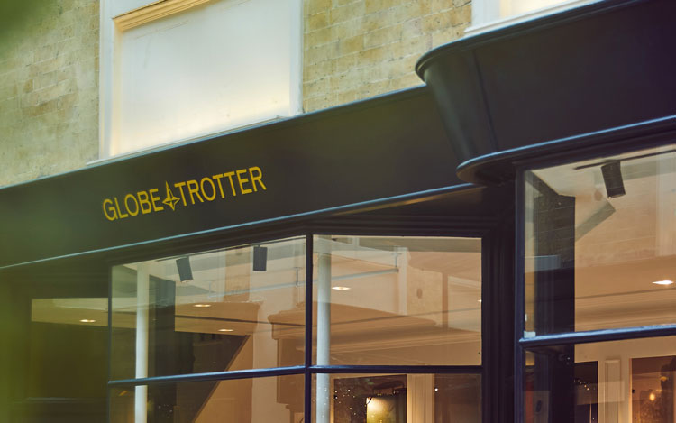
Design studio Ragged Edge has rebranded British luggage company Globe-Trotter, with an identity inspired by the company’s archives.
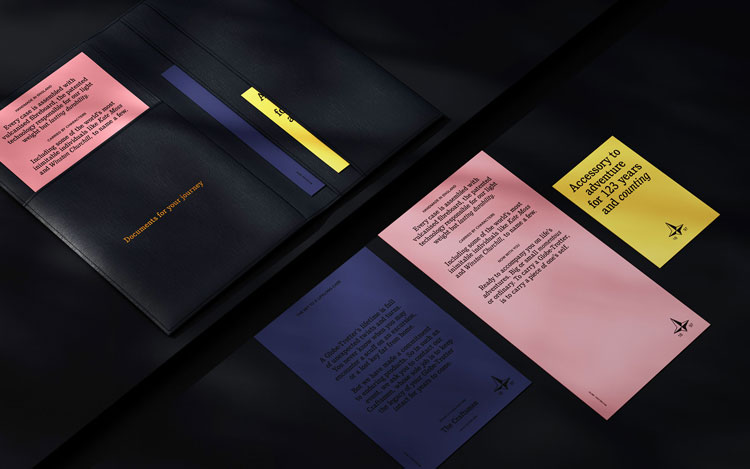
As well as designing a new logo for Globe-Trotter, the studio has provided strategy guidelines and printed promotional material.

Globe-Trotter was established in 1897 by David Nelken in Saxony, Germany, though production takes place in England. All the company’s cases are made by hand, and the company has ventured into material innovation with its vulcanised fibreboard.
In 1912, a one-tonne elephant balanced its weight on a Globe-Trotter suitcase to test the strength of the material. Cases have been used by figures including the Queen and Winston Churchill.
Rebranding for “adventure seekers”
Ragged Edge co-founder Max Ottignon explains that the new identity hopes to reach new audiences around the world, from London to Tokyo. “Globe-Trotter was loved by those in-the-know: connoisseurs who’d discovered the brand organically, or perhaps even inherited a case,” he says.
Instead of trying to appeal to any “ostentatious display of wealth”, the studio hopes the new identity appeals to “people who shared the same values as those original characters – adventure seekers”, Ottignon adds.
All inspiration for the new look came from Globe-Trotter’s archives as well as stories from craftspeople, according to the designer. The identity also seeks to reflect how all the cases are hand-made – “this needed to be a brand rich in texture and detail,” he adds.
Ottignon says that the new logo is an attempt to tell this kind of story, as well as eschewing the “characterless wordmarks that have become a bit of a luxury convention”.
The studio explored Globe-Trotter’s archives and found an old version that had been primarily used on the physical cases, he explains. The team sought to retain the “idiosyncratic feel” of the design, while adding a degree of functionality, Ottignon adds.
Featuring the founding date, the logo seeks to embrace “unconventional form” and avoid oversimplification, he says.
ITC Cushing, originally designed by type foundry ITC, has been chosen as the typeface for headlines. “It felt like an unusual choice in a digital world and fitted the brand’s ethos perfectly,” Ottignon adds.
By a happy accident, the typeface was established the year that Globe-Trotter was founded, he explains.

The colour palette, art direction and tone of voice seek to add a sense of “warmth, history and unconventional detailing”, all part of studio’s aim to exaggerate character rather than hide it, according to Ottignon.
As well as redesigning the company’s website, Ragged Edge has created a journal for the rebrand. “Globe-Trotter is built around stories – the stories of craftspeople who create them, and those of the characters who carry one,” Ottignon says. “So a journal felt like the perfect way to bring some of those stories to life.”
What do you think of the rebrand? Let us know in the comments below.


Brilliant rebrand – love the authenticity and bold heritage which seeps through the font and logo