Alzheimer’s Society rebrands to show dementia is “a problem for everyone”
The charity has been rebranded with the aim of targeting a younger audience and expressing that dementia does not just concern those living with the disease.

Alzheimer’s Society has been rebranded to banish ideas of dementia as an “older person’s disease” and make the charity accessible to a wider and younger audience.
Consultancy Heavenly has designed the new branding and created a set of design guidelines, while advertising agency McCann has worked on a new marketing campaign, which will launch in April this year.
The charity is hoping to ditch its “cold, clinical, passive” look with a new visual identity system incorporating a flower emblem, more colours and a spray paint effect.
The new logo sees a symbol introduced, whereas the previous logo was purely typographic with only a vertical, dividing line separating the logotype and the strapline.
A forget-me-not flower symbol – which is often used an emblem by dementia communities – now sits behind the logotype, with the new strapline “United against dementia” underneath it.

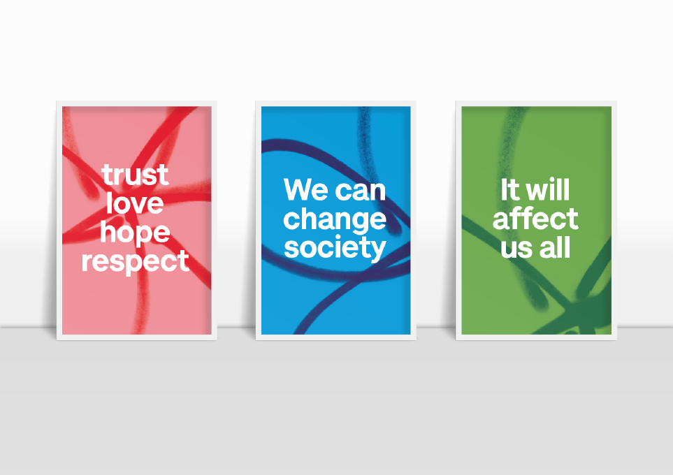
The flower has a spray-paint effect, which aims to symbolise “protest” and “grass roots change”, says Heavenly managing partner Fi Case, in a bid to create a “bolder, louder” visual identity and resonate with the idea of changing and attracting new audiences. This is also reflected by marketing imagery of protest posters.
A new typeface was designed called A S Lettera, based around Neue Haas Grotesk, but adapted to make it accessible for those with dementia and those with impaired vision. Letter spacing, kerning, and letter ascenders and descenders had to be edited in “quite a particular process”, says Case.

The colour palette was also adapted from green and blue to a multi-coloured, “pop-art”-inspired palette, with the main application of the logo set in a dark blue and light blue. The other colours are used across marketing materials, merchandise, office interiors and digital platforms, alongside the spray-paint effect.
Heavenly and Alzheimer’s Society conducted consultations with people living with dementia alongside families, carers and stakeholders. Design decisions were made which aimed to trigger nostalgia for those living with dementia, says Case.
“People felt the green and blue palette was dated, and they weren’t bold or exciting enough,” says Case. “Because a lot of people affected by dementia lived through the 1960s and 1970s, our identity was a nod to pop art, bright, vibrant colours. We chose colours which resonated the most with people with dementia.”
The charity is hoping the rebrand will help it to boost fundraising, complete more research and improve care and support for those with dementia, and give the disease “the attention it deserves”, according to Alzheimer’s Society director of marketing and external affairs Vivienne Francis.
Case adds that the new “bold, vibrant” look aims to engage younger people and hopes it will encourage the charity to be seen as a “leader” in its category.
“People think of dementia as an older person’s disease – but it’s such a problem for everyone,” she says. “It doesn’t just affect the people who have it, but the carers and families. There is a knock-on effect through the generations.”

“We want the brand to be more accessible to a wider audience, enable them to understand the scale of the problem and clear up confusion around dementia and Alzheimer’s,” she adds. “Then hopefully they’ll get behind it, participate in discussion, volunteer – and do bungee jumps for the cause.”
According to Alzheimer’s Society, deaths from dementia are rising year on year and more than one million people in the UK will have dementia by 2021.
The new branding begins rolling out this week on digital platforms, and will roll out in head offices, on merchandise and on marketing and internal print materials over the next four months in time for the charity’s marketing campaign launch in April. Alzheimer’s Society’s in-house digital team will be facilitating the online roll-out.


Read this next


A memorable, simple and appropriate new identity. Before I read the rationale, I thought the symbol represented the synapses of the brain so it works for me on more than one level. I like the colours as well and the boldness of the approach. I also have a personal interest in that my mother is in a dementia care home and also attends a couple of art therapy classes every week. Will be interested to hear what she thinks of the identity.