
Skyscanner overhauls service and rebrands as part of expanded offer
The online flight comparison site has redesigned its app and unveiled a new visual identity in a bid to “simplify travel as much as possible”.
Skyscanner has rebranded in an attempt to convey that it is not only a flight comparison website, but a travel company, which also offers car hire and hotel options.
When the company was launched in Edinburgh in 2001, it was focused on comparing flight prices. Duncan Riley, the company’s director of product design, says that now the company has a more holistic focus on travel, it was “important to better represent its new mission”.
Skyscanner says that its app has had 90m downloads and that 60% of users interact with the brand on a mobile device, making the app’s user interface a key focus of the rebrand.
Skyscanner worked with London-based design studio Koto during a collaborative stage, exploring trends in the travel industry. From this, Koto developed a brand identity, including a logo, colour palette and brand guidelines as well as guidance on photography. Skyscanner’s in-house design team then updated the brand using this framework.
An app to “simplify trip planning”
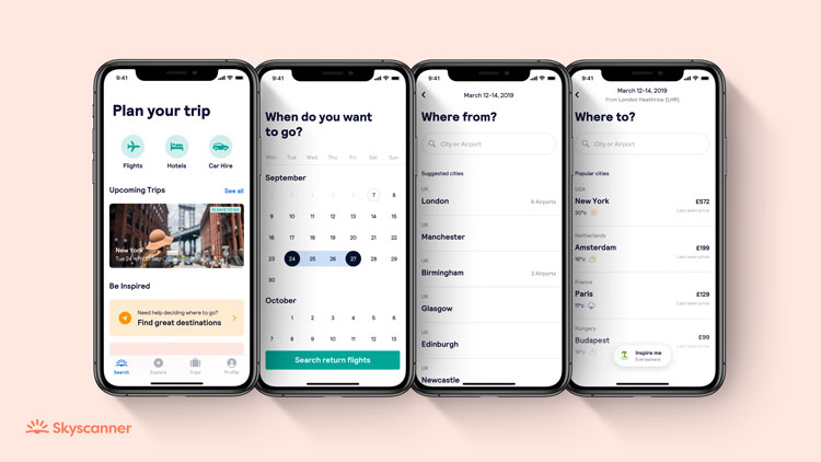
An updated user interface was about giving users more options, Riley says.
“We wanted to offer people new ways to plan travel,” he adds. “Some people start with dates, some have a destination in mind, some have both.”
The app caters to both these audiences. Users can pick a set of dates — the school holidays, for example — and Skyscanner offers them destinations based on availability and price options.
Alternatively, users can pick a destination they want to go to, like New York, and the app offers them the best prices as well as ‘eco flight options’ which show flights with fewer carbon emissions.
“We wanted to simplify travel as much as possible for users,” Riley says.
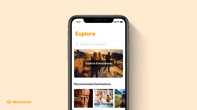
On the ‘Explore’ page of the app, there are sections for ‘Your Perfect Trip’ and ‘Best Deals for Weekend Breaks’ with sub categories like ‘Solo Travel’ and ‘Kid Free’ as well as suggestions for travel dates. Users can also search the best deals for travel by month.
A new illustrative style is also central to the update. Helping to give the app a more “human” feel, Riley says that they are used to “delight and educate users” and “take them on a journey”. One illustration, used for the planning stage, shows a man on a sofa, dreaming of his next trip.

Likewise, the in-app photography aims to “symbolise travel and the feelings that it invokes”, the company says.
New visual identity
The updated user interface is accompanied by a new visual identity, including a logo, which rolls out across all digital platforms. The relatively simple logo attempts to incorporate four elements of the brand: optimism, sustainability, ideas and places to discover.
These are represented by the outward beams to show “the optimism of the sun and Skyscanner’s innovation”, the semi-circle for Earth and the downward arrow which “illustrates a place pinned on a map”, the company says.
Fittingly the new primary colour used is sky blue with a “supporting palette of warm, natural colours” which reflects the “rich hues found in destinations around the world”, according to Skyscanner.
The brand says it is committed to creating more sustainable travel options, as part of its mission “to lead the global transformation towards modern and sustainable travel”.
As well as the option to choose lower emission flight options, it has also joined the Duke of Sussex’s ‘sustainable tourism’ initiative, Travalyst, which aims to “change the impact of travel, for good”.
Riley says that while the company is at the “start of the sustainable journey” it has been embraced by users; low carbon emissions flights have been selected by 10m users over the last year.
Read this next

-
Post a comment


