Illustrated guides
While text has been incorporated into the visual arts for years, the reverse is less common – and writers who do their own illustrations are even more rare. Jim Davies looks at a handful of innovators who have successfully crossed the line.
While text has been incorporated into the visual arts for years, the reverse is less common – and writers who do their own illustrations are even more rare. Jim Davies looks at a handful of innovators who have successfully crossed the line
Writers who illustrate their own work are few and far between. Writers who scoop international awards for their illustration are virtually non-existent. So when, at the end of last year, the precociously talented New Yorker Jonathan Safran Foer walked away with not only the book Illustration award, but also the overall prize at the 2005 V&A Illustration Awards, he proved himself a rare creature indeed.
Extremely Loud and Incredibly Close is Foer’s second novel, following hard on the success of Everything is Illuminated. It’s the story of Oskar Schell, an eccentric nine-year-old whose father has been killed in the 11 September attacks on the World Trade Center. The book follows Oskar as he tries to make sense of his father’s death, discover more about a mysterious key and find answers to all manner of questions arcane and philosophical.
As well as Foer’s blazing dexterity with words, the book contains sporadic ‘illustration’, which adds intrigue and draws the reader into the narrative. I use the inverted commas because Foer didn’t actually create these visual interludes, they’re mainly ‘found’ images culled from the Internet. Most are monochrome photographs, though there are also photo collages, diagrams, and snatches of writing in different coloured markers. The final 15 pages of Extremely Loud and Incredibly Close are virtually stop-frame animation. They show a person apparently travelling upwards, alongside one of the Twin Towers, as Oskar reverses the contents of his notebook in a symbolic attempt to turn back the clock.
Foer didn’t make it to the V&A awards himself, but someone from his UK publisher Hamish Hamilton read out a few words on his behalf: ‘There is no award, at least not that I am aware of, for painters who incorporate text into their paintings. There’s no need for one, as the boundaries of painting were broken down more than 50 years ago. But when novelists bring images into their books, it’s still, often, considered either a gimmick, or some expression of the failure of language.’
He has a point – there is a certain intellectual snobbery about illustrated adult fiction, even though there has been a fine, long tradition of heavyweight novelists illustrating their own work. Until he engaged the professional services of Richard Doyle, William Makepeace Thackeray did all his own visuals. George Du Maurier enjoyed success as both a novelist and an illustrator and Rudyard Kipling was a dab hand with pen and ink. But Foer’s take on illustration – which is woven into the text, rather than a decorative accompaniment – probably has most in common with Laurence Sterne’s Tristram Shandy, where odd squiggles, a completely blacked-out text area, unaccountable paragraphs of punctuation, and two marbled pages appear, seemingly, at random.
‘It’s quite rare to find someone who can combine two such different forms of expression to such a high standard,’ says Sara Fanelli, who was one of the judges of the V&A awards. As an illustrator who writes her own books, primarily for children, Fanelli is in far broader company, but she believes the current dearth of adult writer/illustrators is down to a mix of economics and categorisation – illustrated books are more expensive to produce, and there’s no obvious place to shelve them in bookshops.
The odd one or two, however, manage to buck the system – such as Alasdair Gray, the acclaimed Scottish writer/illustrator, whose Lanark (first published in 1981) has been hailed the ‘great Scottish novel of the 20th century’. Lanark includes beautiful, mysterious illustrations throughout, as does Gray’s Ten Tales Tall & True, which features skilfully rendered etchings and line drawings (pictured right). Another Scot, the dramatist and artist John Byrne, creator of the TV series Tutti Frutti, has also provided terrific visual interpretations for his own words.
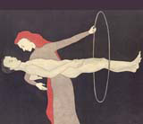
But the general reticence of publishers to embrace illustrated fiction probably accounts for the retrospective release of Chicago-based Audrey Niffenegger’s The Three Incestuous Sisters. This is a fabulous, 176-page, lavishly illustrated fable, which follows the format of a child’s picture book, but deals in distinctly adult themes. Originally, only ten copies were produced, as a hand-printed art book. Then the author had huge popular success with The Time Traveller’s Wife, a conventional novel, which gave her enough clout to relaunch The Three Incestuous Sisters in a more accessible, hardback format. Niffenegger’s illustration style is dark and dream-like. She uses colour sparingly and, though her characters are flat, like comic-book creations, they have a painterly quality reminiscent of Amedeo Modigliani. (Pictured top)
The comic book reference is apposite – the graphic novel has now established itself as a credible and sophisticated vehicle of expression, pulling away from its traditional geeky, angst-ridden audience. No small thanks to the efforts of exponents like Chris Ware, whose tour de force Jimmy Corrigan: The Smartest Kid on Earth won him the Guardian First Book Award in 2001. Not only is it wonderfully conceived, designed and rendered, it’s been compared to James Joyce’s Ulysses in its complexity of narrative interrelationships, and its balance of pathos and humour.
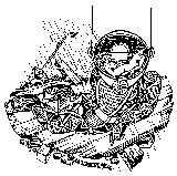
Corrigan demonstrates that images are a powerful means of not only enriching a story, but doing most of the work in carrying it forward. The next intellectual step is to cut the words altogether, a compelling idea that led illustrator (and Royal College of Art tutor) Andrzej Klimowski to create The Depository and The Secret, two unsettling novels which reverse the usual process of literary communication, asking the ‘reader’ to conjure words – rather than creating a picture – in their minds. (pictured left) Here, Klimowski uses stark, black linocuts to create a world of nightmare and desire, redolent with strange conundrums, riddles and fantastical creatures.
‘I’m demanding a lot of the reader,’ admits Klimowski. ‘It’s more difficult than asking them to visualise. I suppose you could make an analogy with silent movies.’ He’s currently working on a third novel called Horace Dorlan, due to be published in 2007. This challenges convention even further, starting as a traditional written novel, but breaking into picture mode halfway through, after the protagonist has an accident and loses his hearing. ‘From then on, he’s experiencing a different kind of reality,’ says Klimowski.
So, why does he think writers who illustrate are so thin on the ground, whereas illustrators who write are more prevalent? ‘Writing tends to be self-contained,’ he says. ‘But many illustrators have aspirations towards an extension of visual narrative. I’ve always wanted to write, but I have writer’s block from the word go. So I start with drawing and the story evolves from that.’ l
Read this next

-
Post a comment


