High spirits
With the popularity of alcopops in decline, spirits-makers have the opportunity to soak up the younger market by refreshing their brand identities. But it is important not to lose sight of their heritage, says David Benady.
With the popularity of alcopops in decline, spirits-makers have the opportunity to soak up the younger market by refreshing their brand identities. But it is important not to lose sight of their heritage, says David Benady
Spirits-makers are revamping their gin, whisky, brandy and vodka brands with increasing frequency, as consumers become ever more fickle in their choice of tipple. Cutty Sark whisky is being updated to make it more luxurious, while rival scotch Whyte & Mackay has made its red lions a central part of its branding. Vladivar vodka is also set to be revamped.
Many other spirits brands are expected to follow suit, as brand-owners review their rapidly-expanding portfolios, some fattened up with brands purchased from last year’s break-up of Allied Domecq. Meanwhile, tighter international restrictions on alcohol advertising mean that packaging has to work harder to convey brand messages.
But the rebrands have to tread a fine line between preserving the authenticity, integrity and credibility of spirits brands – some of which are three centuries old – and giving them an updated, modern makeover to widen their appeal.
Tastes change rapidly in the all-important youth market – an El Dorado for the spirits industry. Diageo recently disclosed that the once booming ready-to-drink sector – including brands such as Smirnoff Ice – is in decline, so attention is naturally turning to re-invigorating the spirits market, in an attempt to soak up the demand.
However, Greg Taylor, head of brand development at Elmwood, says there is limited scope to alter the packaging design of a spirits brand. ‘Research shows that when young people buy drinks, the last thing they want to do is make a fool of themselves, so they can be quite conservative in their choice of drinks. They want to be confident that the brand they buy has integrity – so you can evolve the pack design, but you can’t go mad,’ he says.
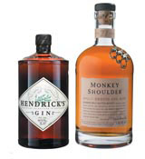
Instead, brands need to use other forms of marketing – such as sponsorship and viral Web campaigns – to attract young audiences. One way around the tricky problem of heritage versus modernity is to leave the brand baggage behind completely and unveil a new product. There has been a host of spirits launches recently, aimed at classy young bar-goers. They have funky names and even funkier designs, from trendy malt whiskies Smokehead and Monkey Shoulder to gin brand Hendrick’s.
Smokehead’s sassy design and packaging are a world away from the common whisky clichés of heather, heath and landed gentry. The pack, created by Anglo Scottish design consultancy Navyblue, is aimed at ‘modern drinkers’, aged 25 to 40, who are enthusiastic about Islay malts. It has graphics placed in reverse on the back of the bottle, so they can be seen through the liquid from the other side. Lewis Moberly designed the Monkey Shoulder packaging, whereas US consultancy Gyro was responsible for Hendrick’s.
Meanwhile, independent distiller William Grant has launched a number of new spirits brands, as it seeks to widen its portfolio. Hendrick’s gin was introduced in the UK in 2003 and comes in a Victorian apothecary-style bottle, complete with a cork-stopper to give it a ‘quintessentially British look’. After this came brands such as Sailor Jerry Rum, Reyka Vodka and the much-talked-about triple malt whisky Monkey Shoulder. The name refers to an injury once commonly sustained by malt workers in making whisky, and the bottle has the image of three brass monkeys crawling on its sloping shoulders. All these brands have strong ‘stories’, implying a ready-made heritage, which are told through the packaging design.
But established brands – particularly whisky – are finding the going tough, according to David King, international marketing director of recently rebranded, blended whisky Cutty Sark. ‘Scotch is flat everywhere, apart from Asia. But we are not just talking about taking on competition within the category – this redesign is about being as good as the best-looking spirits, whether they are vodka, gin or rum,’ he says.
The redesigned Cutty Sark bottle’s shoulders have been raised to give a leaner, more elegant shape, and the words ‘Since 1698’ have been added to the label, to reinforce its heritage. Along with gold foil, the new design, created by Firehouse, aims to emphasise the brand’s authenticity, luxury and masculinity. But King says the redesign is about reinforcing the brand’s appeal to existing consumers, rather than recruiting new drinkers.
King adds that the development of new labelling techniques has boosted designs of spirits packaging, with embossing, etching and personalisation (such as putting customers’ names on bottles) all affordable for mid-priced brands. Consumers are increasingly design-savvy and demand high design qualities. ‘The days of slapping any old label on the front of the bottle are long gone,’ says King.
But the new techniques need to be used sparingly. Elliot Wilson, client director of Landor Associates, says, ‘What most brands are trying to achieve is something timeless, so you don’t have to fall into the argument between modern and aging. You should transcend it.’
Other designers agree that heritage can become a millstone that spirits brands carry around their bottle necks. A spirit can easily become a ‘museum piece’, instead of being a vibrant, dynamic presence on the bar shelf, according to Graham Shearsby, creative director at Design Bridge. He argues that updating packaging and labels is the essence of good branding. ‘It is part of keeping a brand alive and relevant for each up-and-coming, new generation and this is where authenticity comes in. There has to be a story there,’ he says.
Design Bridge has worked, over the past couple of years, on updating the portfolio of The Macallan whiskies and has attempted to reinstate the brand’s luxury status. Inspired by 19th century designs for The Macallan, the redesigned bottle rises from a circular base to an oval shoulder. A triangular label, showing the ‘established date’ affixed on the shoulder, demonstrates the brand’s heritage. The design of the white front label is based on Easter Elchies House, in Craigellachie, where The Macallan was first produced.
As the spirits industry enters a new and potentially tougher phase in its development, designers will have to grapple with the challenge of ensuring brands are modern enough to appeal to the young, but still attract those traditional drinkers who often make up the bulk of their customers.
Read this next

-
Post a comment


