Quark rectifies rebrand mishap with second stylised ‘Q’ logo
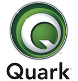
US publishing software company Quark has undertaken its second corporate rebrand in under six months, after the previous identity turned out to be coincidentally similar to the marque used by the Scottish Arts Council (DW 22 September 2005).
US design consultancy SicolaMartin, which undertook the original rebranding, was not involved in the identity redesign. Quark turned instead to its in-house creative team.
Quark launched its branding to much fanfare in September last year, having undertaken an extensive brand positioning review. The design community was quick to note the similarity between the stylised ‘Q’ of the Quark logo and the shape used by SAC, which was designed by Glasgow consultancy Graven Images in 2001.
While no legal action was taken, according to Quark director of corporate communications Glen Turpin, the firm ‘listened to feedback from the design community and customers around the world’ and decided to ‘further distinguish’ itself with a redesign of the corporate identity.
Turpin refuses to draw a direct correlation between the ‘purely coincidental similarity’ with the SAC identity and the decision to undertake a second redesign, but says that ‘changing the mark [avoids] any perception of similarity’.
At the time of the original rebrand launch, Turpin said, ‘It’s fresh, inviting, open and radically different from our old logo. That’s why it’s the perfect symbol for the new Quark.’
SicolaMartin creative director Chris Wood declared that the logo would ‘help Quark break out of the visual “sea of sameness” that lumps together so many corporate software companies’.
Although SicolaMartin was not involved in the second design process, the visual language and photography it created for Quark’s brand guidelines will be retained. A spokesman for SicolaMartin says the consultancy continues to work with Quark and declines to comment further.
-
Post a comment


