Selling with a difference
They’re thick, heavy and repetitive. Trish Lorenz asks whether creative redesigns of traditional shopping catalogues can inject life into a flagging market
As High street retail continues to boom, its poor relation, catalogue sales, is in decline. Research shows catalogues are perceived as old fashioned and boring, with consumers searching for unique, aspirational offers, tailored to their individual needs, rather than a mass-market experience (Mintel Europe: Home Shopping Markets, 2000).
Yet British Airways is making a six-figure investment in launching an entire range of new-look brochures for its in-flight retail operation (DW 15 May), and other retailers are continuing to invest in the medium. Habitat, for example, is using its catalogue as one of the first vehicles to demonstrate its new visual identity (DW 3 May).
So what does this mean for designers in the catalogue and retail brochure field? Do changes in lifestyle and increasing aspiration among consumers require a dramatic rethink in the way that catalogues are designed and presented?
Lamb and Shirley creative director Tim Lamb, known for his work on Next Directory and other fashion brochures, says that the catalogue market is changing and moving upmarket.
‘Traditional big-book customers are now shopping in-store. Discount retailers, such as Ikea, are taking over from the catalogue market. [At the same time] the catalogue marketplace is becoming more sophisticated and catalogues need to look more sophisticated too,’ he says.
But Lamb thinks existing catalogues are uninspiring and that clients are often reluctant to test new formats.
‘I’m staggered they’re still so boring. The products aren’t boring but the format is. Things could move on but they don’t because people don’t want to break the ground rules,’ he says.
Lamb attributes such hesitancy in part to difficulties in pinpointing what persuades people to buy one product over another. His view is that quality cues are vital.
‘For the Next Directory we used a better quality of photography to get the quality message of the product across,’ he says.
The BA revamp is being designed by The Nest, and chairman Alex Willcock agrees the market is perceived as old fashioned.
‘The majority of people don’t even look at in-flight catalogues because the layout uses cut-out photography, as well as cheesy copy,’ he says.
Willcock feels that addressing tone of voice and copy style is one option. ‘[The way forward] is to entertain and romance the product by giving [more seductive] information. We want to use chatty copy and an element of wit.’
Willcock also feels that it’s important to show product in context to inspire consumers about its possible uses and to deliver aspirational cues.
‘The average customer has an enormous level of hesitancy about their own creative ability. As a result it’s really important to have elements that will bring [the catalogue] alive.’
He cites the example of an Australian company, Country Road. Willcock was responsible for revamping the company’s homewares brochure.
‘When we redesigned the catalogue we used four people’s homes [for the shoot]. All of them had completely different styles and we didn’t take away their personal belongings.
‘It looked real and came alive and we had a 44 per cent increase in sales,’ he says.
Graphic Thought Facility creative director Paul Neale is responsible for the look and feel of the directory section of the Habitat catalogue. He says designers need to make a fundamental decision about what task each component achieves.
‘In the Habitat catalogue ten years ago, room sets were doing both jobs, being real and selling the product,’ says Neale.
‘The approach now is separating these two tasks. It’s important they look like they’re doing different jobs so the user recognises which section to get ideas from and which section to check for product information and comparisons.’
Neale thinks that focusing too much on emotive imagery and a magazine-style product can be detrimental.
‘Avoiding the directory look entirely is not beneficial. Accept and embrace it, let information look like information,’ he says.
Neale’s view is that the balance between the functional and aesthetic can be achieved in the overall design. He cites the size of the catalogue, its feel and the relationship between the mood photography and the directory section as key in delivering an overall impression.
Willcock agrees there is a real need to achieve the right mix. He believes some catalogues have gone too far, becoming so abstract that they project a brand image rather than focus on selling.
‘Catalogues do have a role to play in informing customers how to use the product. However, they also need to demonstrate what the product is. The best examples offer a combination of these two [aspects],’ he says.
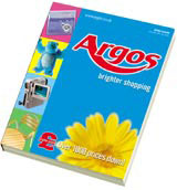
Lamb says that Argos is one retailer gets it right. ‘Whether you like the design or not, it does work hard.’ And both Willcock and Neale are at pains to stress the importance of staying focused on selling products.
As Neale points out, ‘We do the catalogue work [for Habitat] not because of our catalogue design experience, but because we understand [Habitat’s] business and have experience in presenting both product information and emotive imagery to the general public.’
And this is the nub of the issue. Catalogues, like all other aspects of commercial design, ring to the truism that beauty is redundant if it doesn’t achieve its functional objective. Ultimately, the test of effectiveness, and the basis of judgement, will be its commercial success or otherwise.
But, as consumers’ tastes change, achieving commercial success with a catalogue will require a delicate balance between inspirational and aspirational elements and meeting the need for information. The challenge for designers is convincing clients to push traditional design boundaries to achieve the optimum blend.
Read this next

-
Post a comment


