
Shelter reveals activism-inspired rebrand from Superunion
The brand consultancy’s update for Shelter takes the homelessness charity back to its early days of grassroots campaigning.
Shelter has revealed a “determined and brave” rebrand which seeks to embrace the spirit of activism.
Superunion has designed the new branding, which launches alongside a campaign by ad agency Who Wot Why.
Shelter was established in 1966 with the aim of ending homelessness and bad housing in the UK. The campaign charity provides advice and assistance to those in housing need.
The new identity and campaign have been prompted by recent research from Shelter which showed that one in three people in the UK are impacted by the housing crisis.
“More powerful, determined and brave”
According to Superunion design director Jonathan Brodie, the new look goes back to the charity’s roots in its embrace of activism.
“Shelter’s contemporary issues sadly mirror the original issues that provoked their launch as a grassroots organisation back in 1966 – a housing crisis at breaking point,” Brodie says.
He adds: “The new positioning and identity have been created to be less ‘polite’ and more powerful, determined and brave.”

Shelter’s previous identity – which introduced the recognisable roof mark – was designed by Johnson Banks in 2004. Brodie calls this logo a “classic in graphic wit”. “We knew replacing it would be challenging within the design industry,” he adds.
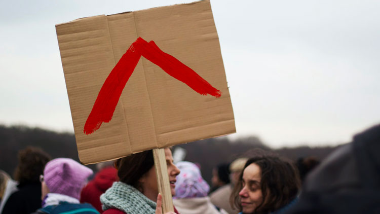
This charity’s shift in focus meant that the previous logo no longer conveyed the “right tone”, the designer says. “We knew the roof of the letter ‘h’ held a lot of equity with people,” he adds. Because of this, the studio has used the shape to symbolise the charity’s “entire cause”.

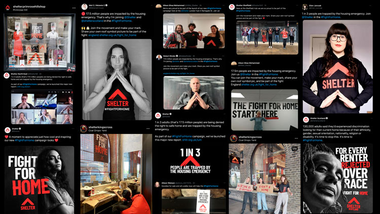
Inspired by protests, the new mark combines the previous brand’s roof shape with a positive upwards arrow. The red colour palette remains though visuals have been recreated in brush strokes.
One benefit of this shift is that the brand doesn’t just depend on the logo and has an entire identity system, according to Brodie. The roof mark is used throughout the identity, from social media to T-shirts.
“The new design gives Shelter a simple toolkit inspired by the spirit of activism to take that message to the streets, literally,” Brodie adds. It’s designed to be easily recreated and reporduced while also standing out in the charity sector, according to Brodie.
He adds: “Whatever designers think about it, hopefully it will be hard to ignore, as the severe housing crisis is far more important.”
The bespoke protest-inspired typeface was designed in collaboration with Thereis studio. A hand gesture has also been introduced into branding and photography, where people can form a roof shape with their hands.
“We hope the mark (and hand gesture) become a universal symbol of Shelter’s fight for home in this country and helps carry them forward on their mission,” Brodie adds.
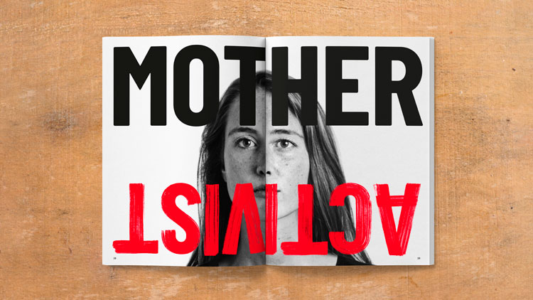
The new campaign, entitled Fight For Home, was created by Who Wot Why and features a film following real people who have been impacted by the housing emergency.
These ads will run OOH and online, with black and white portraits shot by photographer Tom Cockram.
What do you think of Shelter’s new identity? Let us know in the comments below.
Read this next


I really like this new logo. It fits the brand perfectly especially during the modern times. The old design looked too innocent but the new logo is more serious and into the reality.
instead of rebranding at a huge cost, the money needs to be used to prevent homelessness. very disappointed, and as a result many of us volunteers have left. the entire feel of the charity has changed, and the aggressive style fits the new narrative which will be its downfall.
This new rebrand has Woke written all over it. All that black is incredible morbid and off-putting, and the activism message has no relevance to the current housing situation.
The people at Shelter HQ need their heads examined for approving this design.