Why gender stereotypes in typefaces can stifle creativity
A new book from type designer Marie Boulanger explores gender conventions applied to type, the impact it has, and why breaking away can create better design work.
“This is great but make it more feminine.” When it comes to fonts, type designer Marie Boulanger says she has heard comments like this “countless times” from clients. “If you think about it from a design point of view, that word contains nothing that designers can use,” Boulanger says. “I think it’s important to examine your bias and ask why you’re saying masculine or feminine and the qualities you’re attaching to gender that you need to express.”
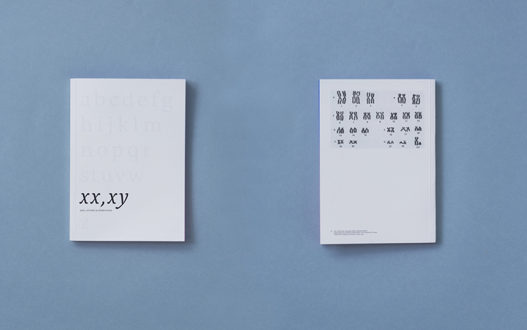
The stereotypes that people apply to typefaces – such as thin, ornamental details for ‘feminine’ fonts and blocky, thicker ones for ‘masculine’ ones – is the subject of Boulanger’s new book, XX, XY: Sex, Letters and Stereotypes, currently being funded via Kickstarter. The book, which started off as a thesis for her MA in type design, investigates the relationships between letters, gender stereotypes and how those impact the wider design industry.

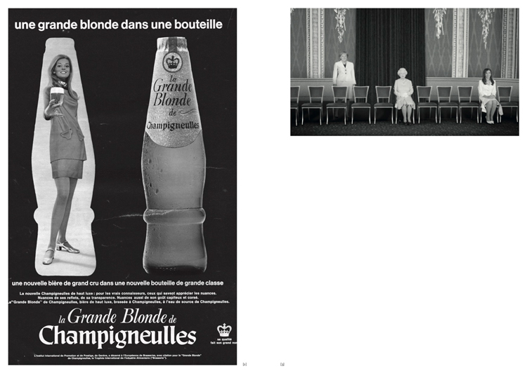
Boulanger started with the letterforms themselves, applying a framework which treated letters like people. “We describe letters in a weird human way,” she says, referring to descriptions like body and weight and anatomical terms like ear or arm. “Accepting that made it very easy to examine gender markers that we see in humans in letters,” Boulanger continues. As part of her research, she looks to art history, anatomical sketches and advertising to show how women are often depicted as more ornamental and slender than men. The designer believes that these stereotypes have pervaded the world of type.
In a talk at typography convention TypeCon, Boulanger drew attention to a comment under an article about popular typeface Mrs Eaves (named for the mistress of British typeface designer John Baskerville). “Mrs Eaves is soft-spoken, warm, low contrast and has a distinct feminine touch to it,” the comment read. For Boulanger, this epitomised some of the problems of how typefaces are perceived. One of the distinctive features about Mrs Eaves are the hundreds of ornamental ligatures, explains the designer, which reveals the associations people make between gender and physical qualities.
“The perceived femininity of Mrs Eaves has nothing to do with its physical aspect, a little to do with its name, but everything to do with a third gender marker – usage,” she adds. Another example of this is Didot, a high contrast, 18th century typeface associated with fashion magazines – particularly women’s fashion magazines such as Vogue. Boulanger believes breaking away from such stereotypes would allow designers to be more creative. “Relying heavily on stereotypes that we tied to gender cemented some typefaces in very narrow uses,” she adds.

“It actively harms the resolution of those problems”

One category where these associations are clear is cosmetics. “The industry is so segmented by gender,” Boulanger says. Because there are such clear marketing strategies, it’s easy to spot the design codes. “There’s almost a complete willingness to do things that follow clichés,” she says, with “hyper feminine products” getting “hyper feminine letters”. However like the fashion industry, the cosmetic sector is making an effort to appeal to audiences less preoccupied with gender binaries.
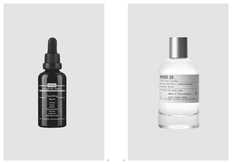
With these products, Boulanger believes there’s a “subtle merging of codes” when it comes to typefaces. In her book, she examines two gender-neutral products, Non Gender Specific and Le Labo. While the former uses a stereotypically gender-neutral typeface and strips the product of “any typographic experimentation or fun”, the latter applies a stereotypically masculine typeface for a gender-neutral product. “I thought that was way more interesting,” Boulanger says.

Some might argue that stereotypes can be a helpful way to describe typefaces – a useful way for clients to express what they want. But Boulanger believes that type designers should strive to be more precise. “It’s harmful not only because it uses stereotypes that nobody wants to hear about anymore but if we’re thinking about design and problem solving, it actively harms the resolution of those problems,” she adds.
“If you want a typeface that is rounder and your internal bias is telling you that feminine means rounder, then I think it’s way more interesting to stop yourself and say, ‘What I really mean is rounder’,” Boulanger adds. “The world needs to hear ’rounder’ because that will help you define your design needs.”
Type can play into what Boulanger calls the “onion system of layers and stereotypes”. She uses the example of two children’s colouring books published concurrently in 2013; The Brilliant Boys’ Colouring Book and The Beautiful Girls’ Colouring Book. The design choices for these titles – from the branding, colour choices and selection of imagery – all emphasise outdated stereotypes, Boulanger explains. The typeface choice – a more ornamental choice for girls and intellectual for boys – was the “nail in the coffin of gender stereotypes”. “That can definitely lead to something actively damaging especially when you market to children,” she adds.
“When I wanted to do type design at first, it was all men”

These stereotypes also affect those working in the type industry. Boulanger recently published her first typeface, Faubourg, with US foundry Positype. It’s a high-contrast display typeface with several monoline capital letters, which is an unusual formal feature, according to the designer. She says that it’s easily something that could be described as “delicate”. On top of this, display typefaces are usually used for titles as opposed to text typefaces which tend do be used for body copy. “In people’s mind, a type designer is a 50 year old white guy from Switzerland who designs text typefaces,” she says.
“All of those things could have been used against me and discredit my work as a type designer,” Boulanger adds. That mean when it came to describing the typeface, Boulanger and Positype founder Neil Summerour were keen to avoid any gender stereotypes. Instead they focused on its “silk-like” movement and unconventional letterforms.

There are of course many issues at play when it comes to the use of type, not least the unequal representation of gender and race within the industry. A list by Fontshop of the best 100 typefaces of all time included only one by a women – Mrs Eaves, designed by Zuzana Licko. Boulanger was aware of this before she even embarked on her career. “When I wanted to do type design at first, it was all men,” Boulanger says. “It freaked me out and I thought, ‘This cannot be me’.” Last year, Design Week spoke to Amber Weaver who founded Femme Type, a platform which takes aim at this problem and looks to celebrate female type designers.
Boulanger hopes that her book will change opinions in the industry, while acknowledging the complexity of the issues at hand. “Of course there’s a massive history of how type has been used and centuries of type designers making choices isn’t going to disappear, and I don’t think it should,” Boulanger says. “But as we evolve, and the way we view gender and roles in society evolves, then the way we use type should follow.”
For more information on XX, YY, you can visit the book’s Kickstarter page.


Nothing new, just look at medicine pack. They are all non gender specific.
Really interesting. I have been thinking for a while that we, as designers, have an obligation to move away from the lazy stereotypes and regressive design shorthands that we implement all the time. Pleased to see this is being written about and discussed.
There’s nothing wrong with type being on a gender scale and identifying something as more feminine or more masculine. The same way there is nothing wrong with a human being more or less masculine or feminine, whoever they are. The problem is with the people observing, who see masculinity only being associated with a man and femininity only being associated with a woman. It doesn’t mean we just make everything neutral. That doesn’t represent real life and the breadth of human identity. It doesn’t move society forward or change the way people see gender.
Aye!
I don’t see anywhere in this article when Boulanger started thinking about becoming a type designer, but judging by her limited knowledge of the current type scene, it would be very, very recent. I can name at least 10 great female type designers, like Krista Radoeva for Fontsmith, Veneta Rangelova for her own foundry, Kaja Słojewska for Fontfabric, Laura Worthington…shall I go on? I just don’t get the complaining….