Qantas airline rebranded – Marc Newson redraws kangaroo
Aircraft livery overhauled with new kangaroo tail fin and wordmark introduced as new cabin interiors are unveiled.

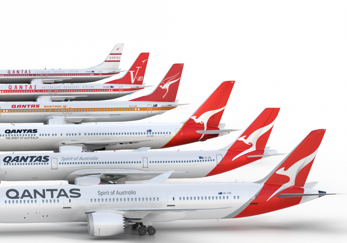
Australian national airline Qantas has been rebranded and its famous kangaroo icon has been redrawn as a simplified silhouette with no arms.
Designer Marc Newson has led the project working alongside Australian consultancy Houston Group.
New look kangaroo
Newson, who has previously designed Qantas airport lounges and its A380 aircraft cabin, says that the redesign “aims to retain the fundamental essence of the flying kangaroo but also move the brand forward.”
The kangaroo is “more streamlined” and the shading behind it “gives a better sense of movement and depth” says Newson, who adds, “A silver band now extends from the tail to the rear of the fuselage to give a more premium feel.”
The new kangaroo can also be found on engine cowls in an effort to make it more prominent and identifiable.
Changing the wordmark
Meanwhile the Qantas wordmark, “which measures nearly two metres high on a 787” according to Newson, is set in a slimmer font, has been simplified and now also appears on the underside of the aircraft “so you can see that it’s the national carrier” when it flies overhead. The wordmark’s italic slant has gone and it is now in a grey hue, rather than blue.
It is only the fifth time the kangaroo has been updated since it was introduced in 1944. The last update was in 2007 when the Airbus 380 came into service with Qantas.
A winged kangaroo, which appeared on the tail of Qantas aircraft 30 years ago, will now feature under the cockpit window next to the name of the individual aircraft.
The new look is rolling out as an aircraft livery as well as across digital assets, signage and ads. Cabin staff and pilot uniforms have already been redesigned.
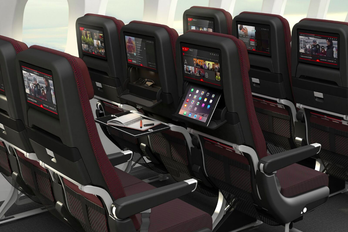
Redesigned cabins
Qantas’ refreshed brand has been revealed alongside the cabin designs for its new 787-9 Dreamliner craft. Business and economy class cabins have been designed by Australian industrial designer David Caon. They are based on an overall Qantas aesthetic, already established by Newson.
Qantas chief executive Alan Joyce says: “When we looked at the history, we found that the logo has always been updated around the time of a game-changing new aircraft joining the fleet.
“It’s a tradition that goes back to the Lockheed Constellation in 1947, the B747-300 in 1984 and the A380 in 2007.”


A proof that a great product designer doesn’t have to be also at least good graphic designer – streamlined kangaroo looks more like a cheetah now and why longer silver line makes it more premium!? Missed opportunity and unexpectedly disappointing work from Newson…
If you didn’t know, does it look like a kangaroo anymore..? By losing the arms, it then looks like the legs are the arms. All for streamlining, and updating…but has the fundamental aim to retain the essence of the kangaroo been lost in the process..? The 2007 version has more of a curved back which works… this version should have retained that element – it would have helped. God I’m sad!
It’s true, all kangaroo-ness is now gone.