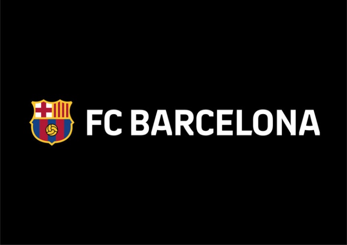
Barcelona FC unveils new crest and type treatment
The new badge was designed by Barcelona-based consultancy Summa, which also created a new typeface and visual system for the club

Update 30 October 2018: FC Barcelona will not be going ahead with the proposed crest. Some of the Assembly of Members, who have to approve the crest, questioned the need to withdraw the acronym FCB, according to Summa. It is not yet known if there will be a new proposal.
However, the club is using some elements of the visual designs by Summa, including the typography.
FC Barcelona has unveiled a new crest which sees the letters FCB dropped, following a redesign by consultancy Summa which looked to make the brand work better across digital channels.
If approved by a delegate assembly on 20 October, this will be the 11th crest design since the club was founded in 1899 and will be rolled out in time for the next season (2019-2020).
Barcelona-based Summa worked “hand in hand” with FC Barcelona over the past two years to develop the brand strategy, according to Roderic Molins, a creative director at Summa.
It was decided that Barça would become one of the brands official names, alongside FC Barcelona, as it was already widely used by fans globally. “It is a very strong expression that all the world knows,” Molins says.
The expression FCB lacked “potential” for the club’s future, was not commonly used among fans and lacked meaning, he adds, so it was dropped.

The name Barça can also be applied to lifestyle and entertainment products and social change initiatives Summa says, as “Barça is more than a club”.
As well as removing the letters FCB, the changes to the crest include reducing the number of blue and maroon “blaugrana” stripes from 7 to 5 to create better contrast and to make the colours stand out more. The two colours have also been made brighter and this part of the shield has been elevated.
The ball image has been made bigger and moved to a more central position giving it “greater importance” according to Summa, and the black outlines within the former crest have been removed. The black outline around the crest has been kept as have the key elements of the shield representing Barcelona and Catalonia.
One of the key drivers for the crest’s update was to make it work better in the modern world and across new technology, according to the club, which wants to future-proof the brand.

Molins says: “The world 12 years ago and today is very different, there has been a new digital revolution, there is Twitter and Instagram, new technology… We needed to ensure that crest, that very important symbol of the club, could be better applied and visualised everywhere. We made it a little brighter, more homogenous, more harmonious, but it still maintains its shape and essence. We made it with a lot of respect.”
The new crest is part of an initiative to promote the brand on an international level and attract more fans as set out in the FC Barcelona Strategic Plan, according to Summa.
A new visual system for the club to use, including colours, patterns and a personalised typeface were also created with the goal of unifying the brand’s creative output and making it stronger more modern and consistent, according to the consultancy.
Summa was keen for the club to have a personal typeface, as it becomes like their “personal voice”, Molins says. Given the go ahead by Barça the consultancy created the new Barcelona FC typeface which is “strong with a lot of personality and inspired by the shapes and details of the crest,” Molins says.

The changes have already been approved by a board of directors, but still need to be approved by a delegate assembly on 20 October.
It will appear on football shirts as well as on club merchandise, communications and online.
Molins, who says many people at Summa are fans of Barcelona FC say: “It is not easy to change a thing that is so important for a lot of people, but I think it is not a change, but an evolution for the actual times, for this new era and for these new kinds of applications.”
All images courtesy of Summa.


Looks like crap…..yet another case of someone re-inventing the wheel, to justify their own existence…..but making it no better. How on earth does removing FCB from the logo make it less digitally friendly?
Removing the lettering from the crest and moving it out aside the crest, allows you to scale the lettering easier because lettering doesn’t depend directly anymore by crest size but I can “module” it in base of how much you are scaling down the logo.
You can imagine such improving easily on print product and in general on small-size branding usage.
About the rest yes, they substantially didn’t change the logo but they did just a retouch, make it cleaner.
That’s all.
Why do football club identities have to be so predictable and boring?
I don’t see why people might have problems with this new logo. I love it. Everything about it is BETTER than the old logo and that’s what this is all about.