Type-spotter framed into thinking he’s seen an error
I was intrigued to see Bruno Maag’s letter (DW 10 February), discussing our Russian project in Design Week. When creating the logo for Dymov we thought we might offend type-spotters.
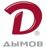
I was intrigued to see Bruno Maag’s letter (DW 10 February), discussing our Russian project in Design Week. When creating the logo for Dymov we thought we might offend type-spotters.
Bruno suggests that the inverted letter ‘V’ was a mistake and that we should be embarrassed by this. That would suggest that the project was badly directed – it was not, it is not an error, so no red faces here.
There is no such thing as right or wrong in design, but there is healthy, subjective disagreement.
There are typographic rules, of course, but then it can be fun to break the rules sometimes, with good reason, in this case framing.
I love type and typography and am fascinated by the origin of letters, whatever the alphabet, whether it be for our British, Russian or Chinese projects.
The letter V was only officially introduced into the expanded alphabet in 1828 with Noah Webster’s American Dictionary of the English Language.
In Johnson’s important English
Dictionary of 1755 he excluded V from the letter list and noted that it was the Roman numeral for five.
In earlier times, V was substituted, and interchangeable, for U at the beginning of a sentence and was certainly carved as such by Roman calligraphers – straight lines are so much easier.
So V is a young letter, in the scheme of things, and I believe it is still able to have fun. The purists need not worry too much, it never appears in public – the Cyrillic version of the logo (pictured) is used across all external communication.
Bill Wallsgrove
Vice-president and corporate brand director
Mildberry UK
London WC2E
Read this next

-
Post a comment


