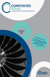
Pencil draws circles to refresh look ofComposites News

Pencil is working on the brand guidelines, print collateral, signage and wayfinding for technology hub the National Composites Centre, which is due to open in Bristol in the summer.
Pencil was appointed three weeks ago following a two-stage tender process, which involved the consultancy developing the company’s identity, predominantly through colour and new iterations of the logo.
Pencil creative director Luke Manning says, ’We took the identity and made it more confident. The original colour palette was too primary and naive.’
The consultancy took the ’c’ and ’n’ shapes from the logo to create a new marque for the publication Composites News. The logo’s ring shape has also been picked up on the cover and is used throughout the publication to showcase imagery.
-
Post a comment


