Pure type
In what seems like a rather unlikely collaboration, Design Studio, D&AD, Nokia and Finlandia vodka are coming together tonight to help present the Nokia Pure Exhibition, celebrating the launch of the new Nokia Pure typeface created by typographer Dalton Maag.
Refreshingly, perhaps, for a mobile phone company, the new typeface is really rather beautiful. Nokia Pure will become the company’s primary font used across 200 million phones worldwide.
Aapo Bovellan, Studio Nokia’s director of brand and marketing, says, ‘Nokia Pure is a celebration of our Finnish design heritage. We wanted to give it a natural, flowing form, while creating something that is highly functional and neutral. Nokia Pure has a clarity of purpose and as little design as possible. It’s made to celebrate human creativity.’
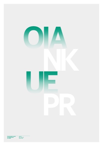
To mark the launch, a host of creative folk have come together to design a series of posters using the new typeface, which will be sold at the exhibition and online to raise money for the British Dyslexia Association.
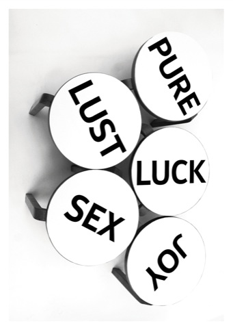
The designers involved are Alex Trouchut, Bond, Build, Cartlidge Levene, Design Studio, Hello Von Nokia Design, Non-Format, North, Practice, Studio Myerscough, Value & Service, ZAK.
Proving that typography can titillate (who’d have thought?), Bond’s Marylin Monroe inspired design takes its cues from the female form. A Bond designer explains, ‘We wanted to undress the font and show some of its most beautiful aspects. Therefore, we created a series of ‘Nokia Nudes’, blondes, brunettes and redheads.
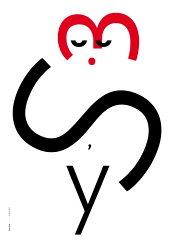
‘The design can be approached in many ways—some might see the ‘s’ representing the curves the female body, while some might see it as a skirt, just like Marilyn’s.’ Oooh-er.
Another DW favourite is Hello Von’s stunning, swirling and somewhat ethereal-looking ‘o’.
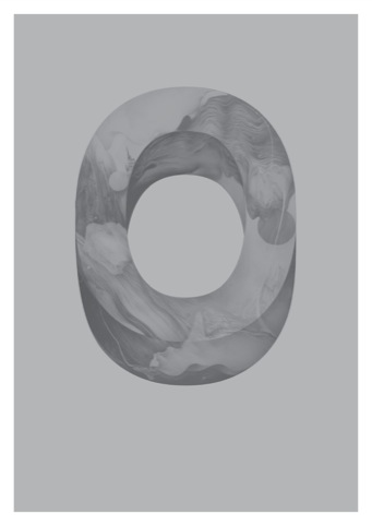
A Hello Von designer says, ‘To me, it was more interesting to steer away from a flat, graphic representation and treat the letter as an object or form in its own right, with its own quietly fluid internal world.’
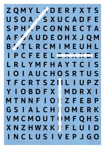
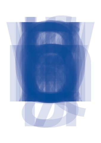
Another standout is the clever, if time-consuming addition by Zak. The blue word search puzzle uses the Nokia Pure font to conceal eighteen words. The designers have kindly helped us out by spelling out ‘Nokia, ‘brand’ and ‘mirror.’ In a well spent morning, we’ve managed to root out ‘connect’, er, ‘mime’, ‘fluid’, ‘icon’ and ‘sxucad’, which apparently ensures 178 points in Scrabble.
The Nokia Pure Exhibition takes place on 24 March at The Tramshed, 32 Rivington Street, EC2A Posters will be available through DesignStudio,


If I was nokia I would concentrate on making some decent phones to be honest
inclusive, seamless, connect, juncture, flow, feel, aqua, coil, chrome, map, sir, hare, tin,
ladne to
I don’t think that this will make any change. They have to do better than that to keep up with Apple. Apple is just far far ahead…unfortunately..
Fonts are just beautiful!!!
ps. as for apple ….hm.. americans are very stupid nation so they eat everythin what they are given (the proof is everywhere on the internet, ex. search for the video “stupid americans” on youtube). so iphone users do not have 1% of the abilities nokia gives to its customers by default, ex. doing everything with the files, watching all kinds of media files without converting and so on…..
Stylish yet almost invisible change; one does notice it unconciously though … Good thing. And as soon as their newest model is presented to public, hot damn!
I counted at least 30-31 words from the Zak’s word puzzle
Beautiful and very much Finnish, indeed! Glad to see some Scandinavian influence and purity in the smartphone interfaces again. Well done!
Some interesting designs. Are they making the font available for free use? That would be nice.
This beautiful NOKIA font will be a huge lift for whole NOKIA production. Their engineers already produce more than “decent” phones. It’s just design which needs more attention and a modern font is a very essential feature in every single product.
What an amazing night! Type has never looked so cool! Amazing work, great cocktails and the most design / type savvy audience seen in one location for a long time.
Where can vi get this new font to the Maemo/MeeGo based Nokia phones?
PS. Sad that Nokia will use the world crappiest OS in their phones, I don’t think it’s worth the billion US$.
“Pure Jenkki”
“Pure persettä”
Pureeko? puree!
puree o paree
GREG. Just keep on consentraiting to eat grab with microsoft an windows an all that pathetic ship! Shame on ya, poor kid!
lol.. and it changes everything -.-
Quite a bold statement @Greg. I think the typefaces are really nice but, just might be the Microsoft influence on Nokia (from their recent alliance).
Personally i think the old typeface has a lot more more character and Nokia’s decision to change is going to be a big mistake…
http://www.jotecy.com/
discount man bags
Famous brand Prada bags sale online jetecy.com in classic and modern styles.cheap prada mens bags,discount prada leather bags,trendy prada purse,prada wallets sale free shipping in the latest styles and trends.
http://www.jotecy.com/includes/templates/jotecy/images/brand/top01.jpg
http://www.jotecy.com/womens mcm handbags