Trying to kid the adults
The children’s food market is an increasingly demanding sector, with packaging design now required to appeal to both kids and parents. Guy Woodward reports
Anyone familiar with the sickly sweet advertising campaign for the sickly sweet ‘fruit’ drink Sunny Delight will understand the conundrum facing food retailers aiming products at children. How do you appeal both to the kids’ carefree, fun-seeking nature and the parents’ more responsible, health-conscious approach?
In this case, Procter & Gamble came up with a tried and tested formula focusing on the alleged ‘goodness’ of the drink, mirrored by an equally feelgood ad lauding family values. Yet recent evidence suggests manufacturers are becoming more daring in their branding and packaging, in an attempt to court attention and corner a part of what is fast becoming a highly valuable market.
According to Mintel, sales of children’s snacks were worth over £400m last year, a growth of 20 per cent in five years. This figure only represents the likes of crisps and other snacks and doesn’t include drinks, confectionery and savoury products targeted at children. ChildWise reports sales of confectionery to children (not including that bought by adults) rose 10 per cent last year to hit £325m. And with the sector now gorging on the likes of pre-packed lunchboxes and character-branded breakfast cereals, creatives are finding kids’ appetites for branding satisfyingly voracious.
Consequently, consultancies are cooking up more and more recipes to tempt the younger consumer. But kids have a habit of staying a step ahead when adults try to pre-empt tastes, the end result being an evermore demanding market.
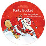
‘Kids are definitely becoming aspirational much earlier,’ says Paul Foulkes-Arellano, managing director of Wren & Rowe, which has just completed designs for Safeway’s Christmas range of children’s chocolates, ice cream, lollies, cakes and the like. ‘Even fiveand six-year-olds are getting attitude. They don’t want toys anymore, they want adventure.’
Wren & Rowe placed traditional Christmas images of reindeer, snowmen and Santas in contemporary settings, such as skating and snowboarding. ‘We wanted to appeal both to the parent’s traditional values and the kid’s sense of adventure,’ says Foulkes-Arellano.
This balance is consistent with the thinking of the majority of retailers. While much of the packaging, branding and marketing is designed to appeal to kids’ rebelliousness and need for interaction, the big supermarkets are aware that it is the parents who hold the purse strings. Given that 70 per cent of confectionery bought for child consumption is purchased by adults, it is fair to say that retailers can’t afford to bypass the parent.
And with advertisers coming in for press criticism for targeting the impressionable younger generation, high-profile PLCs such as supermarket chains are wary. Ultimately, however, appealing to kids remains a method, as one chain puts it, of ‘getting past the gatekeeper’. The art lies in balancing both ingredients.
Tesco introduced its Tesco Kids range in July, to complement its four other ‘pillar’ brands – organic, value, finest and healthy eating – thus filling what it considered to be a gap in its portfolio. ‘The range was launched in response to customer needs and public concern over the likes of additives and obesity,’ says Tesco senior brand manager for kids Catherine O’Sullivan.
The core visuals were created by Brandhouse WTS, and creative director Mark Wickens says the challenge lies in establishing an identity via a quasi-character that will appeal to kids, while also addressing parental concerns. The identity is two-pronged – a pair of eyes takes on the role of a character to appeal to the child, while a tick serves to satisfy the health concerns of the parent.
There are examples of a similar approach in individual food products. Coley Porter Bell recently produced packaging for Nestlé’s Munch Bunch which features six characters masquerading as fruits in a fridge environment, in a bid to appeal across a wide target audience.
‘For mum, the brand needs to shout, “healthy and wholesome”. For the younger child it is about play, and for the older child it is about character credibility and interaction,’ says CPB director of visual planning Beth Barry.
Yet for all the vivid appeal of such packaging, the overriding impression when it comes to presenting kids’ foods is that the parent is still the master, and not simply because they’re the purchaser. CPB’s other recent foray into the sector was to revamp the packaging for Cadbury’s Buttons. In a bid to make the brand more accessible to adults, the new packs do away with cartoon imagery.
Likewise, in its recent overhaul of Somerfield’s sweet range, Taxi Studio challenged the perception that the products are solely targeted at children. Although the packaging draws on bold, bright colours and employs cartoon characters, Taxi director Spencer Buck says it was important that adults could eat the sweets in public without feeling self-conscious.
PI Global has gone one step further in its use of the children’s TV character Zippy for Unilever’s Marmite. The aim is not to appeal to kids, but to lend a retro appeal to the 20-, 30and 40-somethings seen as the main customer base. If a strong, licenced children’s brand can still strike a chord after 30 years, you’re on to a winner. Sainsbury’s, Safeway et al take note…
-
Post a comment


