Abbott Miller on rebranding The Knot: “Clichés are powerful”
The New York Pentagram partner has created a new identity for wedding planning service The Knot, which aims to be “more inclusive” of all genders rather than targeted at women.
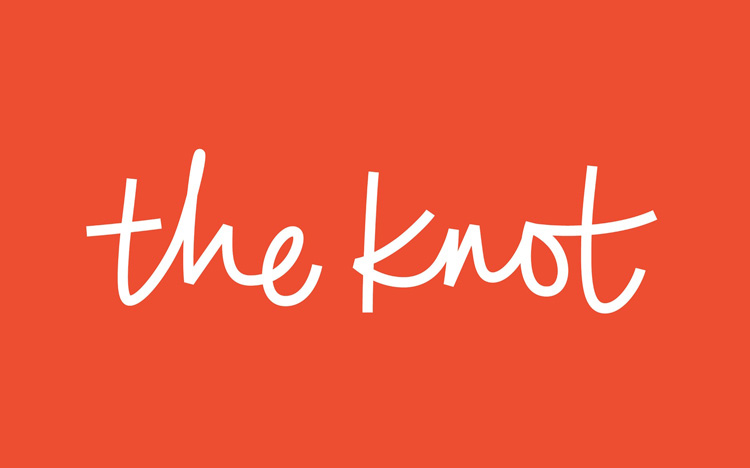
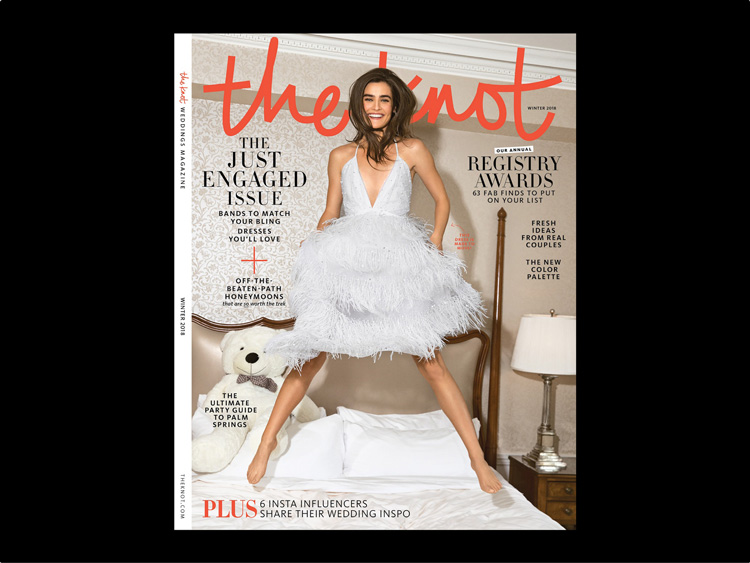
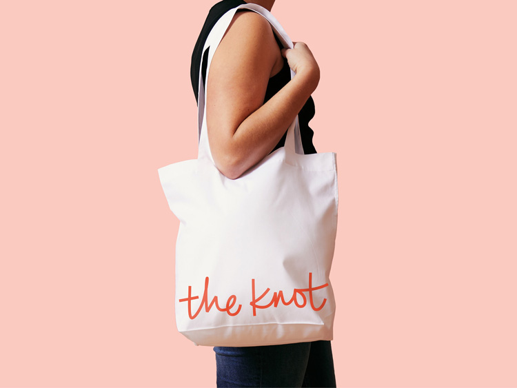
Pentagram partner Abbott Miller has rebranded wedding planning company The Knot, with a handwriting-inspired wordmark logo and red colour that look to be more unisex.
The Knot was co-founded in 1996 by husband-and-wife Carley Roney and David Liu, and is a US-based wedding planning service, offering clients help with all aspects of organising a wedding, such as sourcing venues, suits and dresses, florists, photographers and bridal salons. It is owned by tech company, XO Group Incorporated.
The previous branding also featured a script-style wordmark logo, with a core colour palette of blue and white.

Miller has redrawn the wordmark to give it a “more modern character”, he says. Set in white against a now red background, the logo was initially drawn by hand in ink, then refined with more geometric lines digitally.
He says that the idea is to transform the script from having “bridal” or “wedding” connotations to something that is “closer to a personal signature”.
He adds that the “soft blue” colour used in the previous identity is “traditionally associated with classic bridal aesthetics”, so the team swapped this out with a red shade, which he says is better associated with emotions and love.
“Clichés are powerful and red is a really quick way to say ‘love’ and ‘passion’,” he says.
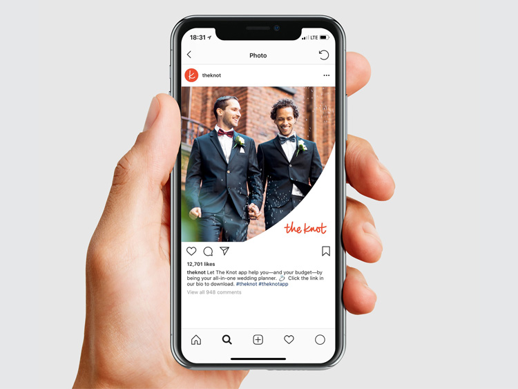
The team has also created a shorthand version of the logo for social media use, which includes a “K” letter set in white against a red background, encased within a circle.
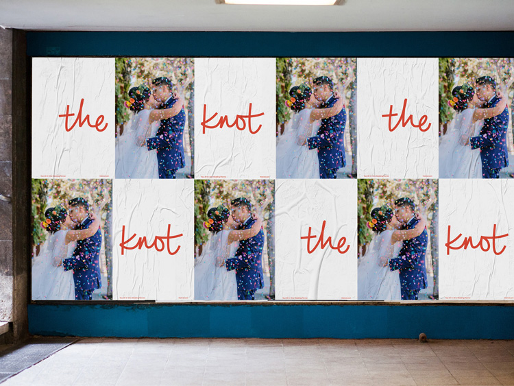
A new photographic style has been incorporated as part of the rebrand, which focuses on people and profile photography, and uses bright lighting to achieve high contrast colours. A new website homepage has also launched this week.
Abbott says the main aim of the rebrand is to banish the stereotype that those using wedding planners are primarily women and be “more inclusive of all audiences” and genders.
“The Knot platform began in an era when the presumed ‘user’ was a woman, which is no longer the case,” he says. “The stylistic language intends to join qualities of personalisation, spontaneity and ease – we’re trying to capture the spirit of the service rather than conjure ‘wedding’ aesthetics.”
The project took five months to complete and is currently rolling out across all touchpoints including print collateral such as advertising posters, digital platforms such as the website and social media and merchandise such as tote bags.

-
Post a comment


