Wash and grow by Dew Gibbons
According to the old adage, 95 per cent of men admit to masturbating and 5 per cent lie. The ratios of men who worry about losing their hair and those who will admit to it are somewhat different. Hair loss is a very sensitive subject, which makes branding and packaging a product for men worried about it uniquely challenging.
In 1998, Procter and Gamble developed a product that gives the appearance of a thicker, fuller head of hair. The challenge for design group Dew Gibbons was to make a global brand out of it. ‘We had the technology, [Dew Gibbons] helped us decide what to do with it,’ says P&G general manager new business development global hair care Nick Peters.
Working alongside Hall & Partners, it researched a range of positionings, from the distinctly laddish to the decidedly pharmaceutical. No prizes for guessing which end of the spectrum Boost belonged to. ‘It’s all about pulling, frankly,’ says creative director Steve Gibbons. Hence the strapline: ‘Boost your chances’. The prescriptive, almost scientific Hair Plus was its antithesis.
The most popular proposition was ‘retaking control’. Gibbons says, ‘Men are very aware of how they look – particularly in the eyes of women – and how that makes them feel. The concept of retaking control of their appearance was appealing.’
Packaging that screamed, ‘I’ve got thinning hair’ wasn’t. ‘We had to create something anonymous, with a more cosmetic than pharmaceutical feel,’ he says.
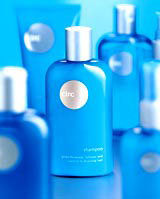
A brand based around the concept was test marketed in Manchester under the name Hair Plus. The key visual elements of the design and the packaging were established: a minimal pack and a distinctive blue. ‘It’s a very straightforward colour that works really well in-store,’ says Gibbons.
However, a new name and identity that would work globally was needed. Graphic expressions of a shortlist of names were researched and Circ survived the legal processes and the consumer tests. The name expresses the process of retaking control and completing the circle, according to Peters.
The identity developed as a visual expression of that circularity and the packaging was adapted to resemble a flask.
Circ goes on sale in February.
Client: Procter and Gamble
Consultancy: Dew Gibbons
Design team: Steve Gibbons, Shaun Dew, Suzanne Langley, Sine Sorenson, Jacqui Owers and Lee Wilson
-
Post a comment


