
I ♥ New York, Stockholm and Chattanooga: how to brand a city
City Identities is a new exhibition at this year’s London Festival of Architecture that explores branding created for cities across the world. Curated by Place Press, the publishing house delves into the stories behind some of the identities featured in the show.
In September 2017, we curated an exhibition that looked at the story of the brave black-and-white branding by German graphic designer Otl Aicher for the small German town of Isny. Branding this Alpine town was such a tumultuous process, we learned, that the city rescinded the entire brand system after an outcry from the civilians, only to reinstate it a decade later.
But that’s a town of 14,000 people. What happens when it’s a city of 14 million? That’s what we hoped our follow-up exhibition, City Identities, would explore.

Many exhibitors taking part in the London Festival of Architecture will have approached this year’s theme of identity by investigating how the design of buildings, public spaces and the built environment forge a sense of personal identity. Our exhibition comes at it from a different angle: how that built environment and everything in it is distilled into a city’s brand identity.
Designing a logo for a business is not easy, but designing a logo for a city is like walking through a minefield. Cities are full of people, buildings, businesses, playgrounds, parks, busses and so on. People have a much deeper connection to their city than they do to their favourite brand of soft drink. Public participation is a fundamental part of the city branding story, and what our exhibition shows is that there is no one way to do it.
Some cities have a completely open process for civilians to submit new logo designs, while others invite the public to vote for the designs that resonate with them most personally. We also observed one city where a design team simply took things into their own hands – design first, get the municipal government involved later. It worked surprisingly well.
What’s just as important as the identity design is what it represents. A city’s brand is more than a logo, and a logo must be more than pretty graphics. To us, it was important to show examples of city branding that told a deeper, richer story of the city. Here are some of the best examples from the show.
New York City, New York, US

Milton Glaser’s I ♥ NY marque is a good departure point for this exhibition. It’s a city branding phenomenon that was never meant to be. It wasn’t commissioned by New York City, for starters, but by New York State, part of an overarching advertising campaign commissioned when New York was at its grimiest and most dangerous. Glaser didn’t think much of it and did the work pro bono.
We spoke to Glaser who, 40 years later, doesn’t see this campaign as a piece of advertising. “The most important thing was it wasn’t trying to sell you something you didn’t want,” he says. “It was an expression of love and concern of the people who lived there – that was the basis.”
As a marque, it doesn’t attempt to communicate a city’s essence, but instead a feeling towards it. And that’s exactly what makes it so powerful and universal. Cities around the world, from Los Angeles to Copenhagen to Hong Kong, have adapted the “I ♥” device to express people’s feelings toward their city.
In 2007, Wolff Olins was invited to create an identity for New York City. The question was: how to create a graphic language to define this undefinable place? The answer was, you couldn’t. “Only one, but no one NYC” was the strategy that underpinned the resulting bold, chunky letters. You’ll find it all around the city, on banners, flags and most notably, the bright yellow New York taxis.

Amman, Jordan

The graphic language of Amman, on the other hand, doesn’t convey a feeling but rather a “mini shot of contemporary Amman”. That’s how designer and architect Ahmad Humeid refers to it, who led the 2008 rebrand with local studio, Syntax Design. In this instance, designing the relationship between the people and the city was not a possibility.
Ancient settlements near Amman date back to 7,250 BC, but the city itself is a relatively young one. 150 years ago, you would only have found a few thousand people living here, near the Roman amphitheatre. But over the last hundred years, the city’s population has ballooned from surges of population, formed of people escaping regional conflict, from Palestine, Iraq and most recently Syria. “To be from Amman is be from somewhere else,” says Humeid, whose challenge it was to create an identity for a city of people for who Amman represented a temporary solution. “Or even if it becomes not temporary, they still have nostalgia for their places of origin.”
That’s why a depiction of the hills and buildings was the preferred route for this identity. The design itself was informed by hundreds of interviews the studio conducted to learn about this complex makeup of people. The final identity was chosen by the public, who were invited to view four design routes at an exhibition and cast their vote for their preferred route.
Chattanooga, Tennessee, US
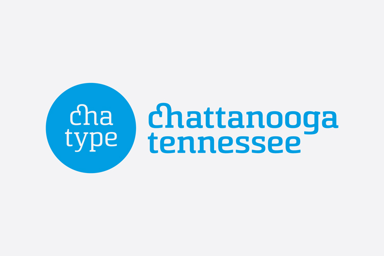
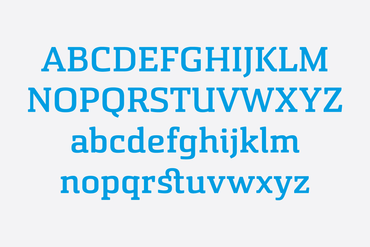
Chattanooga side-stepped the bureaucracy entirely. The city had recently shed its perception of a polluted coal-mining town and was emerging as an up-and-coming technology hub. To further put this city on the map, four designers decided a custom typeface was the answer. The typeface design was informed by many local cues, including the city’s railroading history, the written Cherokee language, and the curvature of the landmark Walnut Street Bridge.
Rather than go through the city, they successfully funded the entire project through a Kickstarter campaign. It worked. Two years after it was released, the city designated Chatype the official typeface of Chattanooga. It’s free for anyone in the city to use, under the one stipulation that it cannot be used for a logo. It’s the voice of the city, not the voice of an individual business. Today you can find Chatype everywhere in Chattanooga: restaurants use it for their menus, the public library for its signage.
The team told us that Chattanooga was the right mix for this to work: a do-it-yourself (DIY) spirit, a proud population and a city that’s just the right size. “Any bigger and you couldn’t do this as a grassroots effort, you’d have to go through the city,” says Chatype designer Jeremy Dooley. “Imagine if you tried to do this in London.”
Stockholm, Sweden
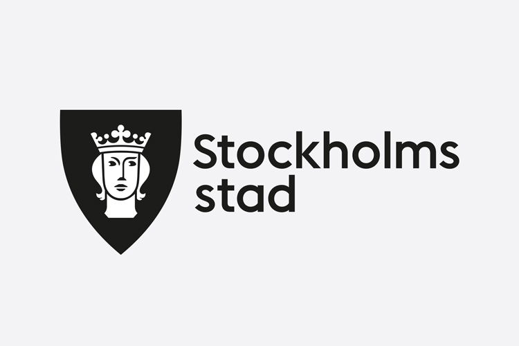
Stockholm didn’t need to consult the public on how to symbolise the city because it was clear from the very start. St Erik, the patron saint of Stockholm, has been a symbol of the city for centuries. He’s part of the city’s coat of arms and his likeness can be found on medieval seals. This identity represents the coming together of medieval heraldry and contemporary graphic design.
We spoke with Anton Gårdsäter, the creative director at Essen International, the studio that led the city’s rebrand in 2012, who said they spoke with historians about St Erik and no one seemed to know much about him. The design system they inherited was centred around a mid-century drawing of St Erik, which they refined to feel more contemporary. The new version of the saint has been softened to look younger and slightly androgynous. “It’s not clear whether the saint is a man, a woman or neither,” says Gårdsäter on the openness of the character. “It’s nice that we can have a symbol that’s not a stereotypical, old man.”

There are many ways to brand a city, but when we surveyed city identities around the world, some obvious patterns and repetition occurred. Many cities have the same goals: to attract talent, investment and to be “world class” – a category so ubiquitous it seems to have lost all meaning.
The danger with this is that some cities have done what Glaser warns as one of the pitfalls of city branding: they do something ordinary.
What we learned when curating this exhibition is how important public participation is in helping to tell a city’s story. For any designer facing a city branding brief, the best way to start is to listen.
City Identities is curated by Place Press and runs until 30 June 2018 at Ground Floor Space, 3 Tyers Gate, London SE1 3HX. Entry is free. For more information, head here.
Place Press is a publisher devoted to producing books based on place and belonging. It works alongside design consultancy Dn&co, operating out of its studio. Elli Stuhler is managing editor at Place Press, and Patrick Eley is creative director at both Place Press and Dn&co.
Read this next


I disagree with everything said here and think all these projects missed the mark entirely. If your branding project does not result in an economic upturn for the city you have failed. all of these projects were huge failures except the NY thing which was not a branding project.