Michael Bierut brings MIT Technology Review tech magazine to life
The Pentagram partner and his team have redesigned and rebranded the Massachusetts Institute of Technology’s magazine, a print publication dedicated to new tech, drawing on designs created by Muriel Cooper over 50 years ago.
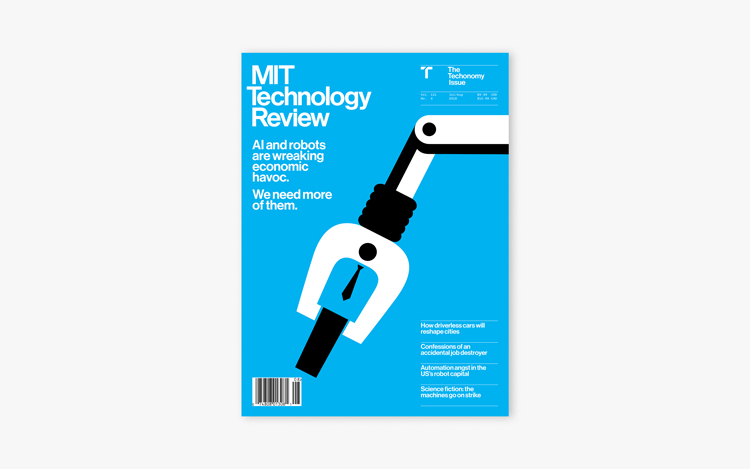
Pentagram partner Michael Bierut has redesigned MIT Technology Review, giving the 119-year-old magazine a new look that aims to celebrate its graphic design history.
The MIT Technology Review is published in print every two months, and is produced by university the Massachusetts Institute of Technology (MIT). It was first produced in 1899, and includes reviews, analysis and interviews delving into the commercial, political and social impact of new tech.
The MIT has a history of rich graphic design, and had its own studio in the 1960s and 1970s called the MIT Office of Design Services. The team was led by graphic designer Muriel Cooper, and also included Jacqueline Casey, Ralph Coburn and Dietmar Winkler.
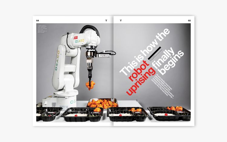
The redesign accompanies a new editorial strategy, which sees each printed issue delve into a different tech theme or issue, with the launch issue (July/August) focusing on artificial intelligence (AI) and the economy.
“Each issue will be an authoritative and exhaustive guide on a single subject,” says Bierut.
Bierut and his team at Pentagram have worked with the magazine’s in-house creative team, headed up by chief creative officer Eric Mongeon, to give the MIT Technology Review a new look incorporating fresh sans-serif typefaces, logo, imagery and illustrations, and colour palette.
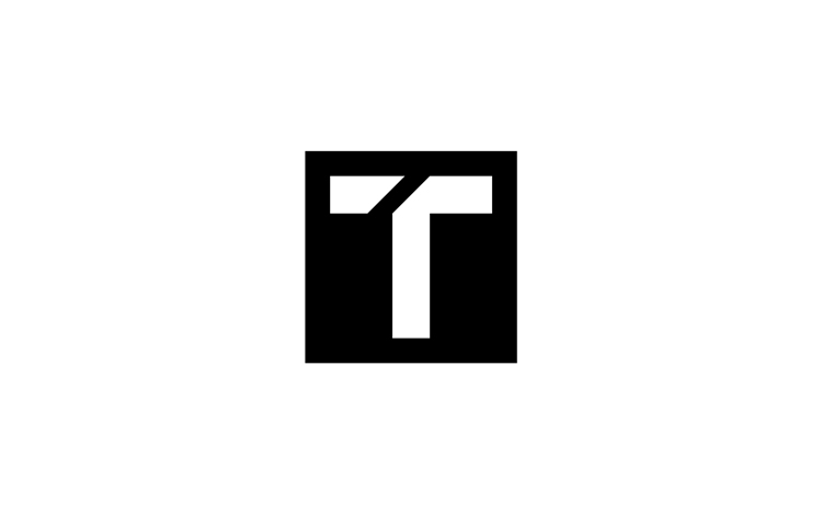
This includes a reinterpretation of the “TR” symbol logo, which now appears as a “T” character sliced through diagonally at a 45-degree angle to also form a lowercase “r” character.
This angle is used throughout the magazine as a way to point to information, organise typography and crop corners of images, and the “TR” symbol is used as an end mark to indicate the end of an article.

This is used alongside a redrawn version of Monotype’s typeface Neue Haas Grotesk for the logotype, which replaces Helvetica and has also been used for coverlines and headlines.
The typeface used for main article text in the magazine is Independent, designed by Henrik Kubel at A2-Type, and is used alongside monospaced typeface TR Mono for captions and sidebars, designed by Hubert & Fischer.

A “bright, modern” colour palette has been incorporated to “bring data and information to life”, says Bierut, while photography, illustrations and infographics aim to be “vivid, varied and striking”.
Alongside this, the pages have been organised into 12-column grids which aim to allow “flexibility” and more space for a variety of elements such as sidebars, infographics and pull-quotes.

The new look aims to bring back an element of the “modernist” and “expressive” nature of the graphic design incorporated by Cooper and her team in the 1960s and 1970s, says Bierut.
“The MIT has a rich – and in my mind, insufficiently appreciated – history of pioneering graphic design,” he says. “In the ‘60s and ‘70s, a group of amazing in-house designers introduced European modernism to America, giving the MIT a worldly and urbane image that was unlike any other university in the country. It was all there – the flat colours, the bold geometry and the sans-serif typefaces.
“Their issues of Tech Review were inspirational, and set a standard that we and [chief creative officer] Eric Mongeon were determined to update for the 21st century.”
The new look will launch in print with the July/August issue of MIT Tech Review, and will also be used across the magazine’s digital platforms, including the website, email newsletters and social media, and on signage and wayfinding at live events.


Read this next

-
Post a comment


