
Virgin Trains East Coast rebrands as London North Eastern Railway
The previously Virgin-owned trainline has been temporarily renationalised and taken over by the Government, and given a new name and identity to match by studio BrandCooke.
Virgin Trains East Coast (VTEC) has been rebranded as London and North Eastern Railway (LNER), following the collapse of the private franchise.
VTEC, now LNER, is a trainline which runs from London to Edinburgh to Inverness. It was operated by private companies Virgin and Stagecoach, but the companies could not meet their promised payments in their contract, allegedly caused by lower passenger numbers and revenue than was forecast, according to The Guardian.
Trainline now run by Government

The trainline has now been temporarily renationalised and will be run by the Department for Transport.
The Government department commissioned design studio BrandCooke to rebrand the company as LNER, which is a return to the original name used by the trainline nearly 100 years ago.
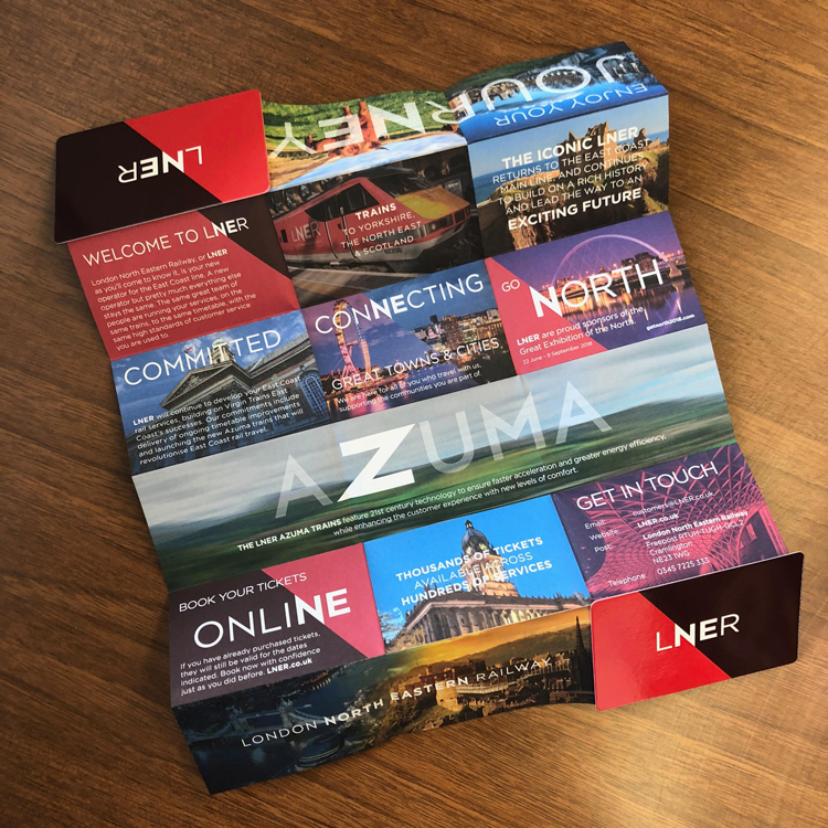
BrandCooke created a new identity for the trainline, which distinguishes it from the VTEC brand but keeps some design elements of it such as colour palette so that existing train livery and interiors do not need to be dramatically changed, says Gary Cooke, founder at the design studio.
Sharper “N” character

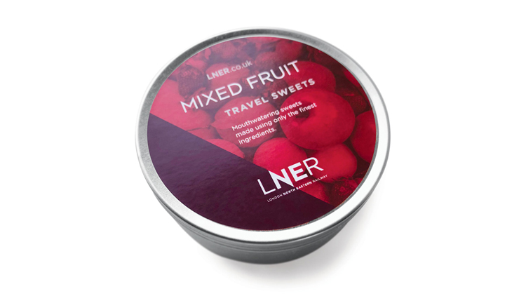
The new brand includes a red and white colour palette – reminiscent of Virgin Trains – used alongside the name LNER set in a sans-serif typeface, which is a bespoke version of Gotham.
The “N” has been elongated and given sharper points, and is used as a diagonal dividing device for colour, imagery and text.
Cooke says that the studio steered away from designing something with a “nostalgic, retro feel” that “railway aficionados may have loved” but would have been too similar to the First Great Western trainline rebrand to GWR completed in 2015 by Pentagram partner John Rushworth.
“To bring back the ‘apple green’ or ‘garter blue’ colour palette from LNER’s glory years, when interiors of the new VTEC fleet had already been agreed and produced, would have been a costly exercise,” says Cooke. “We had to make sure it transitioned smoothly from VTEC to LNER. Many of the new high-speed trains, which are coming in later this year, have already had their interiors and fabrics produced.”
Links back to Gerry Barney’s British Rail symbol
He adds that the “N” symbol in the new logo has a “directional” quality to it, which “subconsciously” harps back to the British Rail logo, designed by Gerry Barney in 1964.
The diagonal symbol is also used in the top right corner of posters and adverts, to further symbolise the North East.
The rebrand comes a few months before a new fleet of high-speed trains called the Azuma fleet are due to launch on LNER in December 2018, having launched on Great Western Railway (GWR) last year.
The Azuma trains were created and marketed under Virgin Trains, so Cooke has kept the name but integrated the pointed style of the new “N” into the “Z” in Azuma.
“Azuma is Japanese for East and by integrating the letter ‘N’ from LNER to form the letter ‘Z’ in Azuma, the logo spells out North East,” he says.
Illustrators to be brought in later

Stock photography has been used of various destinations. There was no time to commission illustrators and photographers due to the short time-span of the project, but this is something that could be pursued in the future, says Cooke, given the graphic design history of the original LNER, which featured illustrative posters between the 1920s and 1940s.
“We wanted the new brand to look bold and confident,” says Cooke. “We didn’t want the launch of LNER to be like sticking a plaster over the old brand – it had to be a well thought-through identity, and a really professional job.”
The brand guidelines have now been passed on to the in-house design team at LNER based in York, which will develop the brand with hopes to commission illustrators.
The new brand has now rolled out across station signage and advertising, such as at London’s King’s Cross and York stations, on marketing and print materials, digital platforms and merchandise. It is currently rolling out on train livery, but will launch in full on livery when the Azuma trains are launched later in 2018.


Read this next


Very smart with a bit of retro thrown in but ultimately window dressing. The main issue is not the branding but how the rail system is run and whether the passenger experience is enhanced. For the third time this line has been brought back into public ownership. No amount of design is going to make up for the fact that this franchise was not run properly and now indicates re-nationalisation of the railways might be the only solution. I think we need an overhaul of the railway system not a rebrand.
The British Rail symbol was designed by Gerry Barney, not Margaret Calvert – although they did work together.
Hi Paul,
Thanks, apologies for the mistake – we’ve fact-checked and corrected.
Thanks,
Sarah
The N points to the North West…
It’s unfortunate that their intention was not to appear like ‘a sticking plaster over the old brand’ , because that’s exactly what it looks like on the existing rolling stock!
I think the logo is pretty strong. I like the versatility, being able to split the colours of the background using the ‘N’, or even have imagery in the background on one of the sides.
I don’t like the proposals I’ve seen for the livery on the new rolling stock. It should be an opportunity to make a statement, with an iconic design that stands the test of time. If it’s going to be plain white with a red and light grey stripe as I’ve seen, it’s a real wasted opportunity. The trains are the biggest promotional aspect of the brand, a real ‘moving billboard’, and being delivered in plain white they are the very definition of a blank canvas, so I hope they get it right.
I’m also not sure what the colour palette is meant to be. Some of the literature and advertising shows primarily red and black (nice, strong combination). So why are the ‘Azuma’ (dreadful name) logos shown in light grey and different shades of red? It all looks a bit unprofessional and ‘thrown together on MS paint’ to my eyes.
A further comment. Pardon me for being awkward but the ‘N’ goes diagonally from North West to South East, (not north-EAST) ‘The diagonal symbol is also used in the top right corner of posters and adverts, to further symbolise the North East’ ???
Hi Neil,
The top right corner of a page indicates the North-East – this was the studio’s explanation for using the symbol in this way.
Thanks,
Design Week team
You have to say that this looks better than the East Coast Branding, which was professional in it’s approach and feel, if not a little bland. The LNER brand really sells the route to passengers.