West Yorkshire Playhouse returns to 1960s name Leeds Playhouse in rebrand
The Leeds-based theatre, which helped to develop the careers of playwright Alan Bennett and actor Maxine Peake, has been rebranded by Reggie London to reference its history and reflect its “inclusive and diverse” offering.
West Yorkshire Playhouse has rebranded as Leeds Playhouse, returning to its original name in a bid to reference its heritage while highlighting its “inclusive” nature.
The Leeds Playhouse was originally founded in 1970 by late actors Peter O’Toole and Sybil Thorndike, following a public campaign in the 1960s to create a new permanent home for contemporary theatre in the North of England.
Its name was changed to the West Yorkshire Playhouse in 1990, when it also relocated to the Quarry Hill area of Leeds.
Now it has been renamed Leeds Playhouse, and has been given a new identity by studio Reggie London.
The rebrand comes as the theatre undergoes a £15 million redevelopment, which will see the main theatre shut for refurbishment and a pop-up theatre in Leeds take its place. The main theatre space will reopen in Autumn 2019.
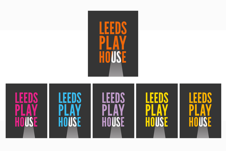
The new branding features the theatre’s name set in sans-serif typeface Antonio, and in various colours to suit different environments, including orange, yellow, blue, purple and pink.
The colour palette has been inspired by artist David Hockney’s landscape paintings of Yorkshire, while the typeface looks to reference the same era in which Hockney rose to fame, the 1960s, says Paul Brooking, creative director at Reggie London.
“The Leeds Playhouse was born out of a movement in the late 1960s from the local people feeling they should have a theatre of their own,” he says. “It’s very homegrown. We wanted to reference the roots of the theatre without it feeling like a 1960s pastiche.”
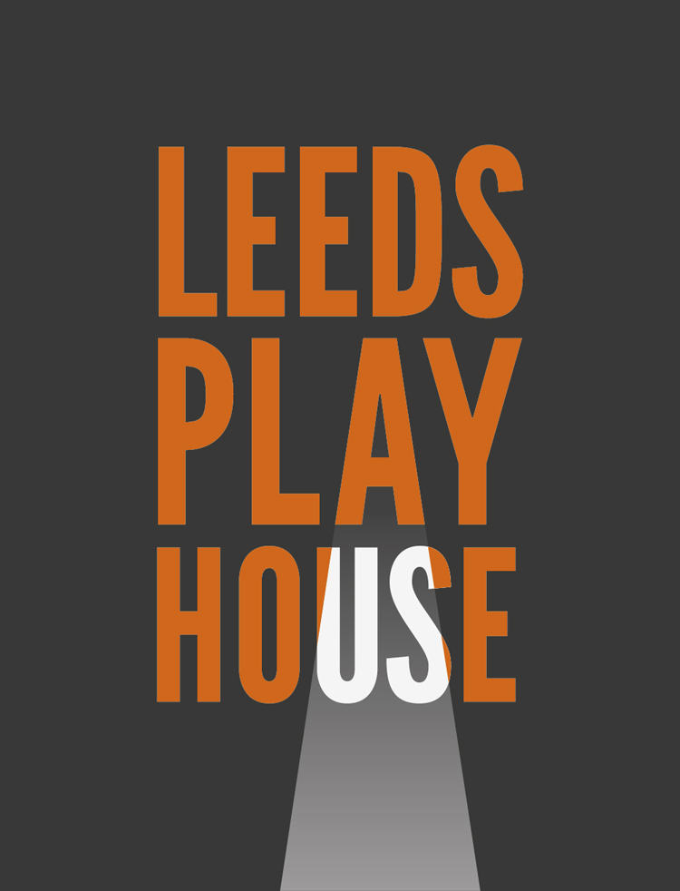
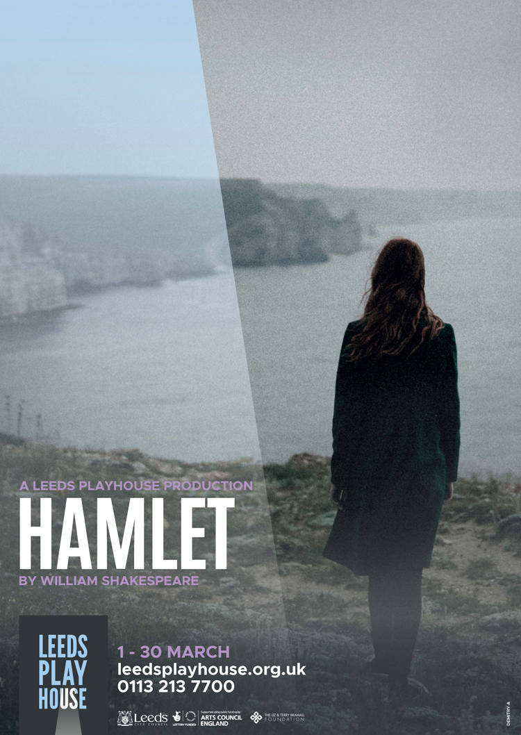
The “A” of “Playhouse” is used to form a spotlight symbol, which highlights the “us” in “House”, in a bid to highlight the “diverse and inclusive” nature of the theatre, says Brooking.
The theatre runs a creative engagement programme that looks to open the performing arts up to a broad range of people. This includes dementia-friendly performances and creative workshops for older people, engaging young people from disadvantaged backgrounds and working with refugees and asylum seekers.
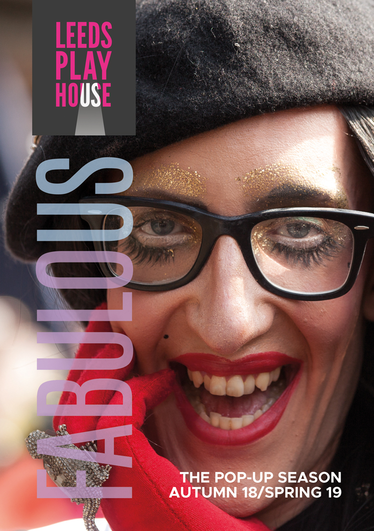
The “us” theme travels through the whole brand, with words used on marketing posters incorporating the word “us”, such as “inclusive”, “audacious” and “fabulous”. Body copy is set in sans-serif typeface Metropolis.
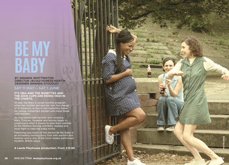
Additionally, the imagery and photography used on posters and leaflets aims to reflect the “gritty but joyful Northern productions” which will be going on at the pop-up theatre space until the main space reopens, says Brooking.
To achieve this, a grain effect has been added to photography to create a sense of “softness”, he adds, and to get away from the “hard, sharp, clear” photography trend. “We wanted to reflect the raw edginess of the new season of productions,” he says.
The new brand has now rolled out across print materials such as posters and brochures, a brand film directed by Reggie London, online platforms such as the website, and signage at the pop-up theatre space.


If this was a project all about heritage, then surely the brand work should have stayed in Leeds to?
So dull and what is inclusive about changing the name to identify with just the city and not the whole area?