Quality control
A2 Graphics/SW/HK is earning quite a reputation for its uncompromising approach to both exhibition and graphic design. Hannah Booth finds out how the group maintains its standards
The highlight for many visitors to the Turner Prize 2003 exhibition wasn’t Grayson Perry’s vases or Jake and Dinos Chapman’s Goya etchings; it was the comments board. Visitors were encouraged to let rip with their musings, which ranged from the thought-provoking to the scatological. Some scribblings made reference to scribblings down the row. One (by MP Kim Howells, the previous year) made the front page of The Independent. And another even noted how well designed the board was.
Whoever that was had a keen eye: for the second year running, the designers responsible are A2 Graphics/SW/HK – Scott Williams and Henrik Kubel – and the work won the pair the temporary exhibition award at last week’s Design Week awards. Was it simply someone with a trained eye, or did Kubel and Williams write that comment when no one was looking?
‘Tate Britain wanted more public feedback on the Turner Prize,’ says Williams. Which it certainly got. ‘And the message board had to be easily editable in case the comments got a bit close to the bone.’ Which they did in Howells’ case. He wrote ‘conceptual bullshit’ on his piece of paper.
The group has just applied similar flair to the Roy Lichtenstein exhibition currently showing at London’s Hayward Gallery, for which it designed a public Drawing Studio and applied graphics. The former features a wall with diagonal stripes representing the standard graphic interpretation of a mirror, a board for mounting visitors’ efforts and a large drawing table. The space is designed to encourage kids and adults to pick up a crayon. It’s interactive, stimulating and fun.
Despite the duo’s success, exhibition work is a relatively new area for A2. Until now, it has been known chiefly for its graphic and editorial design and bespoke typefaces.
A series of 28 low-tech posters for typography workshops that Kubel was hosting at Buckinghamshire Chilterns University College is typical of their painstaking approach. Each poster includes specially designed typography, and the work won a second Design Week award last week, in the posters category. ‘We create a bespoke typeface for almost every job we do,’ says Williams.
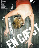
Elsewhere, to name a few projects, the duo designed the Victoria & Albert Museum’s Radical Fashion show coffee table book and a catalogue and broadsheet for an exhibition at Bristol’s Arnolfini Gallery entitled ‘Apparition – the action of appearing’. In an on-going project, the consultancy regularly design posters and books for Copenhagen Theatre Aveny-T (Kubel is Danish).
A2 also worked with the British Council on a black and white book called Multiplication, in which the paper multiplied in weight throughout. ‘The British Council was a sharp, interesting, healthy client and [we had] a very collaborative relationship with it,’ says Williams. ‘It is more likely to take a chance on young consultancies.’
If A2’s projects have one thing in common it’s eye-watering standards. ‘Our production values are high,’ admits Kubel, an understatement if ever there was one. ‘We can be hard work. If a project’s not right it has to be redone. We like to keep printers on their toes,’ he adds.
It seems Kubel and Williams don’t like to get too comfortable either: a short-run specialist publication for the International Society of Typographic Designers for a small fee, for example, was ‘a labour of love. We went bananas, it was created in an 11-colour [palette],’ says Williams. ‘We really wanted to design it.’
This attitude keeps the group’s work fresh and inspired, they say. ‘It’s very hard work and Top: poster for Copenhagen Theatre Aveny-T; above: catalogue for Apparition: the action of appearing exhibition, by A2 Graphics/SW/HKwe make it difficult for ourselves. But the high quality of our work keeps us going, and we enjoy it,’ says Kubel. He met Williams in 1998 on the communication, art and design MA at the Royal College of Art, and they formed A2 when they graduated two years later.
‘We knew there was a good track record of studios coming out of the RCA,’ Kubel says, ‘so we really focused on setting up a practice.’ For him, leaving Denmark and a life designing corporate identities was a top priority.
The group has almost reached the point where it can select its projects. ‘Initially we took on everything,’ says Williams. ‘But in the past year we’ve turned a few projects away. By next year, we’ll really be able to pick and choose.’
Part of the reason for this is they are determined to remain a two-man band, and scarcely use freelances. ‘We would grow if we needed to, but only with the right people. If our exhibition work continues, we might need a couple of extra hands,’ Williams says.
But winning awards (among others a Type Directors Club of New York Certificate of Typographic Excellence this year and gold at the Consort Royal Graphic Design and Print Awards last year) and working under self-imposed high standards has its drawbacks: they’re rather tired. Kubel is ‘knackered’ and looks it. They haven’t had a break in three and a half years. Mention holidays and they look aghast – ‘You have holidays?’, they respond incredulously. Working late is a given and weekends ‘are the only time you can catch up because that’s when the phone stops’. But both are lively and clearly enjoy talking passionately about their work. Holidays can wait.
-
Post a comment


