
Byron overhauls image in attempt to usher in a “new era”
A restaurant redesign, visual update and revamped menu is being rolled out with the aim of reversing the burger chain’s fortunes.
Byron has updated its visual identity, restaurant design and food and drinks offerings as part of a company-wide rebrand.
The new identity, including the interiors, has been designed by London-based studio Checkland Kindleysides.
The 12-year-old burger chain has struggled in recent years, owing to nationwide restaurant closures and a decline in popularity among diners.
In 2018, it announced plans to close as many as 20 stores. This year, it reported a fall in earnings from £4.7m to £500,000.
“On a mission to bring people back around the table”

As part of this overhaul, Byron revealed an updated logo based on its new ethos: ‘All Hail The Table’.
It was created in response to this year’s Wellbeing Index, which reported that almost a third of British adults are eating alone “most or all the time”.
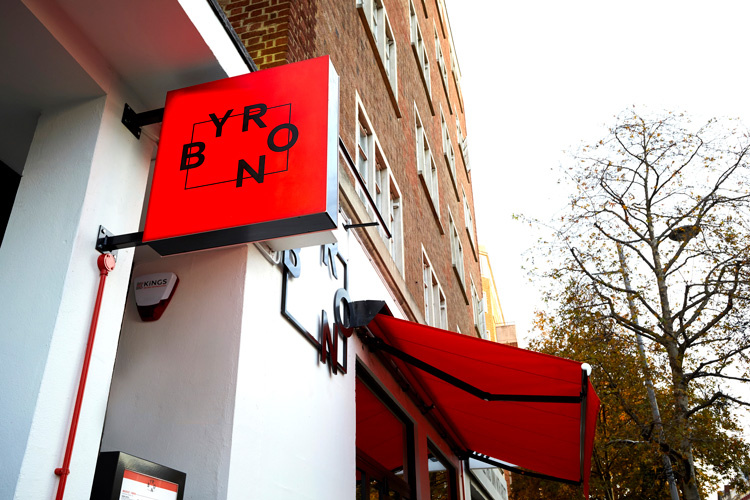
The black and white typographical logo features the five letters of the restaurant’s name around a rectangle, representing five guests at a table according to Byron.
Byron’s CEO Simon Wilkinson says that the logo is a “literal translation” of bringing people back around the table “to connect with each other and share quality time with friends”.
“A whole new dining experience”

Byron’s site redesign builds on the idea of coming together to dine. At the chain’s original site in High Street Kensington, communal tables have been installed along with “social spaces for brunches”.
As well as an emphasis on group dining, there is also a focus on productivity in the redesigned space with “ambient sofas for laptop workers and working lunches”.

Byron will be updating their remaining restaurants across the country throughout 2020.
An updated menu
The restaurant’s menu has been revamped by the restaurant’s recently appointed food and drink director, Sophie Michell.
Taking inspiration from the west coast of America, the chain is launching a brunch menu available in the morning from Thursday to Sunday. It will include dishes like chicken and waffles as well as more traditional British fare like bacon sandwiches.

The restaurant is also trying to appeal to vegetarian customers with options like the veggie butty which uses grilled halloumi instead of meat, as well as targeting health-conscious diners with its new superfood grain salad.
Michell says that she hopes the menu will “breathe a new lease of life into” the brand: “It is so exciting to be witnessing a new era for Byron.”
Image overhaul
As well as its ongoing financial trouble, Byron’s image has suffered after performing a widely-criticised “immigration raid” on its employees in 2016.
Workers were called into meetings, thinking that they were about the dangers of cooking medium and medium-rare burgers. They were actually being carried out by the Home Office as part of a clamp down on foreign workers.
Do you think Byron’s new identity and brand strategy will work? Let us know in the comments below.


Nope, won’t work! The market is saturated!
It’s called karma, and a new logo won’t save you from it
I am not sure why these companies think an image makeover will make any difference.
As one of the previous comments points out correctly the market is saturated and tastes change.
From my personal perspective as somebody who doesnt eat red meat the options were always going to be limited.
Chains like Gourmet Burger Kitchen were offering veggie and vegan alternatives many years ago and I find it hard to believe that Byron have only just caught up.
The painful truth is that this is just another chain whose time has run out and fashion and changing tastes dictate what the market want.
One year it is Italian and the next it is fusion and then there are the new wave of health fried chicken chains and I am not sure it is possible for all of these options to exist in a market that has been taken over by food delivery services.
Even the American themed Ed’s Easy Diner didnt survive the change in eating habits. The branding looks good but it indicates the previous branding may not have been strong enough to keep the customers.