
Mooncup packaging redesign: “It’s time the product shouted proudly from the shelf”
Established in 2002, the Mooncup was the first menstrual cup on the market – a brand overhaul from Bluemarlin looks to strengthen its position as an “ethical pioneer”.
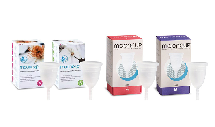
Menstrual cup company Mooncup has undergone a packaging redesign, led by London-based brand consultancy Bluemarlin. Consisting of a new colour palette, new graphics and updated logo, it is hoped the new look will help the brand stand out among an increasing number of competitors.
The Mooncup launched in 2002 as an alternative to traditional disposable menstrual products. It was first brought to store shelves in the UK through health and beauty retailer Boots in 2005, where the company says it was designed to “sit quietly next to tampons and pads…[and] fit in rather than be obviously alternative.”

“A complete reboot”
For much of its history, Mooncup operated as one of a very select few offering menstrual cups. But in recent years, a number of similar products have been launched, both by new companies and by well-established names in the industry.
This presented a challenge to the veteran brand, as company director Kath Clements comments: “How do you compete when you’re used to operating in a vacuum, which is what Mooncup has done until now?” Answering to this, executive strategy director at Bluemarlin Dan Monteith says the team did a “complete reboot” of the brand, while staying true to its “authentic mission”.

“More impact, less carboard”
The new look features lunar and wave motifs, which Monteith says is a nod to both the menstrual cycle and the company’s commitment to the environment. The theme has also been incorporated into Mooncup’s updated logo, which features a subtle crescent in the shadows.
The result is something that is “natural, without relying on greens and browns too much,” according to Monteith. And it all works to give the product more presence on the shop shelf, he says.
“It’s actually just quite a small product, and as a historically environmentally friendly brand, they didn’t want to add more cardboard to the packaging when it wasn’t necessary.”
“Complicated packaging won’t work”
Where the previous design did not to include a picture of the Mooncup itself, the product is the central focus of the new box. This has been done both to instil a sense of pride for the product, but also to dispel myths about what a menstrual cup actually looks like.
According to Monteith, this is because consumers typically don’t have a lot of time to peruse and investigate products. “For whatever reason, a lot of people won’t want to walk into Boots and ask someone what a Mooncup is, so complicated packaging wouldn’t work.
“People need to be able to figure out exactly what it is as soon as they pick it up, which is why we put the product on the box – but at the same time the rest of the branding works to ensure it doesn’t look like a harsh medical device.”

“Something to be proud of”
Monteith says the recurring question the team asked themselves was how they could create a product that was viewed more as a contemporary lifestyle product, rather than something clinical.
“Mooncup’s saying has always been ‘Own Your Period’ and we wanted to create something that people could ultimately feel proud of, rather than embarrassed by.”


LOVE the new rebranding! Great work for an amazing great product!
LOVE the new rebranding! Great work for an already great product!