Writ large
Graffiti chic and economic expedience have turned supergraphics into a cool tool for external branding and wayfinding. Emily Pacey checks out the challenges of scale and legibility that face graphic designers working on a bigger canvas
Avoid walking around at night in any neighbourhood that has a mural,’ said someone amusing on TV about 25 years ago. The 1980s were when murals meant deprived inner city areas at best, and the IRA at worst.
Today, the word still reliably conjures images of everyday folk crafting giant, celebratory wall paintings of their neighbourhoods, but it may also make you think of supergraphics and the designand art-led discipline of giant typography.
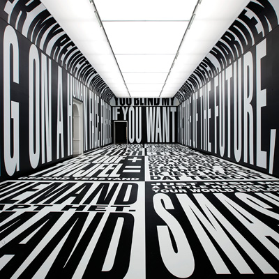
Artist Barbara Kruger has created an exhibition currently showing at Amsterdam’s Stedelijk Museum in the Netherlands that consists entirely of huge, black and white capital letters smothering the floors and walls and screaming abuse at the reader. Here, words have replaced imagery, and yet the visitor is immersed primarily in a visual experience.
But it’s not just the art world that is focusing on big type. In our straitened times, business is also remembering the power of giant type to draw attention, and recognising its ability to transform environments on the cheap.
’Using giant graphics is a growing trend because of their cheapness and attractiveness, even though paint and architecture are deadly enemies,’ says Adrian Shaughnessy, author of a new book on the subject, Supergraphics. ’Using paint is cheaper than making actual signage, and big graphics can transform a space in a similar way to an architectural intervention, but for far less money.’
For the graphic designer tasked with thinking big, it seems that the rules are there to be broken. ’Sans serifs are often easier, and stencilled fonts are very complex for people to understand visually at a large scale, because they break up, so people cannot read the forms,’ says designer Morag Myerscough, a leading exponent of giant typography in the UK. Ten years ago, she ignored her own advice about stencilled letters for the now world-famous signage and wayfinding for the Tea Building in London’s Shoreditch.
For Myerscough, it’s all about context. ’If you are doing the wayfinding at the Barbican (as she did, in 2007), you can’t do naughty things,’ she says, implying that at the less establishment Tea Building, you can.
There are more general guidelines, however. Myerscough believes that to create effective large environmental graphics, ’You need to understand space and scale. A graphic designer usually works in a different dimension to physical space, so you have to change your attitude to think all the time about the viewer’s spatial relationship to the type.’ Unlike text on a page, type that is blown up to several meters high will be viewed from many different vantage points. ’If you are close, it is abstract and if you are far away it comes together, so your approach depends on how the work is being viewed,’ says Myerscough.
Big type fan and Pentagram New York principal Paula Scher is responsible for some of the most recognised large-scale lettering in the world, including for the Public Theater in New York City. ’I like making things big, making things big is fine, everybody likes stuff big,’ Scher told an audience at D&AD last year. Even her 2002 career monograph is called ’Make it bigger’. Scher is from the land of the super-sized, but on both sides of the Atlantic, it can be tough to convince the authorities that big is beautiful – and even Scher says that she ’is scared of the stuff – I’m scared that it’s going to fall down’.
’There are rules when it comes to creating large typography outside, because it is almost straying into graffiti street art,’ says Shaughnessy. ’By its nature, it is often being done in a public space, so you have to adhere to local planning laws,’ he adds. Scher, he recalls, was barred by a local authority from using neon on one of her projects, while some years ago in the UK, Myerscough made it into newsprint for a project that the City of London deemed too bold and daring to allow.
She believes that attitudes are much more open to big, public visual statements now. ’People have changed their perceptions about what is acceptable in the street – for instance, much of the stigma and fear attached to graffiti has disappeared. Instead, people can see how strong big colourful things can look in a neutrally coloured urban environment,’ says Myerscough. ’When you introduce a supergraphic to an urban environment, it has a really big effect – you are basically activating a wall,’ she says.
Gatwick Airport is preparing to activate its walls, internal and external, with its new branding by Lewis Moberly. The airport, bought from BAA last year, has adopted an intimate tone in its new branding. ’We have broken the convention of “the bird and the word” in air industry branding, creating a narrative, intimate logo that incorporates a signature, or sign-off, from Gatwick, in script,’ says Lewis Moberly co-founder Mary Lewis. Of all font types, you might think that italics, or script fonts, are the least suitable to be blown up big.
’We visualised it at scale so that it could be judged, and we did so many legibility tests on it,’ says Lewis. ’The script is actually very, very simple and clear and pared down.’
When you think about it, we are increasingly surrounded by imposing type. By next year, giant orange Cooper Black type-wrapped Easyjet planes will be landing at an airport topped by Gatwick Sans script. Disgorged passengers will look for their exit in Margaret Calvert’s big Motorway font, and navigate their way around office, museum, college or school guided by outsized lettering.
Big type is on the march, and it’s coming to a wall near you.
Read this next

-
Post a comment


