Free-spirited
Graphics duo William Hall are busy combining work for John Pawson with projects that are beyond minimalism, says Clare Dowdy
Graphic designers may like to think of themselves as crazy nonconformists, but most can benefit from a bit of discipline. Whether that’s a tight brief or a limited budget, the chances are a few restrictions will bring out the best in them.
Imagine, then, how much William Hall and Nicholas Barba have benefited. In terms of discipline, they’ve been positively spoilt. For the past four years, the two graphic designers have been flexing their muscles in the visually monastic atmosphere of John Pawson’s architecture practice.
This June, they quit the studio to set up their own business, called William Hall, in London’s Clerkenwell Green. As Pawson’s part-time in-house graphics duo, Hall and Barba have been responsible for pretty much all the architect’s recent two-dimensional output, from the highly acclaimed cook book Living and Eating, to the catalogue Themes and Projects, exhibition graphics and www.johnpawson.com.
Pawson has described minimum as being ‘the perfection that an object achieves when it is no longer possible to improve it by subtraction’.
This approach was applied to the studio’s literature as much as its buildings. ‘We always tried to do the right thing rather than the interesting thing,’ says William Hall, ‘because the graphics were never the most important aspect.’
And rather than being stifling, Hall says it was interesting to work within these parameters of ‘reduction and silence’. But there is life for these designers beyond such minimalism, and this is where much of their attention is turned now.
Hall and Barba studied together in the mid-1990s at Central St Martins College of Art and Design. Hall joined Pawson in 1999, following Stephen Gilmore’s departure to North. In July 2000, he was joined by Barba, and since then the pair has managed external clients alongside a host of Pawson projects.
Pawson has an eye for graphic style, having also worked with North and Simon Esterson.
‘When Gilmore left there were things in place, such as the use of Univers typeface, and we carried that on,’ says Hall. So the whole of the Living and Eating book, bar the cover and slipcase, uses a single typeface, in only one size.
This contrasts with the rest of Hall and Barba’s work, where they have learnt that by just changing small things they can make an impact. ‘By giving ourselves a set of constraints, we break that constraint in a subtle way, and that’s what we are exploring now.’
A good example of this is the work they did for the Zen Spice Market in Marylebone Station, which opened in November 2000, designed by Asso Architects. This was the first job that Hall and Barba tackled as a team, and they were asked to come up with a backdrop for the 25m-long bar. The brief was to exaggerate the horizontal and in their design they incorporated some subtle imagery around transport and meeting.
Hall describes the solution as a beautiful pattern combined with a piece of information graphics, namely the Marylebone to Birmingham timetable. ‘The work that we do for Pawson is really disciplined and reserved and rigorous, whereas the Spice Market had a sense of humour and was a complete exploration of colour,’ he says.
Their other non-Pawson work also shows this approach. The identity for the Manhattan Loft Corporation features the (pre-11 September 2001) Manhattan skyline as a graphic, which works on business cards as well as billboards of the Manhattan skyline.
Phil Reynolds, a costume maker for the Lion King musical and Batman films among others, was presented with an identity that picks up on his craft. The result is a sartorial pattern graphic, which appears in different forms on his stationery. The duo are currently redesigning and expanding his website from two pages to 50.
Last year, they designed a catalogue for Calvin Klein, recording the transformation of his flagship European showroom in Paris (designed by Pawson). It’s a lot more glamorous than any publication they would do for Pawson, and extravagantly uses three different paper types.
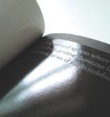
Their 2002 catalogue for German office furniture manufacturer Brunner may only use one typeface, with the type itself hidden under flaps, but the paper is glossy, the photographs by Christoph Kicherer (who is also shot Living and Eating) are dynamic and William Hall has added a border – another unthinkable addition in the Pawson studio.
The pair are currently working on a cookbook for Italian chef Giorgio Locatelli, which is due out next autumn. Locatelli intends this to be the only book he produces, so everything is going into it. It promises to be something special, with bread specialist-turned-photographer Dan Lepard shooting both the staff and clientele for it.
Then there’s the literature for Pawson’s forthcoming homeware collection for manufacturer When Objects Work. And, of course, there are further projects for Pawson, just in case they are at risk of forgetting their minimalist roots.
‘If there is a choice between doing something dynamic and unnoticed for Pawson, we will always choose the unnoticed route,’ says Hall. ‘Now we are excited about not being held back. This is the start of the exciting stuff.’
Read this next

-
Post a comment


