B&B Studio’s identity for insect-based pet food Aardvark resists “twee” clichés
The “punchy” visual identity features a bright orange colour palette and a series of linework illustrations that can be animated.
B&B Studio has crafted the new identity for insect-based pet food Aardvark, which imagines “sustainability through a pet’s eyes”.
As well as designing the logo and wider identity for Aardvark, the London-based studio has also created the packaging.

Aardvark hopes to make the world of pet food more sustainable by providing insect-based kibble for cats and dogs. It’s estimated that pets eat approximately 20% of the world’s meat.
Insect protein has been endorsed by the British Veterinary Association, and Aardvark’s range has been developed in collaboration with vets and pet nutritionists.
“Imagining sustainability through a pet’s eyes”

The brand focuses on “sustainability rather than the ingredient”, B&B head of strategy Lisa Desforges says. The sustainable pet food market is on the rise, according to Desforges, and the studio hoped to differentiate Aardvark by “imagining sustainability through a pet’s eyes”.
“The idea was to build character and emotion into the brand by creating a community of pets who loved the planet and would do everything they could to protect it,” she adds. The brand’s tagline reads: ‘For pets that love the planet’.
Desforges says that the name was chosen for its “wit, warmth and character” and as a subtle nod to the insect ingredient. Aardvark’s initial range has two options, Crafted for Cats and Developed for Dogs.
“Friendly, tasty warmth”

The two ‘A’s in the wordmark can become a moveable icon, which play on the pointed shape of pets’ ears.
B&B creative director Claudia Morris explains that this has been designed with digital applications in mind. “We wanted to create a brand name and subsequent wordmark that could effectively translate into a shorthand digital icon,” she says.
The logotype is bespoke, while copy is written in the typeface Woodgrit. This was chosen for its “punchy, raw feel”, Morris says. “It brings a sense of purpose combined with a naturalness that doesn’t feel too slick,” she adds.
An orange colour palette is used throughout the identity which seeks to create a “friendly, tasty warmth combined with a bold contemporary feel”, Morris says. “It also feels unexpected in comparison to more traditional, worthy eco brands,” the designer adds.
A series of linework illustrations have been created in collaborated with illustrator Aron Leah, chosen for his “natural, quirky style”, Morris says. The team worked to created a modern set of illustrations in line with the identity, according to the designer.
“The illustrations feel contemporary, punchy and friendly rather than twee – which can be hard to achieve with animal illustrations,” she adds.
Resisting “human food cues”

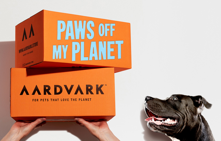
Aardvark is launching as a direct to consumer brand before a wider retail roll-out. When it came to the packaging design, Morris says that B&B wanted to “move past any incorporation of human food cues which was a common trope of the pet food industry”.
The packaging uses the brand’s orange colour palette and verbal identity and takes a “simple, functional approach”, Morris says.

Messaging has been designed to feel “really simple and direct”, she adds, with copy like ‘Sustainable fuel for planet friendly pets’.
The illustrations are also used to reinforced the the brand’s sustainable missions with “warmth and emotion”, Morris says. The shipping bag and plastic-free bags are both recyclable.
What do you think of B&B Studio’s identity for Aardvark? Let us know in the comments below.


sustainable or not please don’t give dry food to your pet, it’s not good for them and will cause many health issues
https://littlebigcat.com/why-dry-food-is-bad-for-cats-and-dogs/