
Design inspiration: the best projects from April
From swimming tigers, to “more-than-human” forests, these projects from the likes of Matt Willey, Kate Moross, Superflux and Mucho are our favourites of the month.
Tick Tock packaging, by Jamie Nash

Rooibos tea brand Tick Tock approached Jamie Nash Studio to develop its newly launched Wellbeing flavour collection and add two more variants. With many brands already in the market and drinkers loyal to their favourite, Nash says the aim was to express Tick Tock’s “playful personality” across packaging and branding.
This has been done through animals. A leaping zebra has been chosen to represent the Ginger Boost tea, with Nash saying this accurately depicts the “zingy, uplifting mood” of the product. Meanwhile a tiger taking a calming dip in a river adorns Chai Relax. He says the tiger swimming in the reflection of the warm sun “perfectly captures” the flavour.
University of California Annual Report, by Mucho
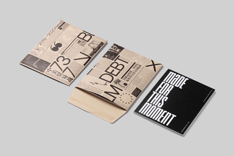
2020 was a newsworthy year, to say the least. According to San Francisco-based studio Mucho, all these events informed the design of its annual report project for the University of California’s Office of the President. News stories, headlines, imagery and type adorn both the envelope and the report booklet itself.
Mucho has designed every annual report for the office since 2014, with the studio saying this year was a collaboration like every other. Inside, a strong editorial stance has been taken with typography used to draw the reader’s attention and signal important sections. This has been mixed with infrequent coloured pages throughout to again break up the report.
Port Magazine Issue 28, by Matt Willey
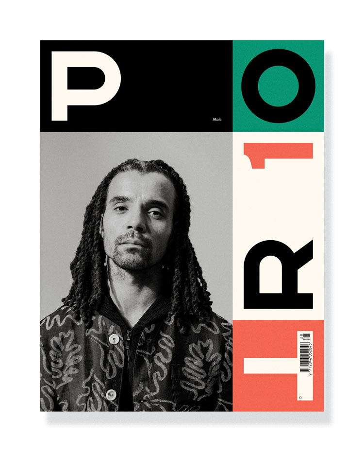
The upcoming Spring/Summer issue of Port Magazine will mark the publication’s 10 birthday. To celebrate, Pentagram partner Matt Willey has designed five covers for the issue. Actors Matt Smith, Malachi Kirby and Caleb Landry Jones, rapper and activist Akala and actress Katherine Waterston all feature on their respective covers.
Known for its bright covers, which usually feature block graphics and colours, the five-cover Issue 28 is no different. This time around, the Port wordmark has been split up across each cover, with the “O” also forming part of the number 10 – a marker for the milestone birthday.
Littlemore identity, by DutchScot
DutchScot describes London-based interior design studio Littlemore as being “defined in their balance of curiosity and sensibility”. These were the driving qualities behind DutchScot’s rebrand of the company. Using the Littlemore name as a starting point, the studio created a visual language for the brand which plays on the idea of “finding balance”.
The typographic approach seeing lots of moving elements on digital touchpoints to show the idea of adjusting to find the perfect spot – the wordmark expands and contracts while the “L” initial device grows and shrinks. On other touchpoints like totes, business cards and printed materials, the “L” device can be found in different proportions to give the effect of shape shifting on non-digital surfaces. DutchScot says the effect, like the job of an interior designer, “playfully pushes and pulls”.
Invocation for Hope installation renders, by Superflux

Opening next month, Superflux’s Invocation for Hope installation was commissioned by the Museum of Applied Arts for the Vienna Biennale for Change 2021. The studio has just released the renders of the experience, which it promises will tackle the reversal of human-led environmental damage with “a notable poetic shift”.
The installation will be an immersive forest experience, which raises the possibility of a “more-than-human” future. In one section, visitors will travel through a grid-like forest of burnt and blackened pine, through to “a resurgent living forest” at its heart where animals and humanity live in harmony. A freshwater pool at the very centre reflects images of a wolf, lynx or bison back at visitors, instead of their own faces.
Adobe billboard, by Studio Moross
View this post on Instagram
Studio Moross’ latest work with Adobe is a trippy video that celebrates the brand’s “Creativity for All” message. The video features a billboard that the studio has turned into a “giant painted canvas” with Photoshop.
The journey up to the billboard showcases the capabilities of the software, with street scenes turning into cartoons before viewers’ eyes. Using the fill, select and brush tools, the studio introduces more and more elements to the environment, from a Keith Haring-esque zebra crossing to colour changing floral displays and doorways in the middle of the road.
Montreaux Jazz Festival posters, by various designers
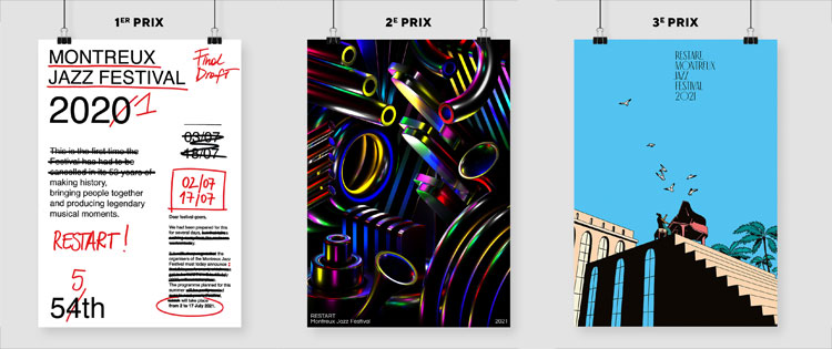
After a year of cancelled live events, the Montreaux Jazz Festival tasked the world’s designers to redesign its event posters for 2021 with a specific brief in mind. The Restart competition asked designers to develop their poster ideas as a representation of their ideal world as it moves beyond the pandemic.
The winning poster came from Italian Valeria Pernice, whose design represented “the emotion” felt by festival organisers and fans after getting cancelled in 2020. Second place went to Swiss designer Jamy Herrmann. Herrmann used the poster to mix the dark mechanical elements of jazz instruments with the colour of the music they create. Finally Italian designer Federico Tramonte was awarded third place – the bright, light illustrative approach “evokes a first note in suspension” according to judge Malika Favre.
What was your favourite design project from the last month? Let us know in the comments below…


Absolutely love Tick Tock packaging by Jamie Nash and Adobe billboard by Studio Moross!
woah! that jazz poster