Audley Shoemakers
Design: Lippa Pearce
Design: Lippa Pearce
Lippa Pearce has recently consolidated a two-year collaboration with Audley Shoemakers with a diverse range of promotional material including point-of-sale material, packaging and press advertising and posters. ‘I feel that designers are becoming more wholehearted in their relationships with clients,’ says Lippa Pearce director Harry Pearce. ‘As a multidisciplinary design consultancy, Lippa Pearce can be working on a range of promotional options, from print, to packaging, to Web. Posters are a part of that offering.’
Pearce questions whether there actually has been a significant increase in poster work among design consultancies. As far as he is concerned, it’s been there bubbling under all the time, and just happens to be getting more recognition at the moment. Personally, he has designed posters for theatres, charities and Boots the Chemists over many years, and feels that it’s a discipline that comes naturally. ‘Many projects – packaging, brochures, identities demand a poster-like approach,’ he says. ‘You have to be as reductive as possible in what you say and how you say it. This philosophy can be used in many different ways, some packs are almost like mini posters.’
The Audley job crystallises the difference in approach between ad agencies and design consultancies. It doesn’t rely on the punchy direct hit, so much as a subtle interaction between poster and viewer. ‘They are playful typographic games which you have to spend a bit of time working out,’ explains Pearce. The strategy fits well with Audley, a highly contemporary, occasionally subversive company, which designs, manufactures and retails shoes worldwide, and has an exclusive Ben Kelly-designed outlet in Mayfair.
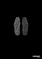
One of the Lippa Pearce posters features a pair of typographically rendered soles, in wob (white out of black) type. It plays with the notion of the rational left, and emotional right sides of the brain, using a no-nonsense sans serif typeface to spell out definitions and formulas on the left, and overblown poetry in a flowery script on the right. ‘You have an analysis of the shoe on one side and the more emotional, almost sexual relationship described on the other,’ explains Pearce.
The second poster in the series is an assortment of colour-coded squares which, if you take the time to work it out, reveals a playful poem about walking. The images have been adapted for press ads and (in the case of the feet) shoe wrappers. ‘It’s what Audley is all about,’ says Pearce. ‘It doesn’t do anything in a regular way.’
Read this next

-
Post a comment


