Silk Pearce unravels Poetry Trust identity

The Aldeburgh Poetry Trust has renamed itself as The Poetry Trust, with a visual identity created by Colchester graphic design consultancy Silk Pearce. The marque will be officially unveiled at the organisation’s 16th Aldeburgh Poetry Festival, which takes place in November.
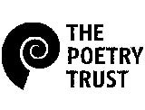
‘Previously, we didn’t have a logo,’ says the trust’s director Naomi Jaffa. ‘The new one has been interpreted as a shell, an ear and an opening spiral: all suggest amplification.’
According Silk Pearce design director Peter Silk, the ‘highly visible’ and ‘bold’ identity is intended to challenge traditional perceptions of poetry and portray the trust as a national organisation. ‘We dropped Aldeburgh from the name as The Poetry Trust has a much stronger national feel,’ explains Jaffa.
The identity will appear on stationery, which Silk Pearce created using ‘earthy’ colours and coarse paper. The group also designed the brochure and programme for the Aldeburgh festival, a three-day annual celebration featuring 30 national and international poets.
Illustrator Brian Grimwood added visual elements to the programme that reference the Suffolk coastal town of Aldeburgh.
Silk Pearce won the work without a pitch. Other applications of the creative work include a CD cover, newsletter and a programme for Lines On The Road, the first tour of the festival, which takes in five UK cities.
-
Post a comment


