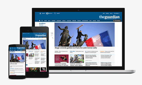
Guardian launches new website to complete multi-platform redesign
The Guardian fully launches its new website today, which features a “container” layout in a bid to reflect how readers consume news rather then how journalists categorise it.
A year-long beta phase has led up to the global launch with the Guardian’s US and Australian audiences being the first to trial the new versions. The first iteration of the new website was unveiled at the start of last year.
The design has been led by the Guardian’s director of digital strategy Wolfgang Blau and creative director Alex Breuer.
The re-launch is part of a broader digital-first strategy, which has already seen the introduction of a redesigned app and mobile site that have in turn influenced the design of the Guardian newspaper and its supplements. We spoke to Breuer about the digital design language last year and also looked at how the Guardian’s digital designs have influenced its print edition.
Speaking ahead of the launch of the new site Breuer said: “What lives behind this is a new design language for the Guardian as a whole. When I started two years ago the design language across everything was slightly disparate. The overarching goal has been to build a common design language.”
From today whether readers are consuming the Guardian on mobile, a desktop, laptop, tablet or any other device, they will be looking at exactly the same product.
There is no mobile site, as such. That is because the new site has been designed to be fully responsive and work across many breakpoints.
User-testing, particularly eye tracking, showed Breuer that on the old site “people only engaged with the top six, seven stories”. He adds: “The form structure of those stories as you scroll down a page was very repetitive and people didn’t really notice what they’re looking at any more.”
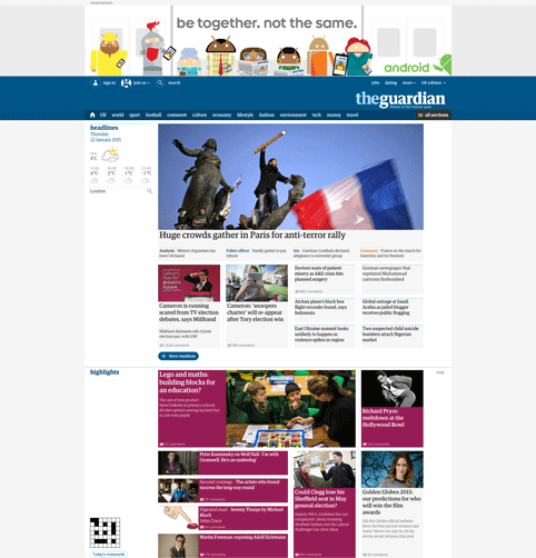
The “container” layout is a solution that came up after user research, which showed that the columnised taxonomy of the old site wasn’t serving user needs.
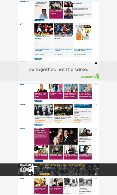
Content is now split into horizontal containers, which can be customised to place greater emphasis on whatever the editors are trying to promote – whether that’s through headlines, video, or large images, and what kind of engagement they are looking for – some analysis and comments pieces will be longer reads, and initially have a more passive engagement for example.
The design team has been thinking about content as “slow and fast” according to Breuer and curating it into containers accordingly.
Editors and production desks have been given a new suite of editorial tools to provide them with more layout flexibility within each container. In “fast” containers, such as Headlines, there can be as many as 50 layout options.
Breuer says that layout can now better reflect content: “It has allowed editors the ability to give hierarchy and to give light and shade to front pages and articles as well as the home page.”
There is now a greater emphasis on up-to-the-minute and live news when you land on the home page of the new site and see the top container, Headlines. This then gives way to categorised columns below including Opinion and curated sections, such as today: Auschwitz.
Readers have been given some control of which containers they want to see and have the option to hide anything they are not interested in.
Blau says: “Some subjects like sport are very polarising, so if you want you click hide and can just get rid of it and next time the site will remember that.”
The Guardian will be able to see what types of stories people are reading so that in time readers can be given even more tailored experiences.
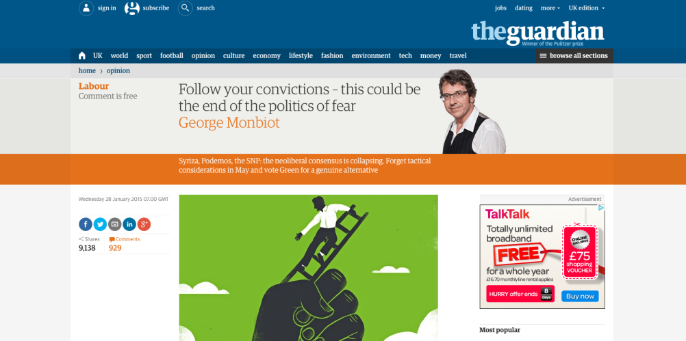
In terms of look and feel the whole experience across the site has been simplified and a new colour palette has been introduced to delineate story types, sections and writers, giving consistency across print, online and apps.
The Guardian Egyptian typeface, which was designed by Paul Barnes and Christian Schwartz for the newspaper, will now appear in all online forms.
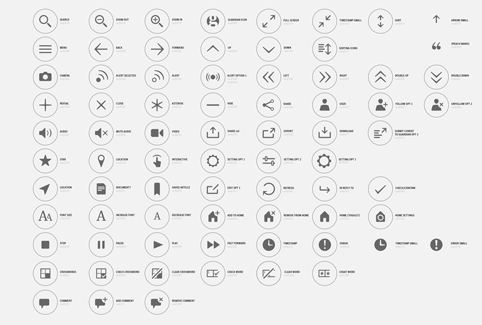
A new set of icons has been created for the site, which will be used across all products, and includes social media buttons that only appear when read on the relevant format. A Whatsapp icon, for example will only appear when the Guardian is viewed on a mobile-sized screen.
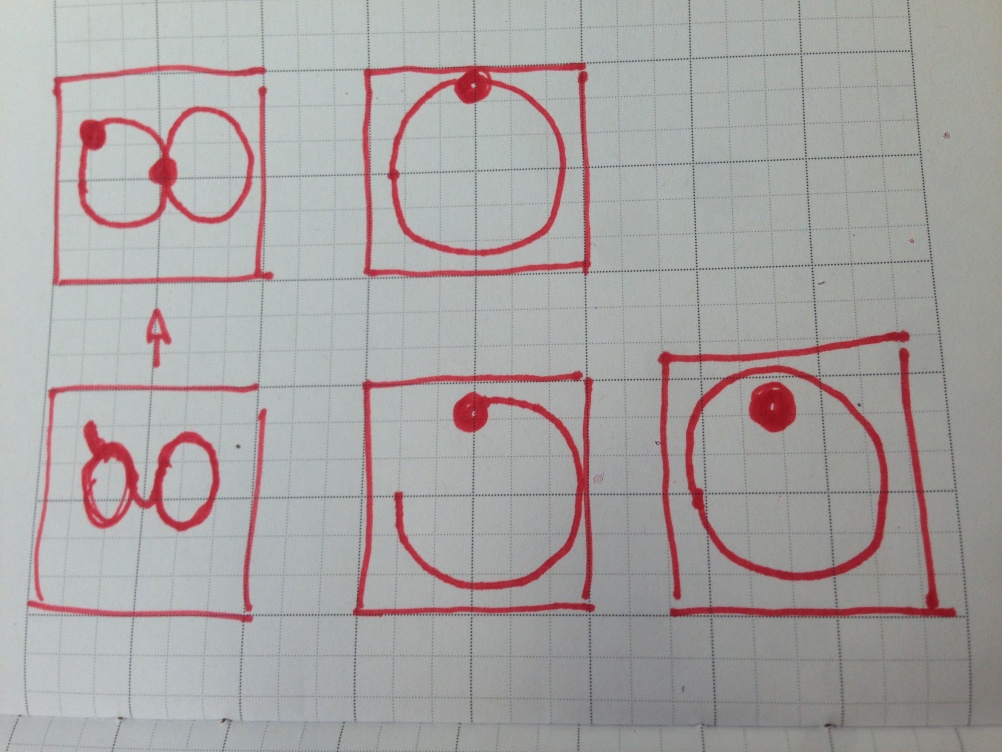
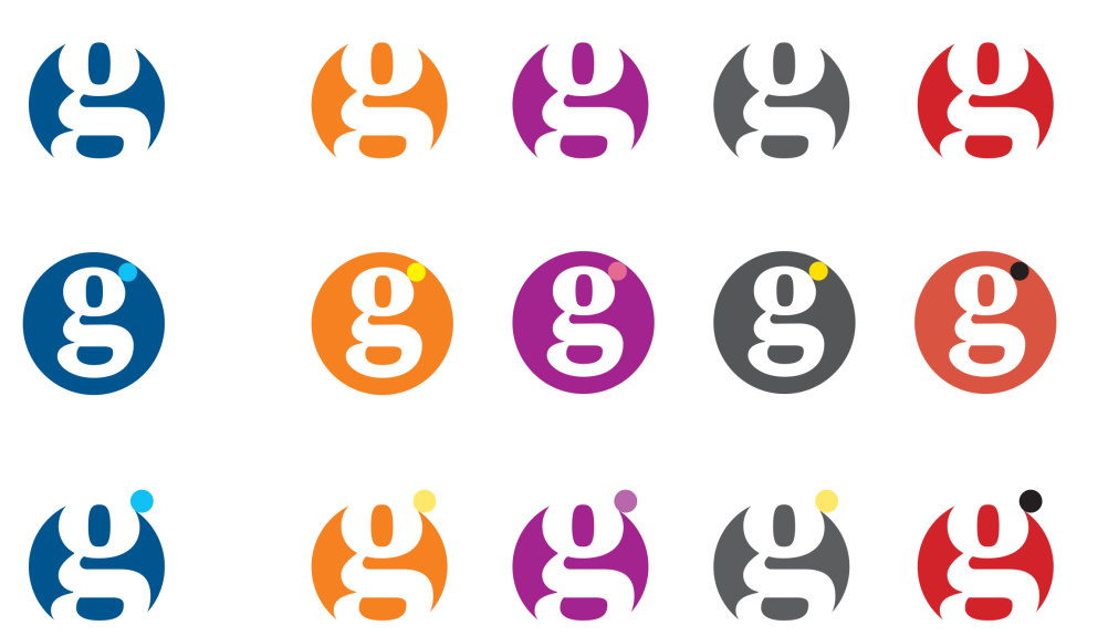
Breuer has also worked on branding, redrawing the Guardian “g”, which appears in a roundel and can be animated so that it appears in motion as a video plays.
This animated “g” replaces a full screen ident, which used to play pre-roll – prior to videos, and usually an ad.
Having a branded animation play while the video is rolling reduces the time a reader has to wait to see the content.
The new site is the penultimate touchpoint for The Guardian’s new look with just the consumer businesses to go, including Masterclasses, Books and Soulmates.

-
Post a comment


