New Pancreatic Cancer Action logo reflects the shape of a pancreas
Studio Sparrowhill has designed the new identity for charity Pancreatic Cancer Action, with the aim of humanising the charity through a logo that reflects the shape of the organ itself.
Owner of the consultancy James Robinson undertook the design alongside freelance designer Jon Stanbrook, and says drew inspiration from other charity projects such as Hat Trick’s work on Prostate Cancer UK.
Robinson got involved in the project after attending a Typographic Circle talk by Michael Johnson, based on the 1964 Ken Garland manifesto First Things Firsts. “It was about reprioritising what we should be doing as graphic designers,” Robinson says. “I liked this idea of doing projects that had some social good – design to make a difference.”
He was also inspired by his father, who had died from pancreatic cancer at age 56, and so had a personal connection to the disease and a need to raise awareness, he says. “Before my father got it, I wasn’t even aware of the pancreas as an organ – I had no idea what it did. It’s literally buried deep behind other organs, and the public has a layman’s understanding of it. I wanted to increase their knowledge of the condition.”
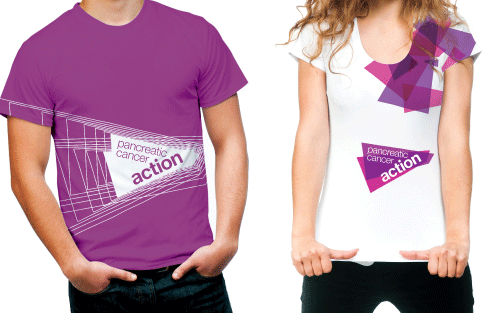
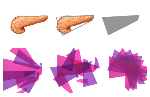
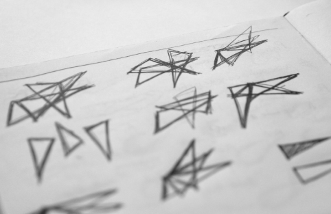
This became part of the solution of the visual identity, he says, which includes a digitally enhanced hand-drawn logo based on the shape of the pancreas. It has also been placed on T-shirts to reflect the actual size and position of the organ in the human body.
“The pansy flower that the charity was previously using was just confusing,” Robinson says. “We couldn’t see a relationship between the mark and their positioning as a charity. This is more relevant and engaging.”
He adds that the consultancy used a Picasso-style abstraction to get the organ down to its basic shape: “We cut the shape out with scissors, took some photos and tried to retain a human element to it. We could have drawn it in a software package, but it would have lost something – the inaccuracies of the curvature give it a handmade quality.”
A controversial advertisement campaign by Pancreatic Cancer Action last year (above) encouraged Robinson to coin the term “positive disruption” and use it within his design process. “It was this idea of acting now and asking for forgiveness later, which was embodied in their campaign,” he says. “We wanted to agitate, get bums off seats and get attention.”
The new identity launches this week with an initial landing page, and will continue to be rolled out across the full website, literature and all forms of promotional items such as t-shirts and badges.
Read this next


Interesting for the designer.
Dull for the public.
No one outside of this article is going to make that association.
It’s a sales technique to get the work signed off, not a useful tool for the organisation using it.
I don’t like being negative but i think that the shape is meaningless, without an explanation of it, to those who have no knowledge of the pancreas and its shape.