The week in design
Our most-read stories of the week
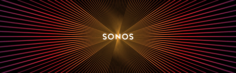
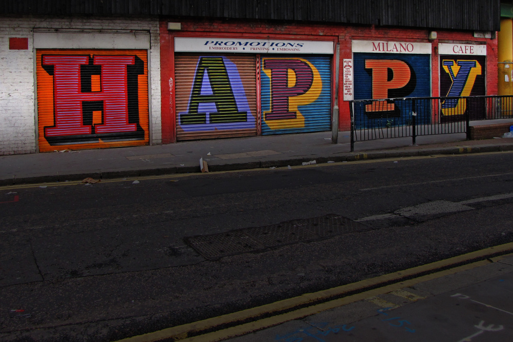
1. With Bruce Mau’s Sonos logo making waves (scroll the image up and down to see why…) we look at this and other identities that represent sound and motion.
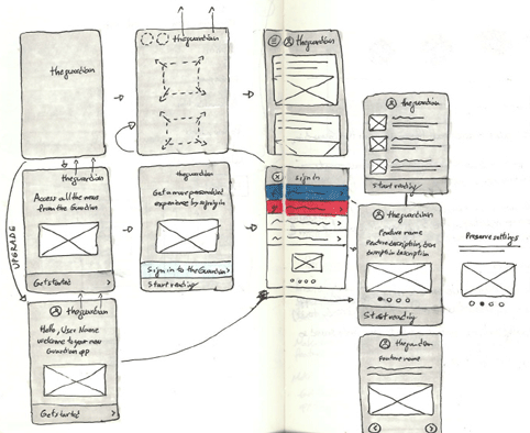
2. The Guardian has relaunched its website, completing its multi-platform redesign. We take a look at the thinking behind the design here and here.
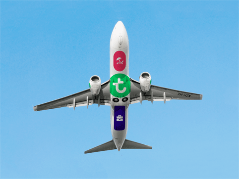
3. Studio Dumbar has worked with digital marketing agency Mirabeau to rebrand low-cost Dutch airline Transavia – adding bespoke icons to the planes’ underbellies.
Our most popular Tweet of the week
Bruce Mau creates pulsating logo for Sonos that shows “soundwaves” when you scroll up & down: http://t.co/aRnkeeIW8V pic.twitter.com/S9VSLoWEed
— Design Week (@Design_Week) January 26, 2015
Our favourite Tweets of the week
Team @guardian have just pressed the Big Red Button to launch the new responsive website worldwide pic.twitter.com/RuyIGDO1sp
— alan rusbridger (@arusbridger) January 28, 2015
“You’re sure nobody will misread it?” “Of course not. What else could it even say?” pic.twitter.com/1LK52PLHEU (via @tony_white_)
— The Media Blog (@TheMediaTweets) January 28, 2015
@Design_Week @NHM_London one of our dinosaurs is trending
— Casson Mann (@cassonmann) January 29, 2015
Image of the week
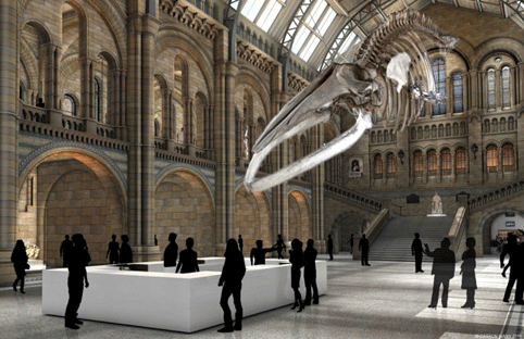
Probably the most controversial image of the week is this one, which shows Casson Mann’s plans for an overhaul of the Natural History Museum’s entrance hall – with Dippy the Diplodocus being replaced by a Blue Whale. The resulting furore was covered in all the national Press and led to the #savedippy hashtag trending on Twitter.
Quote of the week
Source: Leo Reynolds
“We really don’t know how lucky we are, us designers in our ivory Modernist towers. We could be working on the bins. Or up a crane. Or in the ad industry.” Matt Baxter is one of several designers who tell us about how they make sure they keep enjoying working in design.
Our favourite website
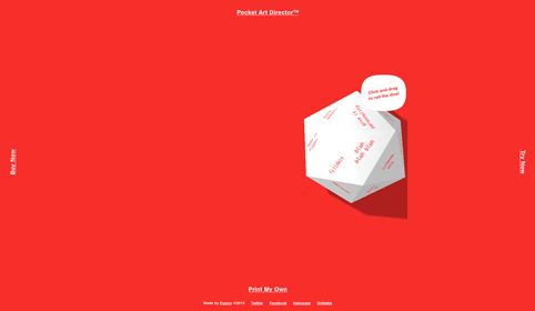
Stuck for an insightful comment to make when presented with work? Try these Pocket Art Directors’ Dice.
Design stories in the national press
Over on the Guardian , readers are submitting their favourite city fonts. There are some lovely examples, including Anton Kurvers’s font for Amsterdam’s bridges.
The latest episode of BBC Radio 4’s The Bottom Line looks at how to charge for services – by time? By results? By difficulty? Interesting stuff for designers.
The Press Association has an interesting look at Apple in Numbers after the company recorded the biggest quarterly profits by any public company in history.

-
Post a comment


