Wolff Olins rebrands Hive around “affordability” of connected home products
The British Gas-owned smart home brand has recently expanded its product offering beyond heating, and aims to be “accessible” to a wider range of consumers with a new visual identity.

Wolff Olins has designed a new visual identity for Hive to “humanise” it, as the company expands its products beyond smart heating to an extensive connected home portfolio.
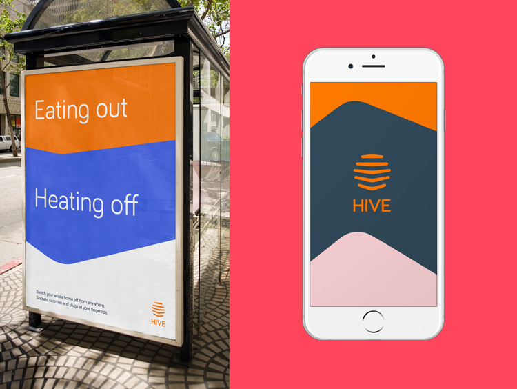
The new branding retains Hive’s orange colour, but sees an adapted typeface from sans-serif lowercase to all-capitals. The panel-based, abstract beehive symbol in the logo has also changed shape, and is now used across digital platforms in animated form.
This includes the logo being drawn, rotating, and disappearing as panels of colour, photography and copy fall down and replace it. The panel icon is taken from the logo, and used as a placeholder in animations for various imagery.
Rosie Isbell, lead designer at Wolff Olins, says: “As the business has evolved, so has what Hive offers consumers. So we wanted to humanise the brand, and make it more connected and dynamic.”
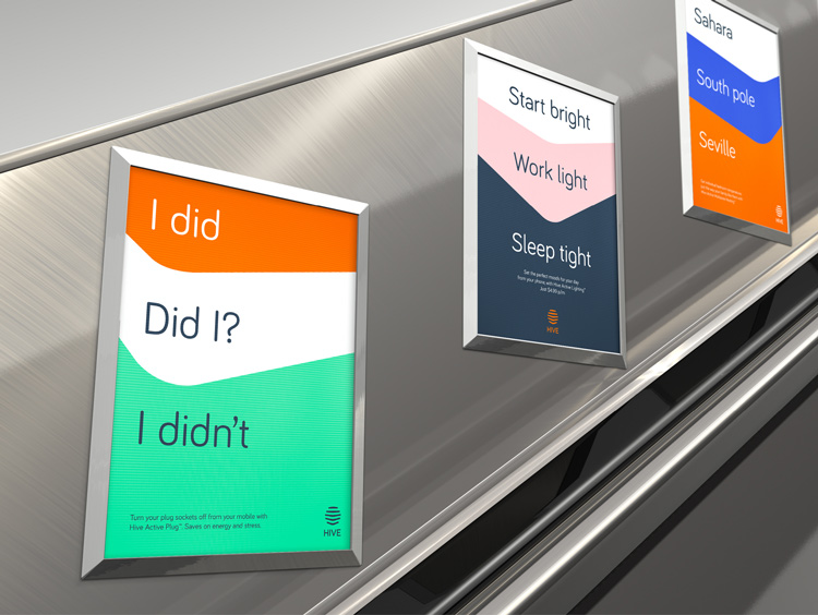
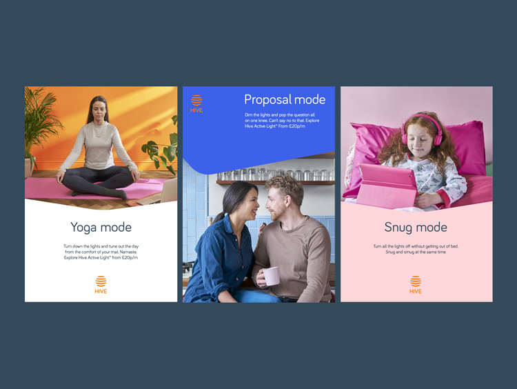
The “perspective panels”, Isbell adds, have been used as a “bright and open” device to “tell the stories of using Hive”, as well as showcase its services and products.

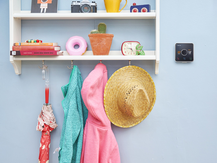
A new palette of colours of green, purple, pink, grey and white has been introduced in communications and packaging, alongside photography of people doing day-to-day activities and a more casual tone of voice used for copy.
Advertising agency Chi & Partners and Hive’s in-house design team used the new brand to create a campaign for Hive.
Hive, owned by British Gas, started off offering smart heating in 2013, which allows people to control their heating via a smartphone app, website or remote.
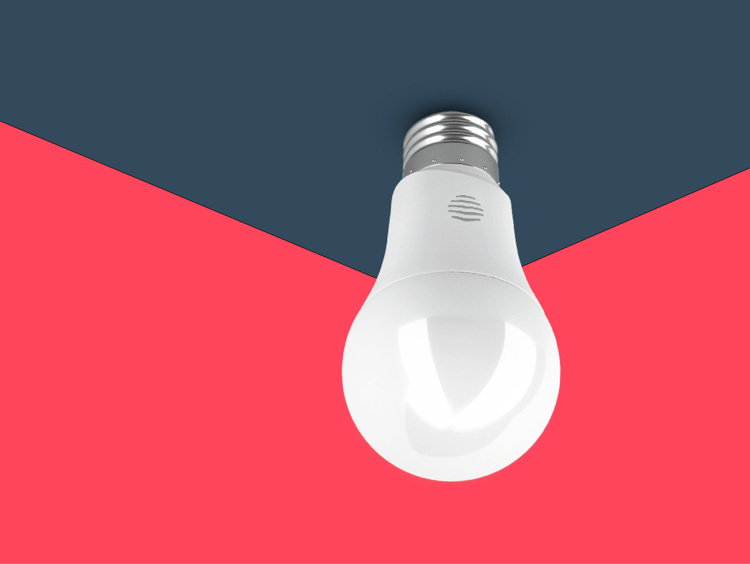
The company has since expanded its offering, with smart lighting, motion sensors, plugs as well as a hub bringing all of Hive’s products together. The majority of new brand communications do not mention British Gas, though the parent company features as a partner logo in some instances.
The new look aims to signal a shift in “accessibility” of connected home products, says Isbell, as now being more “affordable” and available to more people to use in their homes.
Accountant PricewaterhouseCoopers (PwC) predicts that the connected home market could be worth £117bn globally by 2020, stating that it is becoming “anyone’s game”.
The campaign and new brand has rolled out across print and digital touchpoints.


I do like the logo 🙂 The product family branding I feel gives Hive an edge over their competitors. What is currently holding back the smart home market is the mish-mash of different products: Belkin for plugs, Nest for heating, Philips for lighting and Homekit or an Amazon Echo to hold it all together. Interoperability exists but all it takes is an update to Homekit to temporarily break the product bonds whilst manufacturers update their firmware.
Hive have the advantage of offering affordability, futureproof hardware and a clear branding tying them all together. This makes it far easier for consumers to kit their home out.