England Rugby’s new look aims to “reflect diversity” of the game
Design studio Onwards has refreshed the branding of the organisation, basing it around a “timeline” linear graphic system that looks to be “flexible” and appeal to a wider range of people.

Onwards has refreshed the brand identity for England Rugby, which aims to widen the appeal of the sport to a broader audience and modernise the brand.
England Rugby, historically known as the Rugby Football Union, is the “national governing body for grassroots and elite rugby in England”, according to the organisation. It more recently changed its name to England Rugby.
The brand refresh comes at a time when there will be a lot of attention on the sport, according to design studio Onwards, with the Rugby World Cup taking place in 2019, as well as the annual Six Nations Championship starting early next year.
Onwards co-founder, Graeme Cook, says: “Rugby has a wide and varied audience, so we are conscious we have to cater for all types of people.

“We wanted to make the identity feel a bit younger and fresher, but we were aware we have to still make it attractive to people who play the game currently and have been knowledgeable about rugby for years. It was about trying to strike that balance.”
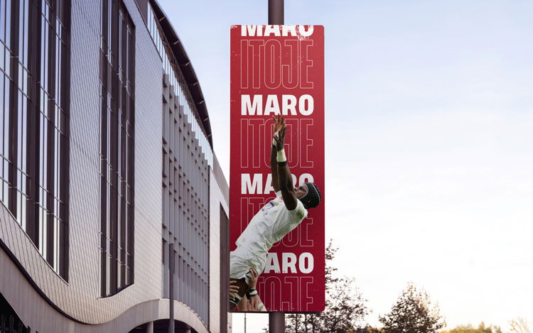
The studio has focused on creating a new look that could be adapted to different touchpoints, from digital channels and social media to large printed graphics, for example at Twickenham stadium.
While the previous branding was “very consistent”, Cook says the studio has chosen to “go for coherence over consistency” to allow for more “flexibility”.
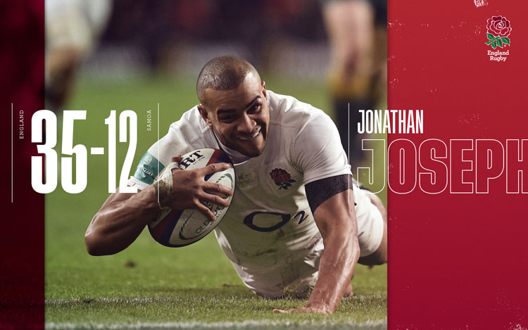
The new branding is centred around blocks of graphics and text, some of which are animated to scroll, in a graphic system the studio refers to as “the timeline”. This has been used to hold different types of content, from typography to photographs.

Cook says: “We were working with England Rugby, which had the idea of rugby being the ‘game of our lives’ so we were looking at how to bring that to life visually and came up with a graphic timeline that aligns with the idea.”
He adds that the idea encapsulates “how rugby can affect different parts of your life”.
“It’s not just about the sport, but what it can do for you in general, such as [teach] discipline and respect, which you just don’t really have with some other sports,” he says.
The new look aims to “reflect the diversity of everyone who plays and supports rugby in England”, he adds.
According to the design studio, while rugby may once have been seen as “elitist”, it is now “evolving”; the men’s England rugby team has become more “multicultural”, an “elite” women’s team is competing on a world stage and England Rugby is supporting outreach rugby initiatives nationwide.

The imagery within the timeline aims to show this diversity; it ranges from photos of the women’s professional team to “grassroots imagery from social media”.
A sans-serif typeface known as Tusker has been used in a range of weights and styles throughout the identity.
“We chose quite a bold typeface to reflect the physical nature of the game and then used various textures to introduce a more tactile element,” Cook says.
As well as offering “flexibility” across branding and communications, he adds that using the typeface in “varying weights and sizes reflects a bit about people who play the game – all shapes and sizes can play, so we liked the idea of that.”

The England rose logo has not been changed and the colour palette, which includes red and white, has been kept mostly the same.
Onwards has been working with England Rugby’s internal team to roll out the branding across a range of touchpoints, including tunnel graphics and digital communications. It has already been used in the tunnel at Twickenham for this year’s Autumn Internationals.
The studio is also working with England Rugby on its campaign for the World Cup, which will take place in Japan from 20 September to 2 November 2019.


-
Post a comment


