
Scottish brewery Fyne Ales’ new branding reflects its farm heritage
The independent brewery has a new look designed by O Street, which aims to pay homage to its rural location and stop it appearing “safe” on the supermarket shelf.
Glasgow-based studio O Street has rebranded Scottish craft brewery Fyne Ales, in a bid to realign it with its countryside location on a family farm in Scotland.
Fyne Ales was founded in 2001 on a family-run farm in Argyll, a rural region of West Scotland. Opened by the same people who ran the farm, Jonny and Tuggy Delap, its aim was to boost the economy of the local area, by bringing “jobs, industry and tourism” to the “isolated corner of Scotland”, according to the brewery.

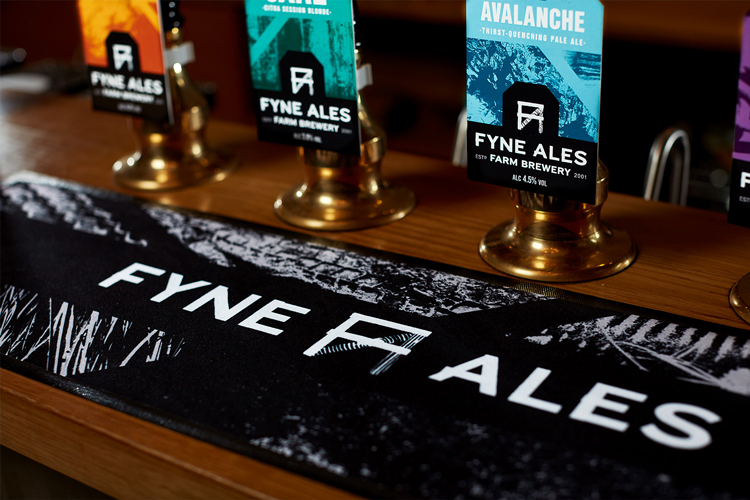
The new logo features an “FA” monogram made from planks of wood, symbolising beer crates as well as cow fences, according to Tessa Simpson, designer at the studio. The “A” letterform is textured, reflecting a wooden or tree trunk pattern.
Under this, sits the full brand name Fyne Ales, alongside with new strapline Farm Brewery alongside its founding year of 2001, all set in a bespoke version of sans-serif typeface FS Cattle, designed by Fontsmith, which also aims to replicate the look and feel of wood.
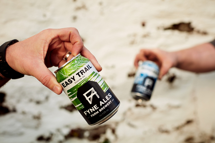
All this is set within an abstract shape that is a silhouette of a barn, in a bid to “remind the drinker where [the ale] was brewed”, says Simpson. The core logo colours are grey and white, but the brand incorporates a broad palette of red, blue, yellow, green and purple for bottle and can labels, and packaging of different ales.
Bottles and cans labels also feature different textures that represent materials and objects found in the farm, such as metal ladders, tree stumps, grass and crops, and hay. These are transformed into abstract, colourful patterns, used to distinguish cans and bottles, and help the brand “escape its safe supermarket [presence]”, says Simpson.
These “artistic” textures have also been used across the Fyne Ales website, and a selection of art prints that the brand has released online.
Many of the textures were created initially by hand, with the design studio dipping clumps of hay in ink, and using objects such as potatoes and bottles as ink stamps, and some were taken from photography taken around the farm, such as close-up shots of wooden crates used to store beer and the rust on tractors.
“Our thinking for the texture approach was to allow the Fyne Ales team to go on to create their own textures from things they find around the farm, for future special releases of the beers,” says Simpson. “So far, they’ve been rolling pine cones in ink and using cigar ends to create patterns for the brand’s collaboration brew with Cigar City.”
Peter Dibdin was commissioned to complete on-site photography for the new branding, such as in barns, and of animals and landscapes.
Secondary sans-serif typeface Nimbus Sans has been used for labels and packaging.
Simpson says the aim of the new brand is to “position Fyne Ales as a contemporary, progressive brewery”, while referencing its farm history, and giving it a “unique and unified” look.
During the research process, O Street spent time on the farm itself, says Simpson, to “understand the place and its culture”, and “explore the brewery, from mash tuns to cow pats”. A mash tun is a machine used in the process of ale-making, which converts starch found in grains into sugar for fermentation.
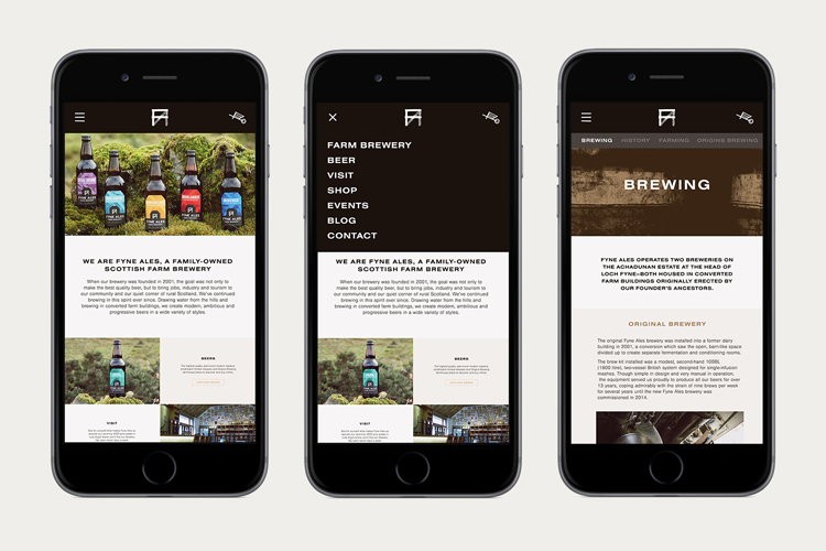
O Street also designed a new website and a set of design guidelines, to be used by the brewery for future marketing materials.
The new Fyne Ales brand is now rolling out across all touchpoints, including product packaging, labels on beer taps in pubs, on-site branding at the Fyne Ales brewery, advertising materials and posters, merchandise, and across online platforms including the website and social media.


This is a damn ‘fyne’ piece of work – you can have that.