Rufus Leonard creates new look for ODEON cinemas
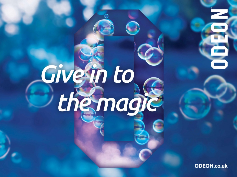
The new branding is based around an “O” motif that is “used as a portal to transport viewers’ imaginations”.
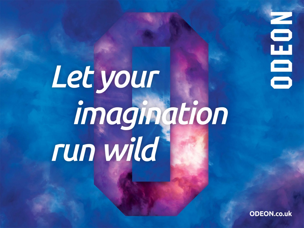
Rufus Leonard has developed new branding for cinema chain ODEON, based around an “O” motif that is “used as a portal to transport viewers’ imaginations”.
ODEON was founded in 1928 by Oscar Deutsch, and the name is derived from the phrase “Oscar Deutsch Entertains Our Nation”.
The original ODEON logo was created by Deutsch himself and was used up until 1997, when it was replaced by a new identity designed by Wolff Olins.
New “O” visual
ODEON now operates 2,221 screens at 240 sites across Europe as a whole, including 120 sites across the UK and Ireland.
ODEON says its new look aims to “create a definitive brand experience that sets it apart from competitors”.
The new look is based around an “O” visual, which will be backed by “sensual and emotive” imagery – such as a bird’s eye-view from Space.
“Digital-first” and new colour scheme
Rufus Leonard has also developed a new colour palette, which takes ODEON’s signature blue and adds new tones including fuschia and orange.
The new branding is launching both on- and off-line and a new “digital-first” typeface has been introduced.
ODEON says the new branding launch is part of a drive to “focus on experiences”.
Immersive experience
The company is set to open a new “iSENSE” cinema in Charlestown, Ireland, which will feature floor-to-ceiling high-definition screens and Dolby Atmos sound-systems.
As part of the opening, Rufus Leonard has created an “immersive experience” for the Charlestown cinema, which will see customers move through a 7m-long audio-visual sound and projection tunnel before arriving at the iSENSE screen.
“special and magical”
James Ramsden, executive creative director at Rufus Leonard, says: “For years, people have been choosing where to see their favourite movies based on how close they are to their local cinema. The time has come for customers to expect something more individual, special and magical from a cinema brand.
“The work we have created nods to what we all know and love about ODEON; it has a wonderful sense of heritage as an iconic picture house. But what’s crucial is we use design and creativity to unlock the potential and future of cinema in a creative and emotionally engaging way.”
Earlier this year rival cinema chain Curzon launched a new identity, created by The Plant, which uses the idea of “light playing in the dark” to represent “the powerfully emotional sense of being in the cinema”.
Discover more:
• Odeon pilots branding by Wolff Olins
• Curzon’s new identity aims to capture “power and emotion” of cinema


Saw it last night and thought it most impressive, especially with the swirling flames and emotive music. Created a sense of anticipation. Would love to run it on my home cinema. Well done for a distinctive logo.