Flight club
Hugh Pearman enjoys a book which documents how the image-led, yet kitsch world of air travel has changed since the 1920s.
Naff polyester uniforms, appalling food served in cramped circumstances, dodgy tailfin logos. And, of course, the evolution of the first-class airline seat into a fetishistic, over-designed and very ugly object. It’s all in Keith Lovegrove’s loving analysis of airline culture. The odd thing is that a real sense of the spirit of aviation emerges from this examination of the industry. It almost looks like fun.
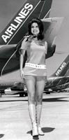
Lovegrove’s book is a winner because it has nothing whatsoever to do with technology. In this it reflects the airlines, which all have the same planes, which all go at the same speed. Therefore, competition between airlines can only come in the details. There are (or were) irreverent redneck airlines like Texas’ Southwest, which, in the 1970s, selected its female cabin staff entirely according to whether they looked good in hot pants. Rival carrier Braniff was famed for its Braniff’s Babes. Others – usually national carriers such as British Airways or Lufthansa – tend to offer an image of solidity and reassurance, as if they were airborne banks. BA’s uniforms at this time were modest affairs by Sir Hardy Amies. The French got Pierre Balmain. The likes of Mary Quant designed for upstart charter companies.
There are those that compete on food (famously British Midland successfully challenged the British Airways Shuttle service in the 1980s by offering food – BA, which regarded its internal flights as bus services, did not). There is competition on centimetres of legroom, on the facilities offered at the airports and, to a limited extent, on price. Er, that’s about it, really. There’s a picture in this book of a clutch of designers – the consultancy Factory – inside a stripped-out Concorde. Their heads are touching the ceiling. You realise it’s just a metal tube, and there’s a limit to what you can do inside it once you’ve got seats and overhead lockers in.
So airlines, more than any other transport concern, rely totally on image. If the image is wrong – think of Aeroflot – then it’s in trouble. If the image is right – efficiency, flawless service – the financial rewards are immense. On the whole, Imperial Airways – later British Airways – has done all right on this score. Look at the interiors of its Empire flying boats or its 1920s long-haul Handley Page biplanes, set out like luxury train compartments – because airliners were still train-shaped.
Something of that opulence lasted through to the double-deck Boeing Stratocruisers of the 1950s. It may yet revive with the designs by Priestman Goode for the biggest airliner yet, the Airbus 3XX (strangely the consultancy is not credited in the book, though its work for Virgin Upper Class is shown). Even when the first Jumbos were introduced, design studies were done for basement bars in the hold, with glass-topped tables allowing you to look downwards to the ground far below. A frightening idea that never happened.
The full-colour pictures of airline meals are even scarier, as are some of the corporate liveries. Plenty of good designers have worked for airlines down the years, and a surprisingly large number fall prey to the curse of tackiness. Only a few, “classical” airlines such as Lufthansa have real design staying-power. As you wallow in the nostalgia of this excellent book, ask yourself – what is it about working for airlines that somehow subverts designerly notions of good taste? Why do the upmarket cabins increasingly resemble set designs from bad sci-fi movies? And why, given the general lack of space, did anyone ever think it was a good idea to kit out stewardesses with tall hats?
Airline: Identity, Design and Culture by Keith Lovegrove will be published on 1 November by Laurence King Publishing, priced £19.95
Read this next

-
Post a comment


