mOcean
– Timecode trailer and titles
They’re well aware of the mantra “location, location, location” in Hollywood. So when mOcean (pronounced, of course, “motion”) creative director Michael McIntyre decided to establish a graphic design consultancy a year ago, it was no accident that he landed on one of the coolest locations in town, setting up shop within a mile of the ocean near California’s Venice Beach. “It gave us our name, but it also goes some way to illustrating the company ethos, which is about being small, original and different; looking at things in a different way, offering clients something other than what they’ve been used to,” says McIntyre.
He and editor Justin King-Hall had worked together on a number of projects, approaching them from different perspectives. “We wanted to totally integrate those elements. While our specific backgrounds are editing and designing, what we’re doing now is simply image making,” says King-Hall.
Having paid his design dues via greeting cards and movie posters before dedicating seven years to movie trailers, McIntyre decided to set up mOcean primarily to work on title sequences, though he doesn’t turn down interesting trailer work, and indeed it was through the trailer for Figgis’ recent feature Timecode, produced for distributor ScreenGems, that mOcean won the job of title design on the film. “ScreenGems had a very rough cut of the film and didn’t know what to make of it at all, and because we were new and there was a buzz about us the company decided to bring it to us,” says McIntyre. “Straight away we could see this was a really exciting piece of experimental film-making, and devised a trailer that Figgis really liked,” he adds. So much so that the director asked the group to also design the title sequences. “The typographic elements were derived from text used on the trailer, but with the other elements we had complete freedom to shoot anything we thought would work,” says King-Hall.
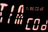
Timecode splits the action into four quadrants on the screen, with the action taking place simultaneously and some judicious sound editing directing you to different quadrants to follow the narrative. The title sequence by mOcean echoes this device from the very beginning, splitting the ScreenGems logo, the first thing you see on screen, into four quadrants. “Figgis liked this idea of one thing, the whole, being split into four, as it echoed the style of the movie,” says McIntyre.
After that, McIntyre wanted to bring in the theme of the film, which he did via the introduction of the countdown and having what he describes as “different things happening in all four of the quadrants, which again suggests different perspectives to seeing the film.”
“Title sequences are about setting a tone, but the best ones are stylistic while helping the audience read information,” adds King-Hall.
Shot on digital video and edited using Avid Media Composer and Adobe After Effects on an Apple G4, the sequence took three weeks to produce. “Figgis was fantastic through the whole thing,” says King-Hall. “He gave us great ideas but then gave us total creative freedom because he saw us as co-collaborators, as artists,” he adds. So what next for mOcean? “We’re designing the US trailer for Snatch, which is a lot of fun, and that’s good, because if we’re doing sappy stuff that’s not fun, that’s too much like work,” says McIntyre. “It’s an advantage to being small, we can pick and choose what we do,” he adds.
see also “DW200010270059”
-
Post a comment


