The Film Factory
– Tube Tales and New Year’s Day film titles
If title design in the US includes a stint in Hollywood, the British route usually involves a spell at the less glamorous but arguably more instructive BBC.
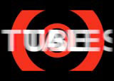
Graphic designer Simon Giles worked there before moving on to the commercial world of satellite TV and, four years ago, co-founding The Film Factory, a central London company which works on digital visual effects, title design and production, cinema commercials and feature films. Most of these are British, and many of them use type as an integral part of the sequence; notably in last year’s much lauded Tube Tales, the new Julien Temple movie Pandaemonium and the yet to be released New Year’s Day, a dark and disturbing tale about two teenage boys who are tipped over the edge by a fatal school trip. The protagonists take revenge on society through 12 tasks, to be achieved before committing suicide on New Year’s Day.
Giles came to the project via a personal recommendation, and found “95 per cent autonomy on it. The final sequence and the way it was edited together came from the animatic I originally submitted,” he says. “My original ideas for the sequence came from talking to the director Suri Krishnamma and just developing a dynamic graphic title without giving away the story. It was just a device to make people wonder what the numbers were about,” says Giles. Based on the animation of numbers, the sequence echoes the central theme of the film, the countdown. “The video look we used was based on the fact that the first several minutes of the film ape a home video look, seen from the point of view of the holiday video of the school trip,” he says.
The staccato sense of movement to the type is complemented by a wonderfully textured background: “I wanted the backgrounds to be fractured, so I shot the video images from my TV at home of parts of the film. Sometimes I shot only a few inches away from the screen, and consequently got some great graphic images, sometimes playing and fast forwarding the video to get glitches as part of the edit,” says Giles. “This material was then transferred to higher resolution, giving a very graphic and strong background to work with,” he adds.
The type was then animated to match the background. Giles only looked at a couple of fonts before settling on Bank Gothic because, he says simply, “I can usually feel if the typeface is right”.
It’s interesting that while technological advances have made Giles’ job much easier, he chose to go back to analogue methods to create the desired effect. “There are always up and downsides to technology; sure, now you can create digital titles sequences and preview everything, which used to be very difficult, but the downside is that clients can see that and change their minds now before you commit to film,” he says. And let’s not even get started on the main titles suddenly not matching with the opening of the film because a preview screening has gone badly and they recut the film.
see also “DW200010270059”
-
Post a comment


