Jones Lang Lasalle Brochures by River Design

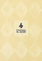
A traditional French-made artist’s paper was used, appropriately enough, for brochures promoting the sale of a French chateau estate and hotel. ‘We chose the Arjo Wiggins Arches paper because of its heritage, traditional feel and to add a sense of luxury,’ explains Colin Smith of River Design.
The brochures are designed for Jones Lang LaSalle. ‘We considered using a standard cartridge paper, but didn’t want any surface shine,’ says Smith. ‘We also felt that texture would add interest, so opted for the matt Arches, which has a felt mark texture, giving a subtle, stippled surface.’ Printing turned out to be fairly straightforward. The Arches stock has been put through its paces plenty of times and sample books come with a helpful panel of advice on handling. ‘The base paper colour is cream,’ Smith adds. ‘On one brochure we added just one colour, but on the second brochure had two colours. In the early runs the ink appeared too solid and dark, so pressure was released on the press and the effect was softened immediately. It now has an almost hand-printed quality.’ The diamond pattern design alludes to a luxury handmade French wallpaper which appears in one of the featured properties. The inside cover was printed a rich Pantone brown black. In addition to the printing, each cover has a debossed panel and foil-block details. ‘The debossing has produced good crisp edges and the foil was a Pantone metallic which has produced a warm old gold gleam.’ Interior pages are printed on a matt coated stock and the finishing touch is cotton stitching down the spine.
-
Post a comment


