
Design inspiration: the best projects from April
From Pentagram’s Home Poems to a period branding project, we take a look at some of our favourite work from an unusual April.
Futr visual identity, from Lantern studio
London-based studio Lantern has created the identity for AI company Futr. Futr provides AI-powered platforms so that organisations can communicate with people through messaging services like Whatsapp, Slack or Skype. It has taken on new relevance during the COVID-19 crisis as local authorities have used it to communicate with people. Its founder, Andy Wilkins says that it is a “revolution in how organisations communicate with their customers and employees.”

The branding aims to give the company more of a “human face”, a trend in tech branding (most recently seen in this cryptocurrency identity). That’s evident in the icon, which is both an F and a human face that “could be winking at you”. The studio says it’s a “radical departure from the abstract shapes and chat bubbles that dominate the sector”. A colour palette of blue, green, yellow and pastel red has been chosen, and Telegraf has been used as the typeface. Messaging has a “short, punchy tone of voice” and the identity rolls out across communication materials, including the website, investor decks and explainer videos.
St Mary’s Children’s Intensive Care Unit, from the Imperial Healthy Charity and The Josef and Anni Albers Foundation

Last year marked the 100th anniversary of the Bauhaus movement, and two of its most influential members continue to inspire projects. The Alberses’ geometric patterns have inspired the new interiors for the children’s intensive care unit at St Mary’s Hospital in London. There are wall murals and prints from Josef Albers’ Homage to the Square series, bed screens and wallpapers from Anni Albers’ designs and installations from the foundation.
According to the foundation, “the collaboration has helped to create a warm and welcoming environment during what can often be an extremely stressful time in hospital for families.” Josef Albers was known for his exploration into colour theory, and yellow and orange shades have been used throughout the unit as he believed yellow was the colour of healing. Nicholas Fox Weber, the foundation’s director, says: “For Anni Albers, abstract art was a source of balance and diversion, a relief from life’s troubles. For both her and Josef, the universal and timeless qualities of rhythm and colour brighten existence as can nothing else, and enable people to withstand some of life’s greatest challenges.”
Bloody Funny branding for Bloody Good Period, from A Studio Of Our Own
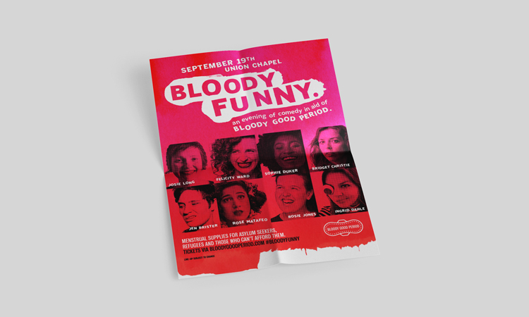
Bloody Good Period is a charity that provides menstrual supplies for refugees and asylum seekers, a luxury that many of those in need cannot afford. For its annual comedy fundraiser, Bloody Funny, A Studio Of Our Own created a brand identity including a logo that is “based on smears of blood”. The studio also created a “lo-res, deliberately cut-and-paste approach to typography in reference to the campaign’s activist credentials”. The identity has been rolled out across social media platforms, with posters and flyers, as well as merchandise including tote bags, stickers and enamel badges.
Macklin typeface, from Monotype
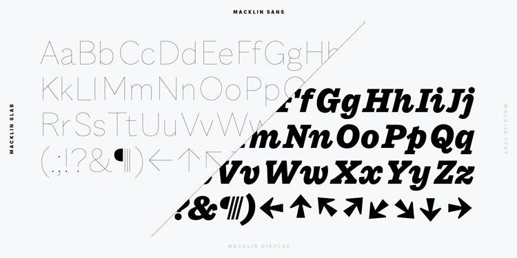
Monotype has launched a typeface, inspired by 19th century typographer Vincent Figgins. Featuring four sub families with a total of 54 styles, it “synthesises Figgins’ body of work into a single, comprehensive type system”. Figgins was working at a time of change in the type industry, as advertising and job printing created new possibilities for “stylistic experimentation”. He was one of the first typographers to create sans-serif typefaces.
However, type designer at Monotype, Malou Verlomme says that it is not a “historical typeface”. In fact, while the foundation is intact, “all historical details have been removed” in the hopes of creating a “contemporary family that offers a large palette for branding and editorial needs”.
Stuff That game, from Make it Red

An online taxidermy game might not seem like an obvious business plan. But Stuff That has been designed to help clients see that it can be beneficial to “chop up” their own brand “in order to reach undiscovered pastures and encounter new niche audience horizon”. Players can interact with a world that’s inspired by Frankenstein and the Island of Dr Moreau. Make it Red says that it’s become even more popular during lockdown, as adults and kids dedicate their time to “create some odd creatures while being house-bound”. You can have a go on the studio’s website.
Home Poems, by Pentagram
For many, it has now been weeks of working at home and this period has inspired a multi-disciplinary project from Pentagram. Naresh Ramchandani, a partner at the London studio, has created ten (very) short films that are based on poems about domestic topics, from birds to biscuits. Nine out of ten of the films were filmed in the home of designer and director Steven Qua, while music was created by Yuri Suzuki and JeanGa Becker. The titles have been created by Harry Pearce and Tom Walker, and the sound was mixed by Iain Grant. They have been narrated by poet Henry Ponder. One of the poems, Stairs, was shot in Oscar-winning director Kevin Macdonald’s home.
Football Type 2, from Rick Banks Face37
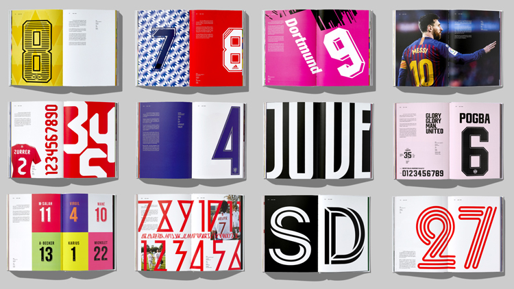
Rick Banks’ follow-up to 2013’s Football Type, has arrived with a more expansive look at the typography of football kits. It follows the the evolution of shirt numbers, which have gone from “identificatory aids” on players’ backs to brands in their own rights. The book is a celebration of these numbers, and its scope is broad: from World Cup kits to smaller five-a-side teams, as well as a look at the growth in women’s football. It involves case studies and the hidden stories behind some of football’s best-known branding stories.

-
Post a comment


