Designing an app that helps doctors prescribe the right drugs quickly
The British National Formulary (BNF) is a printed catalogue of drugs for doctors, nurses and pharmacists, updated and released twice a year – now there’s an app version, making searching, checking and prescribing easier. We speak to studio Modern Human about creating the digital platform.

Before patients can be prescribed something, many factors need to be considered. Are they already on drugs that could interact with a new one? Are they a risk factor group, such as a child or a pregnant woman? Which dose is appropriate for their condition?
The British National Formulary (BNF) reference book, which is published by the British Medical Association (BMA) and the Royal Pharmaceutical Society (RPS), is like a bible to medical professionals. Sent out to doctors regularly across the UK, the book is used to look up drugs, as well as the conditions they are used to treat (indications), to see when drugs should not be prescribed such as when a patient is on other medication (contraindications), and to understand side effects, doses, legal classifications and prices.
While having a physical book to flick through has its merits, the BNF realised that the prescribing time could be cut with the use of an app that does the searching for you.

Design studio Modern Human was commissioned to turn the index into an app, as well as redesign the cover of the print version. The free BNF app launched in July last year, and now over 126,000 NHS and private healthcare clinicians are using it to treat roughly 1.5m patients every month.
Paul Jervis-Heath, principal and chief designer at Modern Human, says the main considerations of the digital BNF were efficiency, speed and patient safety.
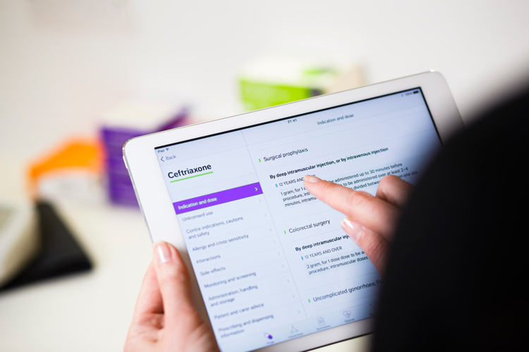
The app centres around an interaction checker – when clinicians open it up, they can type in the name of a drug they are considering prescribing, alongside the names of any drugs that the patient is already on. The app then tells the user if there are any interactions between the two.
“When we watched doctors, nurses and pharmacists working, the interactions between drugs was something we noticed them struggling with,” says Jervis-Heath. “They had to flick between sections of the book, cross-reference different pages, and hold it open with five fingers. Students were sticking post-it notes everywhere.
“The app instantly tells you about interactions, and advises you to reduce dose or change drug if necessary, and helps you find the right drug quickly. It also looks at interactions with non-medical substances – cranberry juice can interfere with a lot of drugs, for instance.”

The “smart search” also means clinicians do not need to be able to spell an entire drug name, but instead finds the right drug based on typing a few letters. There is also an alphabetical index, for scrolling, and all relevant information about the drug is listed, such as side effects and dosages.
The app also aims to instil greater confidence in clinicians and put patients at ease, by helping doctors appear more professional and efficient, adds Jervis-Heath.
“The last thing you want from your doctor is for them to have their nose in their phone or a book,” he says. “It makes you think they’re not listening or don’t know what they’re doing. The app’s speediness means the focus can remain on the patient, and it also enables the clinician to share information about a drug. It’s much easier to pass a patient an iPad rather than turn a computer screen around.”
The app has other informative sections, including recommended treatment plan summaries, diseases and conditions, equipment and how to use it, borderline substances, which are non-medicinal substances that can be prescribed such as supplements and special dietary foods, and wound care.

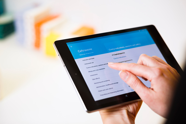
The user interface (UI) design of the app aims to be “functional, minimal and pared back”, says Jarvis-Heath. It includes the use of a limited colour palette and sans-serif typefaces, which are in line with the brand guidelines of the devices they are being used on. When used on an Android device, the design follows Google’s Material Design brand guidelines, and when used on an Apple device, it follows Apple’s guidelines for iOS.
“Clinicians get taught how to use the BNF as part of their medical courses,” says Jervis-Heath. “We wanted it to be that if they could use their phone, they should be able to use the app.”

The redesigned print edition of the BNF takes on a much more colourful look. While Modern Human created the covers for the book, Peter Burgess Design designed the inside, including text layout, type, formatting and sections.
As the book is republished every six months with updated information, Modern Human incorporated a colour scheme of red, orange, blue, yellow, green, pink and purple to differentiate between various editions.
They also printed the number of the edition large on the spine and front of the book. The decision was made to design a separate BNF book for treating children, which is also differentiated by colour.
“We noticed that clinicians would always check the big number on the front of the BNF, so they were confident they were using the latest edition,” says Jervis-Heath. “We made this the core visual element of the books.”

But could the convenience of the app be a replacement for the archaic, printed edition? No, says Jervis-Heath, who adds that while content is duplicated across both, they serve different purposes.
“We’ve had feedback showing that doctors like the print version when they’re sat at a desk and have time, but the app on their phone is indispensable when they’re doing a home visit or are in a rush,” he says. “People use them slightly differently but they complement each other. The app aims to put the power of all that existing information into doctors’ hands so they can use it more effectively.”
The BNF app is free for any clinician to download from the Apple and Android app stores.

-
Post a comment


