Old Vic stamps celebrate 200 years of the London theatre
The set of eight, Royal Mail stamps have been designed by studio Hat-trick in collaboration with typographer Kelvyn Laurence Smith, and aim to convey the feeling of watching a play.

A set of commemorative Royal Mail stamps celebrating the Old Vic theatre’s 200th anniversary has been released.
The Old Vic was founded in 1818, and is based in Lambeth, South London. It is known for putting on a range of theatrical performances including traditional plays, operas, dance, music and comedy, and was the original home of the English National Opera, the Sadler’s Wells dance company and the National Theatre.
Notable performances include actor John Gielgud’s depiction of Shakespeare’s Hamlet in 1930 and Glenda Jackson switching gender roles to play Shakespeare’s King Lear in 2016.
The set of eight stamps have been designed by Hat-trick Design, which worked with typographer and letterpress artist Kelvyn Laurence Smith on the type.

The stamps are “heavily typographic”, says Gareth Howat, founding partner at Hat-trick, which looks to complement the current typographic brand identity of the Old Vic, designed by Pentagram partner Harry Pearce in 2016 and reference the “theatre poster look of using type as image”.
The stamps focus on eight key performances from the Old Vic’s history, all of which have been taken from the 20th and 21st centuries.
“Although this is celebrating 200 years, it’s difficult to go back and visually showcase the really early plays,” says Howat. “So the stamps show the more modern Old Vic. The most important thing was that they showed the diversity of different plays the theatre puts on, and had a mix of male and female actors, and traditional and non-traditional shows.”
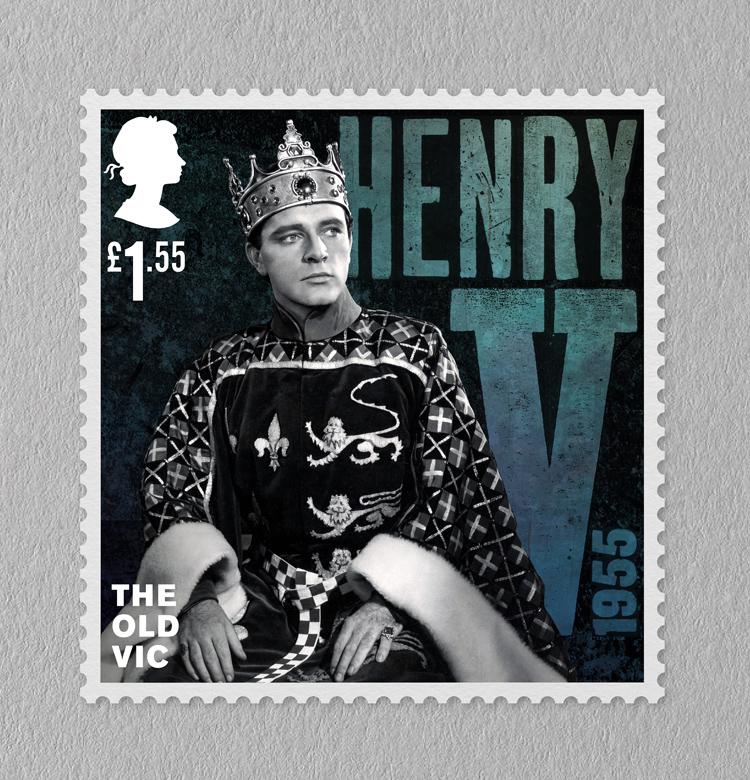
Each stamp features a close-up headshot or body shot of a protagonist from a play, alongside the name of the play set behind them, and the theatre name in either the bottom right or left-hand corner. The queen’s head and price of the stamp features as standard in the top left.
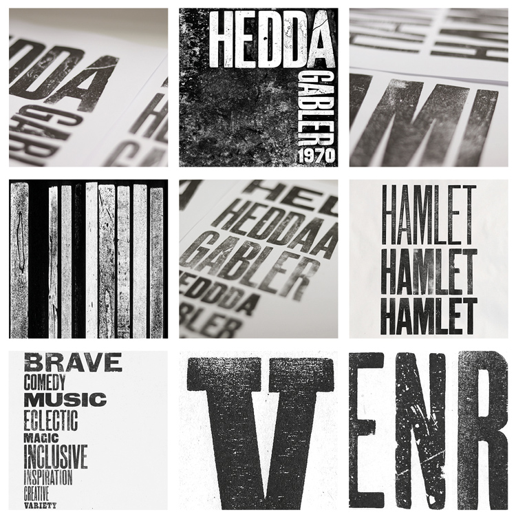
A broad colour palette of browns, oranges, reds, purples, greens, greys and blues is used across the stamps, as well as a gradient and faded effect which features across the type. Some portraits feature in black-and-white and some in colour. The typefaces differ across stamps, but are all either English grotesques or slab serifs.
The idea was to create a “theatrical effect” across the stamps, says Howats, with the text on each one acting as a “theatrical background” or stage set, putting the actor “front and centre-stage”.
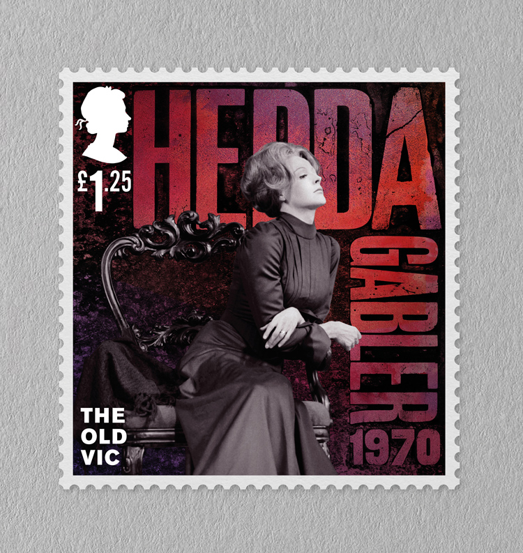
“The main thing we wanted to get across was the power of the actors and productions,” he says. “That close-up crop of the actor was key. There’s a slight lighting effect on the background type, which gives a balance between front and back, and also means the type almost becomes a theatrical backdrop to the stamp.
“The colours were in part guided by the play – we used red for Hedda Gabler to show how it is a very intense play and the main character breaks down at the end – but in general we wanted to use a broad spectrum,” he adds. “There had to be a balance of colour across them, so that they worked individually but also as a set.”
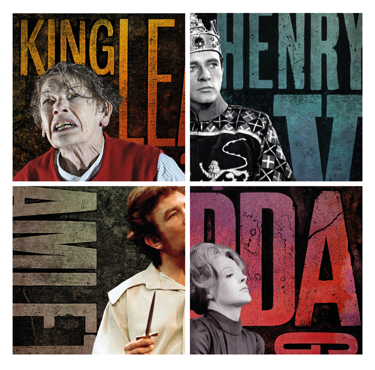
The stamps also feature little hidden nods to the plays, Howat adds. The “a” in the title of Hedda Gabler is slightly cracked to reference the mental deterioration of the main character, while the word “King” creates a type-based “crown” on the head of the actor in King Lear.
Negative space is also used for subtle references – the space formed around the “m” in “Hamlet” depicts the main actor’s dagger, while the “v” in Henry V forms an arrow-shape.
The stamps launch on 30 August and are available to buy through the Royal Mail.
Hat-trick has also designed a stamp presentation pack, which features the stamps as well as historical information about the Old Vic and archive photos, and a first day cover, an envelope which features the set of stamps postmarked on their day of issue.


-
Post a comment


