Pantone launches £75 magazine to help designers make colour choices
The high-end, biannual print magazine is aimed at industry professionals working in graphics, branding, interiors, fashion and product design.
Pantone has launched a £75 magazine looking at colour trends, which aims to act as both a “coffee table book” and a “trusted design resource”.
Viewpoint Colour is a 152-page biannual magazine aimed at designers and creative professionals, who want to learn about colour trends across disciplines such as fashion, product, graphic and multimedia design.
It will have an international perspective, with each issue exploring one global trend, and featuring news, analysis, and exploring social, psychological and scientific context behind colour trends.
“Colour should be a conscious part of decision-making”
The magazine aims to help designers create “effective colour strategies” for their work, according to Laurie Pressman, vice president and creative lead at the Pantone Color Institute, adding that today’s “highly visual world” means design is led by “colour and material” over “shape and form”.
“Pivotal in the design process, colour should be considered from the moment materials are developed,” says Pressman. “It should be a conscious part of every level of decision-making, from the raw materials that go into the product to the packaging it leaves the store in.”
Viewpoint Colour is intended to help graphic, multimedia, fashion and interior designers increase “consumer engagement”, by helping them make colour choices for packaging, branding, web design, interiors, furniture and clothing.
“Our approach is quite different from Wallpaper”
The magazine is priced at £75 in the UK, or $99.95 in the US. Pressman says the high price point compared to other luxury design magazines is down to the business acumen Viewpoint Colour aims to provide for the design industry and Pantone’s clients, and the fact that it will provide information on trends and stories 12-18 months in advance of the next season.
“Our approach is quite different from a magazine like Wallpaper,” says Pressman. “The goal is to put colour in perspective and provide a voice of credibility and integrity that is relevant to all colour-conscious industries.”
It has been designed by Pantone’s in-house design team, edited by FranklinTill Studio and published by View Publications.
The design of the magazine is “clean and high level”, according to Pressman, and features “bold imagery”, “quality photos” and “high quality paper stock”.
“The focus is on the visual impact and the colour stories,” says Pressman. “Viewpoint Colour could be seen as a coffee table book as well as a trusted design resource to be looked at over and over again.”
Viewpoint Colour has launched its first edition and is currently available to buy via Pantone’s website.


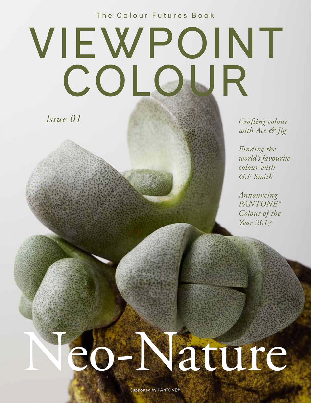
All photos extracted with permission from VIEWPOINT COLOUR – Neo-Nature


Presumably, it will tell us the exact shade of the Emperor’s’ new clothes.
With a £75 magazine Pantone is clearly reflecting the pricing structure behind its swatch books – and the same inflated idea of their utility.