The way ahead
Information design should be intuitive and informative, as Jim Davies finds out.
‘The exhibits work on two levels,’ says Peto. ‘There’s the way the information is conveyed – is the design effective? – but also the pull and interest generated by the subject area itself.’ As an example, he cites a pre-World War II map of the Berlin underground system, the U-Bahn. It’s only now, some 15 years after the Berlin Wall came down, that some of the dozens of ‘ghost’ stations are being reopened.
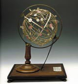
Peto has also introduced a number of three-dimensional objects, such as globes and medical models, to counterbalance the flat graphics and create a sense of spatial drama in the 570m2 hall. There’s a degree of interactivity, but his main focus has been on how to visualise practical things: ‘How do you convert a 3D globe to a 2D poster? Fundamental design problems like these,’ he explains. The design of the exhibition itself, by graphic designers John Hares and Laurent Benner, has been kept simple and elegant; deliberately downplayed to avoid conflicting with the exhibits.
It’s certainly an ambitious project, but is it too specialist – dry even – for the wider public? Peto thinks not. ‘There’s a fun element [to the show] too,’ he says. ‘A certain quirkiness.’ For instance? ‘I found an osteopath who had a diagram of the human body made up entirely of plumbing materials.’ That’s quirky alright.
And what do the experts think? ‘Information design has a low profile, and isn’t seen as sexy,’ says Tim Fendley, creative director of AIG, which specialises in the area, and is currently putting together proposals for a consistent pedestrian signage system across central London. ‘Design has been so taken over by “rockstarism” that people are only interested in brilliant one-off pieces, rather than a system that works really well. Information design is about making things work for people, it delivers real benefit that’s practical and often commercial too. The only problem is it’s not seen, so it’s not appreciated. So a show is a great idea, I hope it will shine things up a little.’
‘Information design is pervasive,’ says Ian Cartlidge, founder of design group Cartlidge Levine, which has created signage systems for the Lords and Oval cricket grounds as well as Millennium Point, the popular science museum in Birmingham. ‘Often, the less you’re aware of it the better it is. As a designer the best way to understand the underlying principles is to get first-hand experience of it, but you’re relying on a certain amount of intuition, as well as applying logic and addressing questions of legibility.’
Perhaps the exhibition will give Cartlidge inspiration as he gets to grips with one of the most taxing information graphics projects around. Yes, Cartlidge Levene is in the throes of implementing a signage and navigation system for the notorious Barbican Arts Centre.
You Are Here – the Design of Information runs from 12 February to 15 May at the Design Museum, Shad Thames, London SE1
-
Post a comment


