
Can “visceral” graphic design bring the plastic crisis to life?
Plastic Free July aims to draw awareness to the plastic crisis and one studio project focuses on a hard-to-swallow element of the problem.
The plastic crisis is well-documented. Around 8bn metric tonnes of plastic has been created worldwide – with a projected figure of 34bn by 2050 – and much of the material is single-use. Once it is used, it is often discarded, filling landfills and making its way into the ocean and water systems. It’s estimated that there are five shopping bags full of rubbish for every foot of coastline around the world.
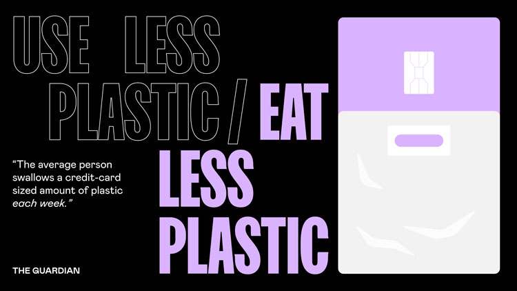
Plastic Free July is an annual campaign which aims to reduce plastic usage through awareness and commitment to more sustainable habits. Design studio How & How has created a project in honour of the campaign, around a startling statistic: on average, a human eats a credit card-sized amount of plastic every week.
How & How creative director Cat How tells Design Week that the studio had wanted to create work around sustainability for a while, with the “planet as a client”. Reading an article featuring the credit card detail prompted work on the campaign. The “visceral nature of connecting what’s happening to the planet to an object” makes the idea more “real”, How says. “We were all shocked by the statistic,” she adds.
Issues around plastic have erupted lately because of the pandemic. Anti-plastic activists are concerned that the plastics industry is seizing on the coronavirus pandemic to undo work on awareness and habit-forming. The organisation behind Plastic Free July said that 250m people participated in the challenge last year, from a total of 177 countries, leading to an annual saving of 825m kg of plastic waste. But detractors point out the need for plastic in preventing the spread of a pandemic, through the production of PPE and disposable face masks for example.
“It’s really gross but visual”

How & How, which is based in Lisbon and London, was inspired by “the horrific beauty of plastic”. The images of plastic washed up on beaches are distressing, but they do feature colourful materials which have an aesthetic appeal, How says. This speaks to the central credit card image of the campaign, which How calls “gross” but very “visual”.
“We wanted it to be colourful in nature,” she says. The visuals’ tones have been inspired by neons and bright plastic colours – the details are almost like Pop Art, How adds. The work also has an illustrative focus, and the studio was inspired by the likes of Giacomo Bagnara and James Joyce. Plastic packaging, from bottles to carrier bags – are shown in credit card shapes which form the link between plastic waste and consumption.

“Strong” typography has also been key; it needed to be “in your face”, How says, just like the main statistic. Sharp Grotesk has been used for the headlines, and Mabry for body copy.
With the amount of information around the topic, How wanted the campaign work to be as straightforward as possible. One of the problems was to be able to depict the plastic bottles inside credit card shapes, but not make it look like the card was made from recycled plastic. The style needed to look “naïve” and “simple” so that the visuals were not overcomplicated; How & How wanted the shapes to be easily discernable.
How do you design for social media?

Produced in a mini-sprint period, the campaign has an eye toward shareability on social media. With these awareness campaigns, How says there’s a lot of discussion about how to illicit the most powerful reaction. Do designers aim for shock or optimism? Is it more effective to create something beautiful that people will share and therefore raise more awareness?
“With this one, the hook was that people are essentially selfish, and the moment you think about yourself, and how issues can be affecting you, suddenly it takes on a whole new dimension,” she says.

It’s also about matching up these statistics with effective visuals. “Sometimes you see these statistics in dry scientific journals,” she says. By matching it up with more “contemporary” visuals, it can have a greater effect.
“This was an excuse for making it really loud,” How says. The tagline – Eat Less Plastic – is also unexpected. People might be more used to seeing Use Less Plastic, though she says this presented its own problem as it often read as Useless Plastic.
“Drowning in plastic”
Design can play an important role in bringing statistics to life. Design Week spoke to the in-house design team at news agency Reuters about bringing global news stories to life. The team’s take on the plastic crisis showed a person “drowning” in plastic bottles, as a way to show how 1m plastic bottles are bought around the world every minute.
Another image took a similar route to How & How, by showing how on average, a person consumes enough plastic every six months to fill a cereal bowl full of shredded plastic flakes.


-
Post a comment


