Landor gives BP image some ‘dynamic energy’
Following its £120bn mergers with Amoco and Atlantic Richfield and Burmah Castrol, BP has finally unveiled its new corporate identity and retail strategy, created by Landor Associates’ San Francisco office.
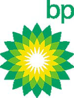
The identity replaces the BP shield with a “helios” symbol, representing the Greek god of the sun, which is associated with ‘dynamic energy’. It has been adapted from a marble motif at the company’s London headquarters, designed by architect Sir Edwyn Lutyens more than 75 years ago.
The green and yellow colour palette introduced by Addison is all that remains of BP’s previous marque.
Gone will be Amoco’s name and torch logo from the group identity, but the brand will appear on some forecourt signage, and product brands such as Castrol will be retained. BP’s logotype will bear the new group name BP in lower case symbolising the phrase “beyond petroleum”.
By the end of the year BP plans to introduce a new-format petrol station, beginning in London and rolling out worldwide. Branded BP Connect, forecourts will feature e-kiosks offering interactive services. Design is by Landor.
The service will cater for pre-paying fuel customers and enable future direct shopping spin-offs. Customers at the pump will be able to order sandwiches interactively, then pick up at the till. Forecourt roofs will be solar powered.
BP Amoco chief executive Sir John Browne says: “We expect the move to a global brand and the introduction of state-of the-art retail sites to bring a significant increase in sales.”
The cost of new stations, including Web services, is expected to be the same, or lower, than at present, he says. He adds that Landor’s design fee is a “small proportion” of the $7m (£4m) spent on researching and preparing the new brand.
-
Post a comment


