5 important things that happened in design this week
Our exclusive interview with Alan Kitching, Theresa May triggers Article 50 and UKIP looks set to rebrand – the important design news from the last seven days.
Theresa May triggered Article 50 and we looked at the effects on designers
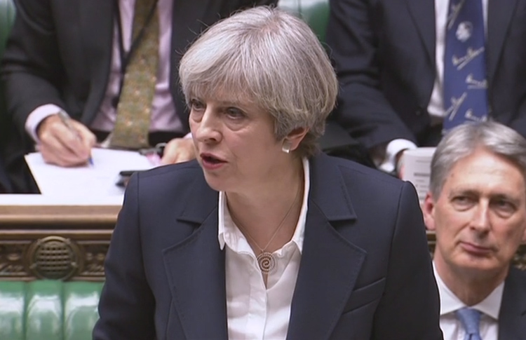
This week, the Brexit process officially begun as the prime minister triggered Article 50 of the Lisbon Treaty, handing over the UK’s resignation letter to the European Council.
The UK now has two years to exit the European Union – and in her speech this week, Theresa May spoke of how leaving will give the UK a chance to become “truly global” and work more with international markets.
We looked at the effects on designers. May has promised that, despite stricter immigration curbs and restrictions on the free movement of people, the UK will continue to invite the “brightest and best” to study and work here. But if this is judged in line with salary, it is likely that those working in the creative industries will fall short.
As May says, Brexit could offer opportunities for more trade with international markets. But unfortunately, the EU is currently the UK creative industries’ biggest trade partner, receiving the majority of its exports – so there is a lot of work to be done establishing relationships overseas before design consultancies will benefit from this.
Read our full analysis on Theresa May’s Brexit plan here.
Alan Kitching told us that letterpress is “no longer relevant”
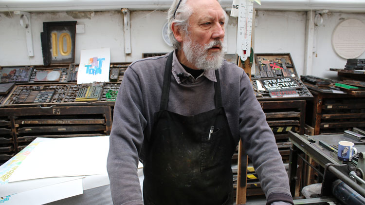
Alan Kitching began his career in the 1950s in Darlington, where he worked as a typesetting apprentice at a printing company. He has gone on to become one of the most influential graphic designers working in traditional letterpress of the 20th century, creating work for The Guardian, The National Theatre and later teaching at the Royal College of Art (RCA).
Design Week visited his studio this week, and spoke to him about his career, memories of our magazine, and how the design industry has changed – including his thoughts on letterpress being an antiquated art.
Watch our exclusive video interview with Alan Kitching in full here.
UKIP said it would rebrand to “modernise” the political party
Right-wing political party the UK Independence Party has had its fair share of controversy over the last year, with former leader Nigel Farage rejected from the official Vote Leave campaign for his extreme views on immigration, then later stepping down following the EU referendum.
This week, current leader Paul Nuttall announced that the party would be rebranding to “modernise” UKIP and give it a “different feel”, and that this would be revealed following the party’s annual conference in September.
He has confirmed that the name of the party will not change, but we could see the logo’s purple and yellow colour palette and pound sign symbol disappear.
The change could be in aid of moving beyond the controversial image Farage painted of UKIP, and away from the idea of the party being focused on immigration.
A fresh, new design could also be an attempt to rebuild trust with the public and improve public ratings, after research from YouGov showed that the vast majority of respondents “did not trust” Nigel Farage in June last year.
Perhaps it will also be an opportunity for the party to take design into greater consideration. Nuttall candidly told The Telegraph this week that UKIP originally settled on the strange combination of purple and yellow “because there were no other colours available”.
The Honey Monster got a makeover – and became slightly less sugary

Reducing sugar consumption is high on health professionals’ priority lists at the moment, with Public Health England this week urging businesses to cut sugar in their products by 20% by 2020.
In line with this, children’s breakfast cereal Honey Monster Puffs has cut its sugar content down by 25% in a new recipe, revealing a rebrand designed by consultancy Robot Food at the same time.
The well-known, fluffy, yellow monster has gone from “creepy” to “personable”, says Mike Johns, senior designer at the consultancy, as the brand takes on a more “natural”, illustrated style.
“We’ve got rid of the nasties from the design and made it purer, with less computer-generated imagery (CGI),” says Johns. “We feel we’re allowed to do this thanks to the new recipe with less sugar.”
Whether the cereal can now be described or portrayed as healthy is up for question, however – the new recipe still contains 22g of sugar per 100g of cereal, which brings it just below the “high in sugar” boundaries set by the National Health Service (NHS).
The new branding and packaging starts rolling out in store from April, with a refreshed website to launch soon as well.
The Design Council looked to tackle social issues in London
Increasingly, design is being used by the public sector to improve lives. Everything from Morag Myerscough’s colourful installations in hospitals to the redesigned gov.uk website centralising the Government’s services demonstrate how these organisations are embracing design.
Now, the Design Council’s Design in the Public Sector scheme, which launched in 2014, is working with six London boroughs to help tackle different issues. These range from homelessness to rethinking services for children with special needs and disabilities.
The 16-week programme has launched in partnership with the Local Government Association (LGA), and the six boroughs join 48 other local authorities across England who have participated in the scheme since 2014.
Expect findings to be published by the Design Council after the programme ends. Read the organisation’s report following the first 18 months of the programme here.
Got a design story? Get in touch sarah.dawood@centaurmedia.com.

-
Post a comment


