Seachange goes with flow of GSK’s currant drink
GlaxoSmithKline launches a six-figure identity and packaging revamp of its flagship squash drink Ribena next month, in a return to the brand’s traditional imagery after controversy over the health benefits of its Toothkind variant.
The work, by Seachange Creative Partners, will extol the virtues of Vitamin C and acknowledges that the brand has recently ‘lost its way’, according to Seachange creative director Sally Costen.
Costen says, ‘The brief was to rediscover Ribena.’ She says five separate logos were being used and as a result the identity had become ‘very diluted’.
Ribena marketing category director Simon Kemp concedes the range needed to be brought closer together. ‘The brands were not as strong as they could have been in terms of achieving an overall co-ordinated identity.’
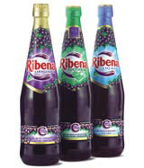
The Seachange design evokes the brand’s key claim in a literal way, Costen says, focusing on the ‘rich dark liquid synonymous with the brand’.
‘The new Ribena identity is now encapsulated by juice drops that form a ‘C’ device that underpins the core brand proposition,’ she says. ‘The sunny burst behind the logo helps to communicate refreshment and natural goodness.’
Getting the illustrative style right was ‘imperative’, she adds. Graphics of the fruit by freelance illustrator Barry Patterson are described as ‘fixed, ownable and mouth-watering’.
Seachange won a three-way, paid, strategic pitch in January last year. Senior designer Simon Attfield and freelance designer Chrissie Levitt also worked on the project.
Read this next

-
Post a comment


